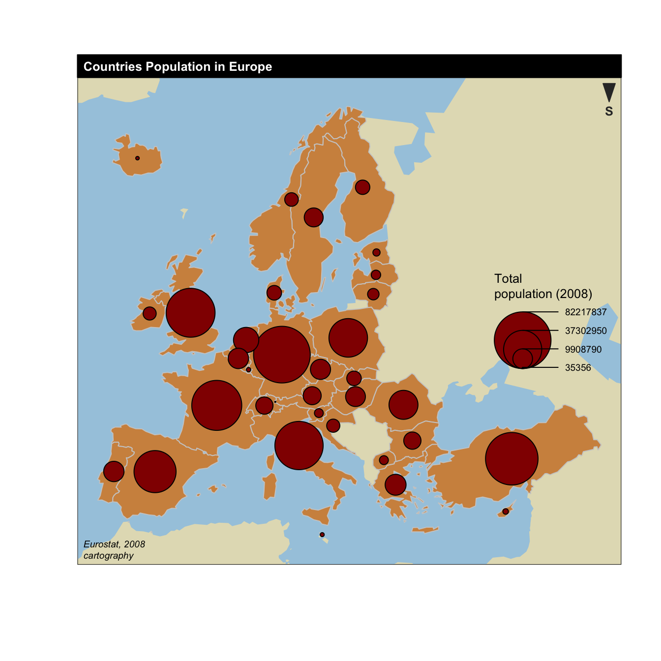
The cartography package is a very good alternative to
the other tools presented in the
gallery for building maps.
It notably allows to:
- display a legend with embedded circles
- add data sources on the bottom of the chart
- show north / south
# Library
library(cartography)
library(sp)

# Upload data attached with the package.
data(nuts2006)

# Now we have a geospatial object called nuts2.spdf containing the shape of european regions. We can plot it with the plot function.
# summary(nuts2.spdf)

# We also have a dataframe with information concerning every region.
# head(nuts2.df)
# Both object have a first column "id" that makes the link between them.

# Plot Europe
plot(nuts0.spdf, border = NA, col = NA, bg = "#A6CAE0")
plot(world.spdf, col = "#E3DEBF", border = NA, add = TRUE)
plot(nuts0.spdf, col = "#D1914D", border = "grey80",  add = TRUE)

# Add circles proportional to the total population
propSymbolsLayer(spdf = nuts0.spdf, df = nuts0.df,
    var = "pop2008", symbols = "circle", col = "#920000",
    legend.pos = "right", legend.title.txt = "Total\npopulation (2008)",
    legend.style = "c")

# Add titles, legend...
layoutLayer(title = "Countries Population in Europe",
    author = "cartography", sources = "Eurostat, 2008",
    scale = NULL, south = TRUE)