The levelplot function of lattice allows to deal with 3 numeric variables as shown in the heatmap section of the gallery.
Here, the idea is to plot data points as circles using
panel.levelplot.points to get a scatterplot. Then, a
layer is added using panel.2dsmoother to show the
general distribution of the third numeric variable.
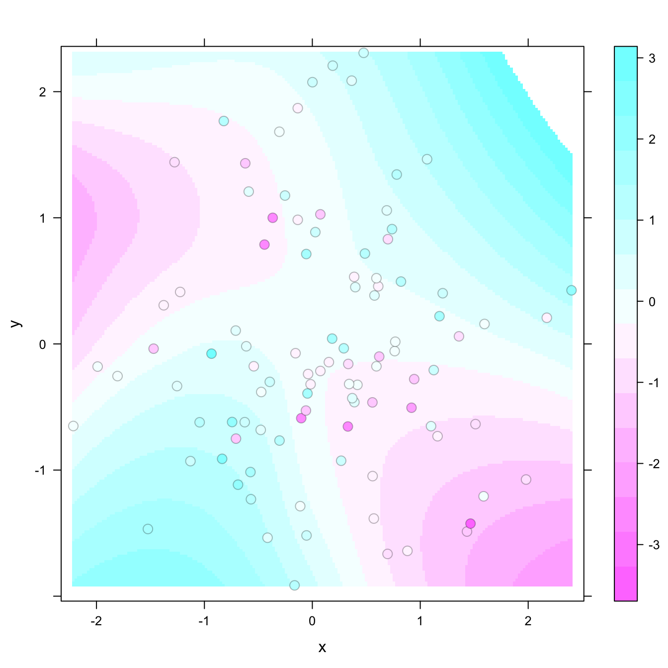
# library
library(latticeExtra)

# create data
set.seed(1)
data <- data.frame(x = rnorm(100), y = rnorm(100))
data$z <- with(data, x * y + rnorm(100, sd = 1))

# showing data points on the same color scale
levelplot(z ~ x * y, data,
          panel = panel.levelplot.points, cex = 1.2
    ) +
    layer_(panel.2dsmoother(..., n = 200))