A Ridgelineplot (formerly called Joyplot) allows to study the distribution of a numeric variable for several groups. In this example, we check the distribution of diamond prices according to their quality.
This graph is made using the ggridges library, which is
a ggplot2 extension and thus respect the syntax of the
grammar of graphic. We specify the price column for the
X axis and the cut column for the Y axis. Adding
fill=cut allows to use one colour per category and
display them as separate groups.

# library
library(ggridges)
library(ggplot2)

# Diamonds dataset is provided by R natively
#head(diamonds)

# basic example
ggplot(diamonds, aes(x = price, y = cut, fill = cut)) +
  geom_density_ridges() +
  theme_ridges() +
  theme(legend.position = "none")
Shape Variation
It is possible to represent the density with different aspects. For
instance, using stat="binline" makes a
histogram like shape to represent each distribution.

# library
library(ggridges)
library(ggplot2)
library(dplyr)
library(tidyr)
library(forcats)

# Load dataset from github
data <- read.table("https://raw.githubusercontent.com/zonination/perceptions/master/probly.csv", header=TRUE, sep=",")
data <- data %>%
  gather(key="text", value="value") %>%
  mutate(text = gsub("\\.", " ",text)) %>%
  mutate(value = round(as.numeric(value),0)) %>%
  filter(text %in% c("Almost Certainly","Very Good Chance","We Believe","Likely","About Even", "Little Chance", "Chances Are Slight", "Almost No Chance"))

# Plot
data %>%
  mutate(text = fct_reorder(text, value)) %>%
  ggplot( aes(y=text, x=value,  fill=text)) +
    geom_density_ridges(alpha=0.6, stat="binline", bins=20) +
    theme_ridges() +
    theme(
      legend.position="none",
      panel.spacing = unit(0.1, "lines"),
      strip.text.x = element_text(size = 8)
    ) +
    xlab("") +
    ylab("Assigned Probability (%)")
Color relative to numeric value
It is possible to set color depending on the numeric variable instead of the categoric one. (code from the ridgeline R package by Claus O. Wilke )
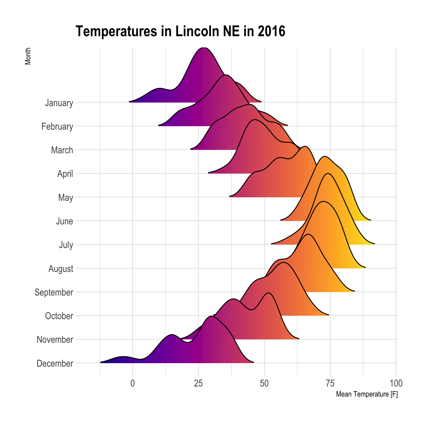
# library
library(ggridges)
library(ggplot2)
library(viridis)
library(hrbrthemes)

# Plot
ggplot(lincoln_weather, aes(x = `Mean Temperature [F]`, y = `Month`, fill = ..x..)) +
  geom_density_ridges_gradient(scale = 3, rel_min_height = 0.01) +
  scale_fill_viridis(name = "Temp. [F]", option = "C") +
  labs(title = 'Temperatures in Lincoln NE in 2016') +
  theme_ipsum() +
    theme(
      legend.position="none",
      panel.spacing = unit(0.1, "lines"),
      strip.text.x = element_text(size = 8)
    )