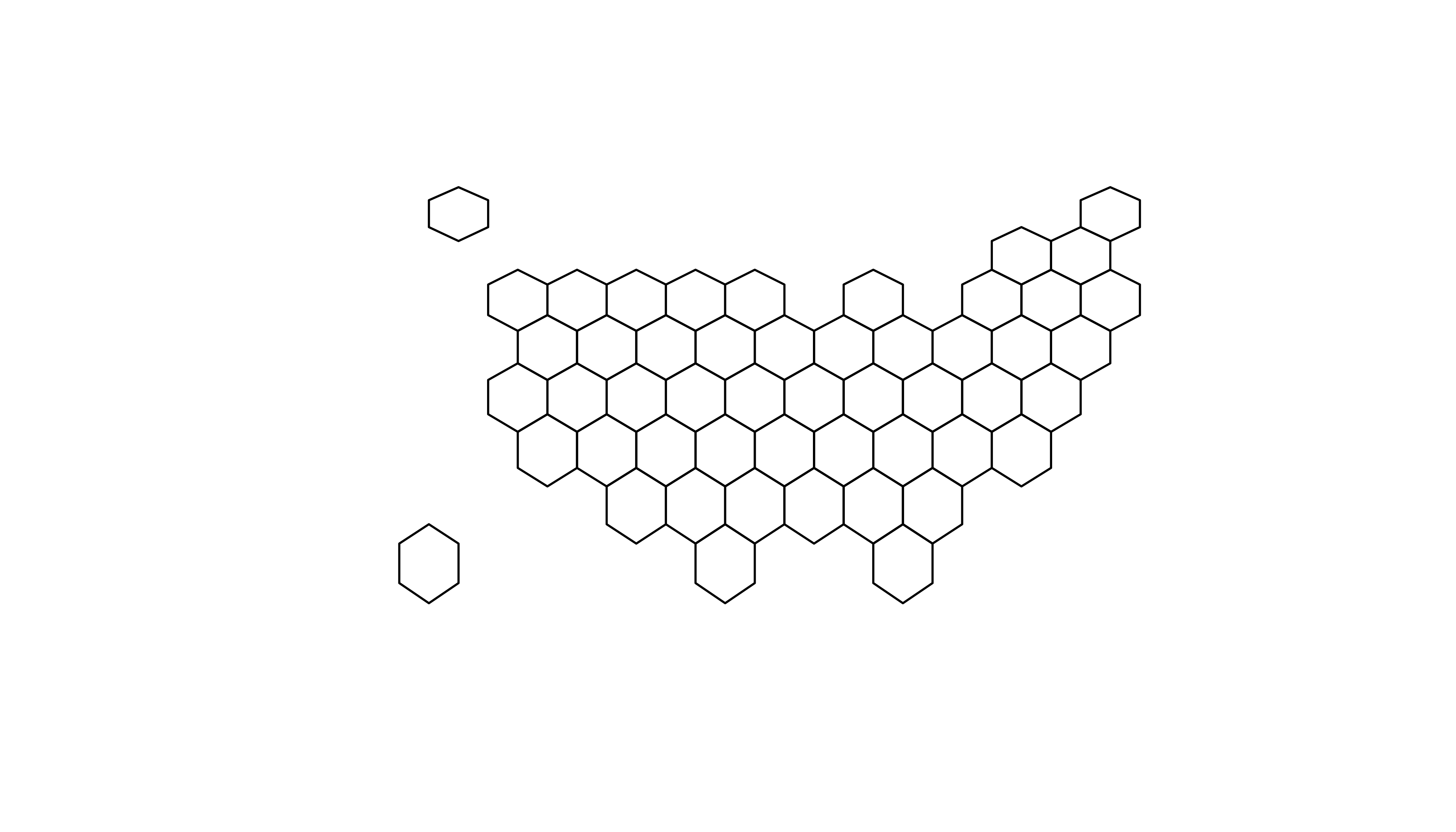
Basic hexbin map
The first step is to build a basic hexbin map of the US. Note that the gallery dedicates a whole section to this kind of map.
Hexagon boundaries are provided
here. You have to download it at the geojson format and
load it in R thanks to the
st_read() / read_sf() function. You get a geospatial
object that you can plot using the plot() function.
This is widely explained in the
background map section of the gallery.
# library
library(tidyverse)
library(sf)
library(RColorBrewer)

# Download the Hexagon boundaries at geojson format here: https://team.carto.com/u/andrew/tables/andrew.us_states_hexgrid/public/map.

# Load this file. (Note: I stored in a folder called DATA)
my_sf <- read_sf("DATA/us_states_hexgrid.geojson.json")

# Bit of reformatting
my_sf <- my_sf %>%
  mutate(google_name = gsub(" \\(United States\\)", "", google_name))

# Show it
plot(st_geometry(my_sf))
ggplot2 and state name
It is totally doable to plot this geospatial object using
ggplot2 and its geom_sf() and
geom_sf_text() functions.
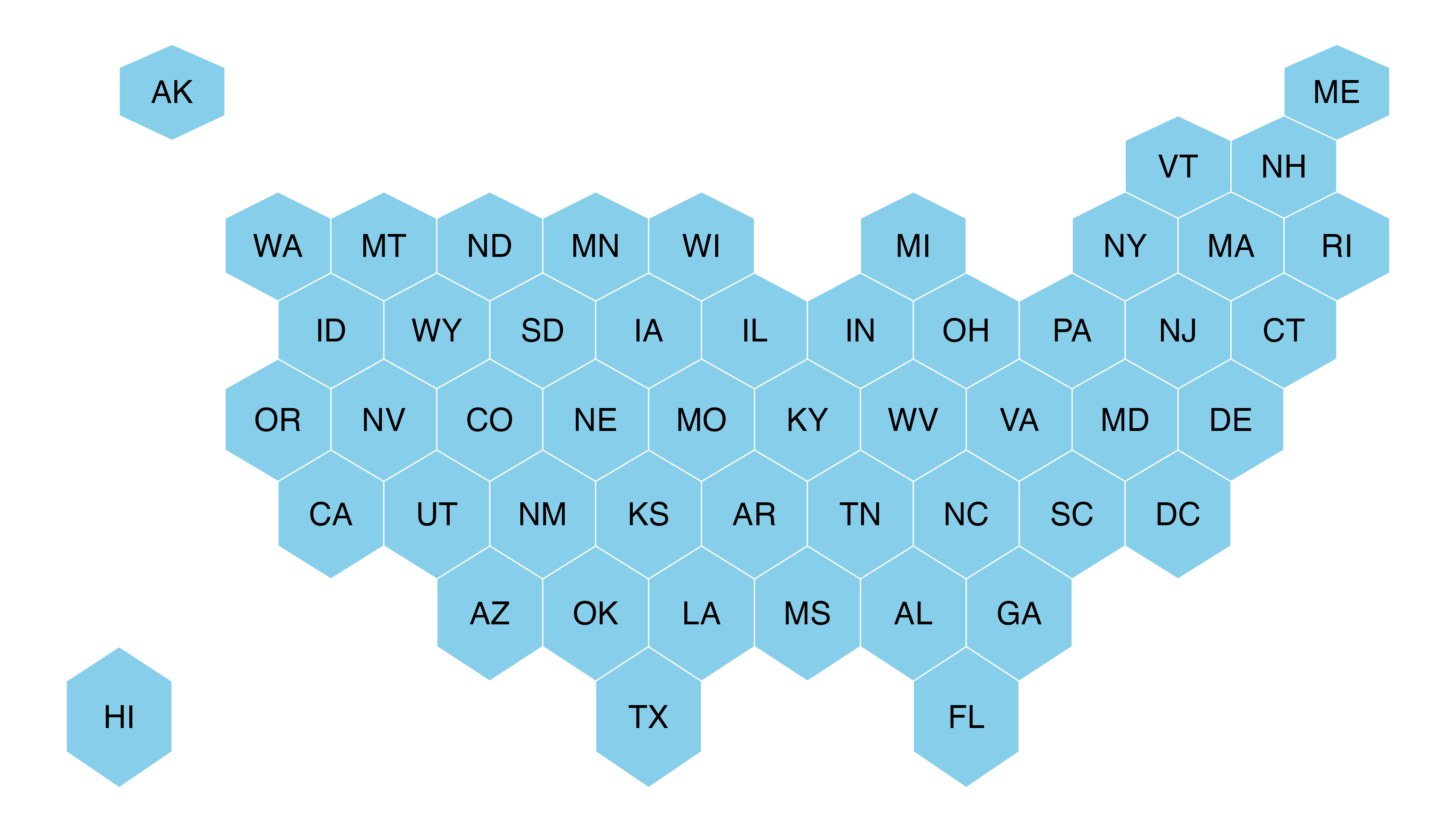
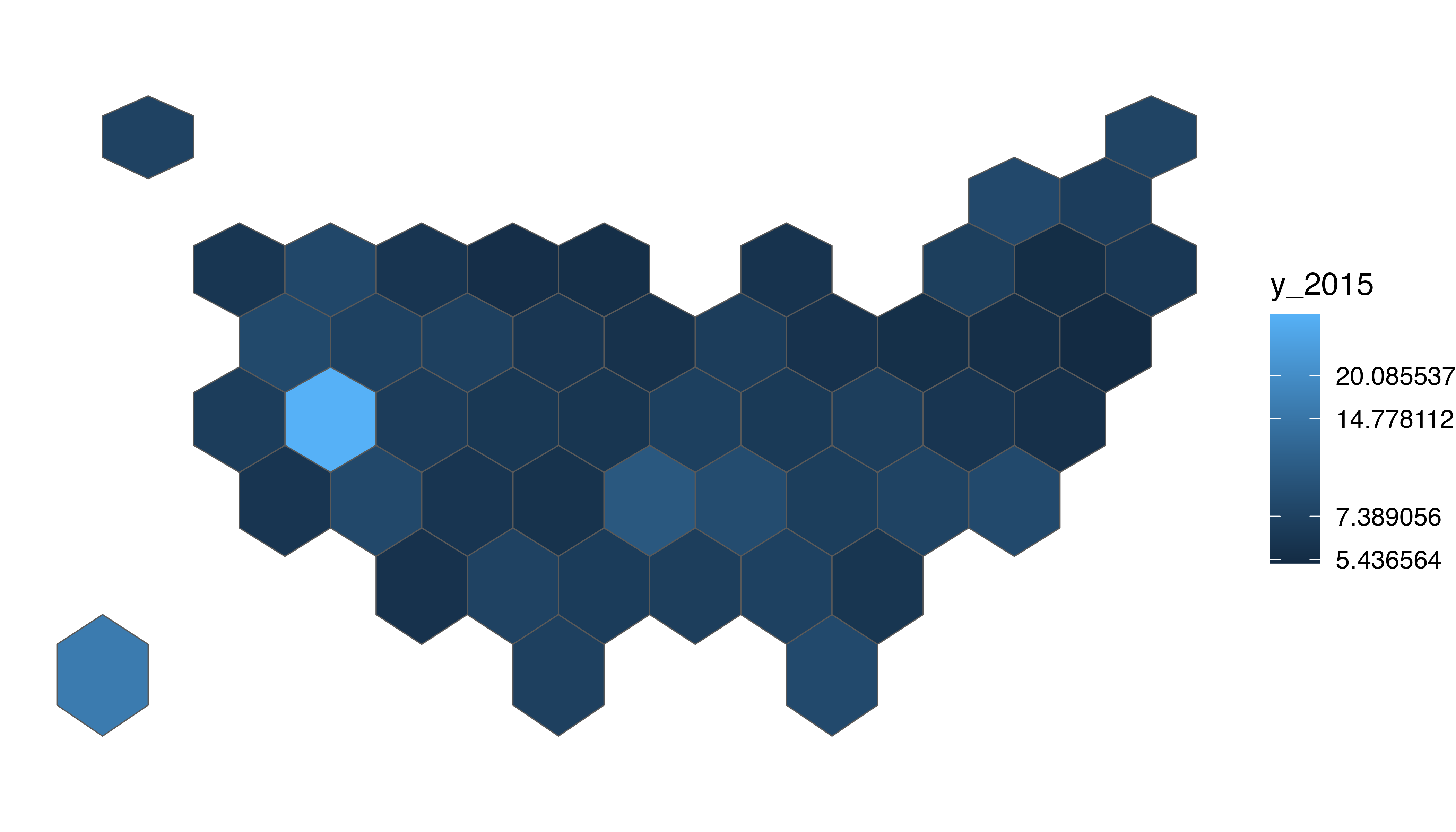
Basic choropleth
Now you probably want to adjust the color of each hexagone, according to the value of a specific variable (we call it a choropleth map).
The data is about the number of wedding per thousand people, and you can load it directly using the following code.
Let’s start by loading this information and represent its distribution:
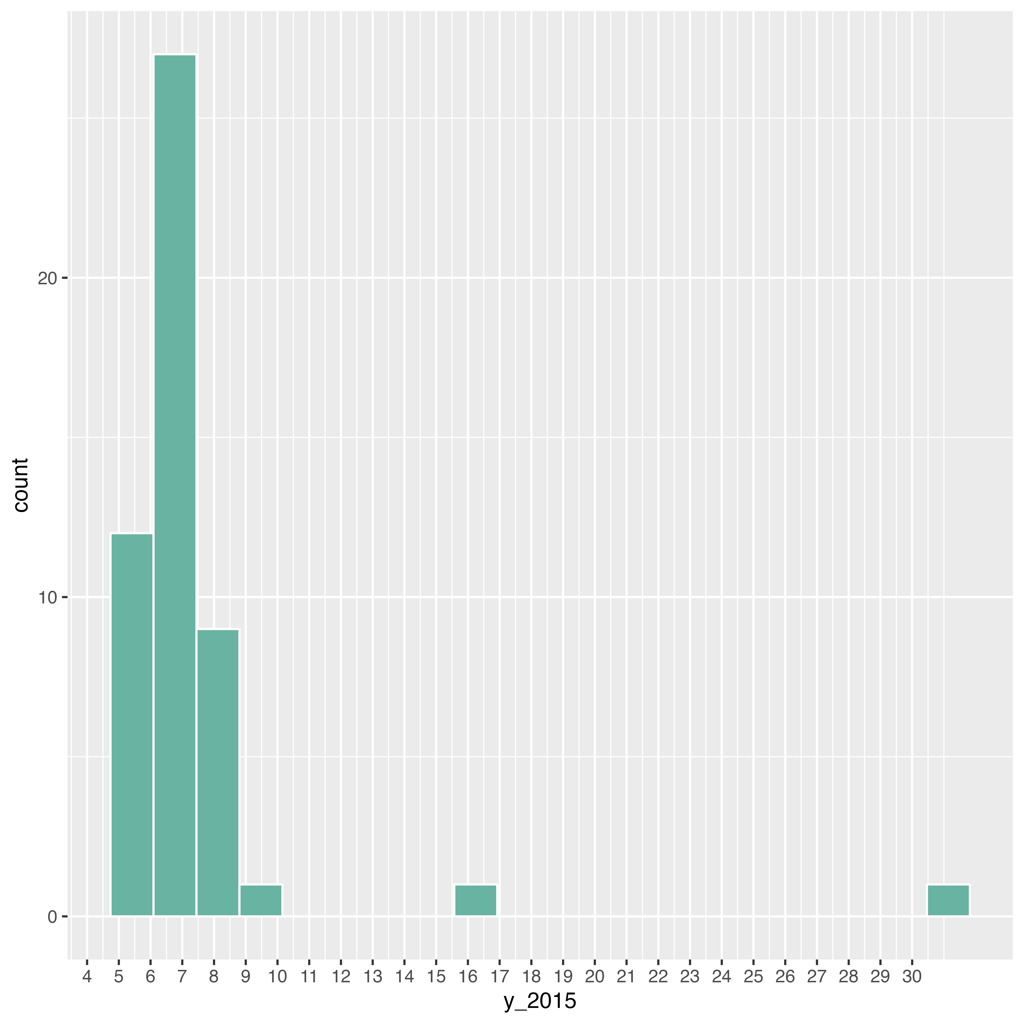
# Load marriage data
data <- read.table("https://raw.githubusercontent.com/holtzy/R-graph-gallery/master/DATA/State_mariage_rate.csv",
  header = T, sep = ",", na.strings = "---"
)

# Distribution of the marriage rate?
data %>%
  ggplot(aes(x = y_2015)) +
  geom_histogram(bins = 20, fill = "#69b3a2", color = "white") +
  scale_x_continuous(breaks = seq(1, 30))
Most of the state have between 5 and 10 weddings per 1000 inhabitants, but there are 2 outliers with high values (16 and 32).
Note the use of the trans = "log" option in the color
scale to decrease the effect of the 2 outliers.
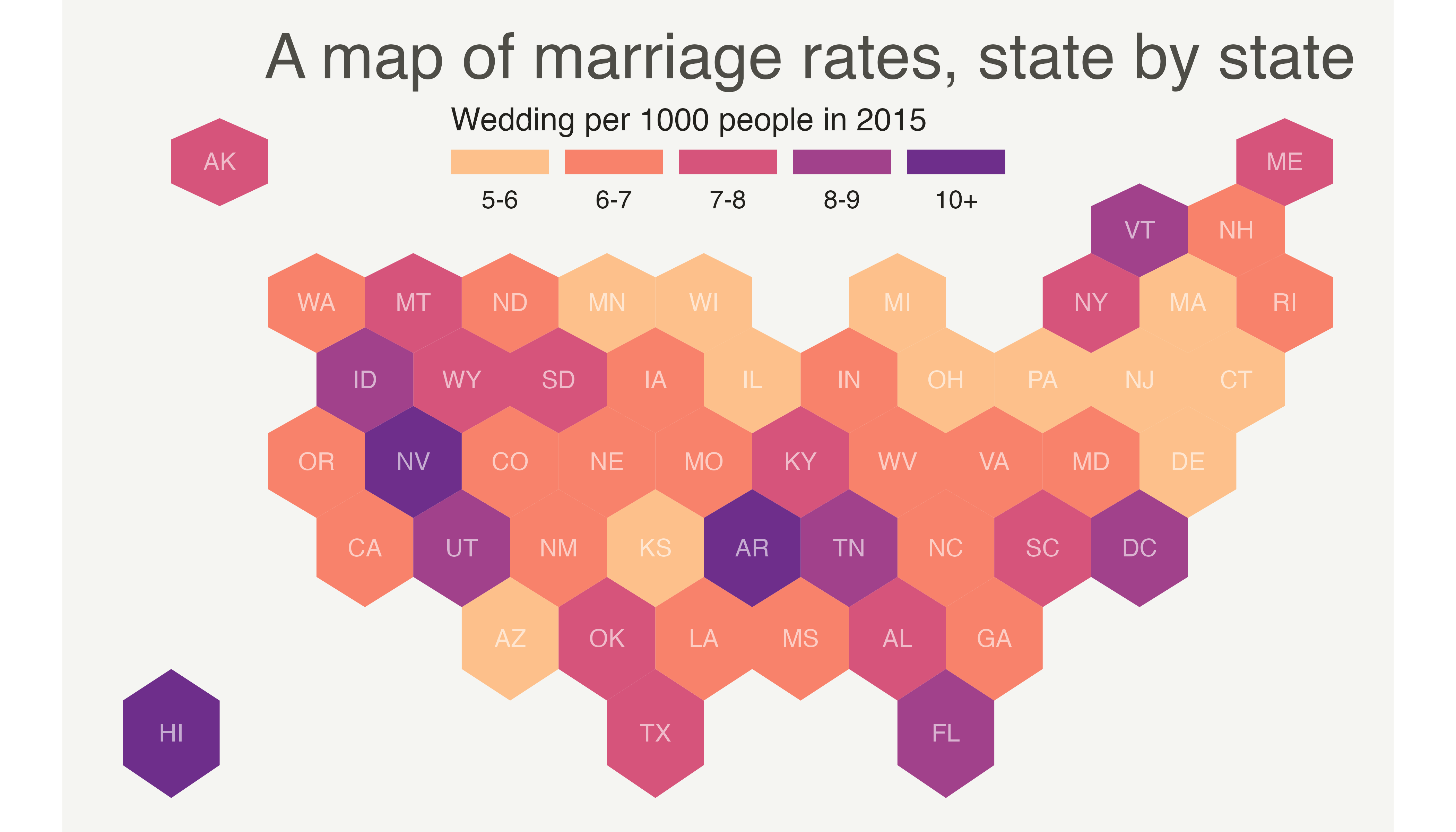
Customized hexbin choropleth map
Here is a final version after applying a few customization:
-
Use handmade binning for the colorscale with
scale_fill_manual - Use
viridisfor the color palette - Add custom legend and title
- Change background color
# Prepare binning
my_sf_wed$bin <- cut(my_sf_wed$y_2015,
  breaks = c(seq(5, 10), Inf),
  labels = c("5-6", "6-7", "7-8", "8-9", "9-10", "10+"),
  include.lowest = TRUE
)

# Prepare a color scale coming from the viridis color palette
library(viridis)
my_palette <- rev(magma(8))[c(-1, -8)]

# plot
ggplot(my_sf_wed) +
  geom_sf(aes(fill = bin), linewidth = 0, alpha = 0.9) +
  geom_sf_text(aes(label = iso3166_2), color = "white", size = 3, alpha = 0.6) +
  theme_void() +
  scale_fill_manual(
    values = my_palette,
    name = "Wedding per 1000 people in 2015",
    guide = guide_legend(
      keyheight = unit(3, units = "mm"),
      keywidth = unit(12, units = "mm"),
      label.position = "bottom", title.position = "top", nrow = 1
    )
  ) +
  ggtitle("A map of marriage rates, state by state") +
  theme(
    legend.position = c(0.5, 0.9),
    text = element_text(color = "#22211d"),
    plot.background = element_rect(fill = "#f5f5f2", color = NA),
    panel.background = element_rect(fill = "#f5f5f2", color = NA),
    legend.background = element_rect(fill = "#f5f5f2", color = NA),
    plot.title = element_text(
      size = 22, hjust = 0.5, color = "#4e4d47",
      margin = margin(b = -0.1, t = 0.4, l = 2, unit = "cm")
    )
  )
Going further
This post explains how to build a hexbin map of the US.
You might be interested in how to combine hexbin map and cartogram, and more generally by the hexbin map section of the gallery.