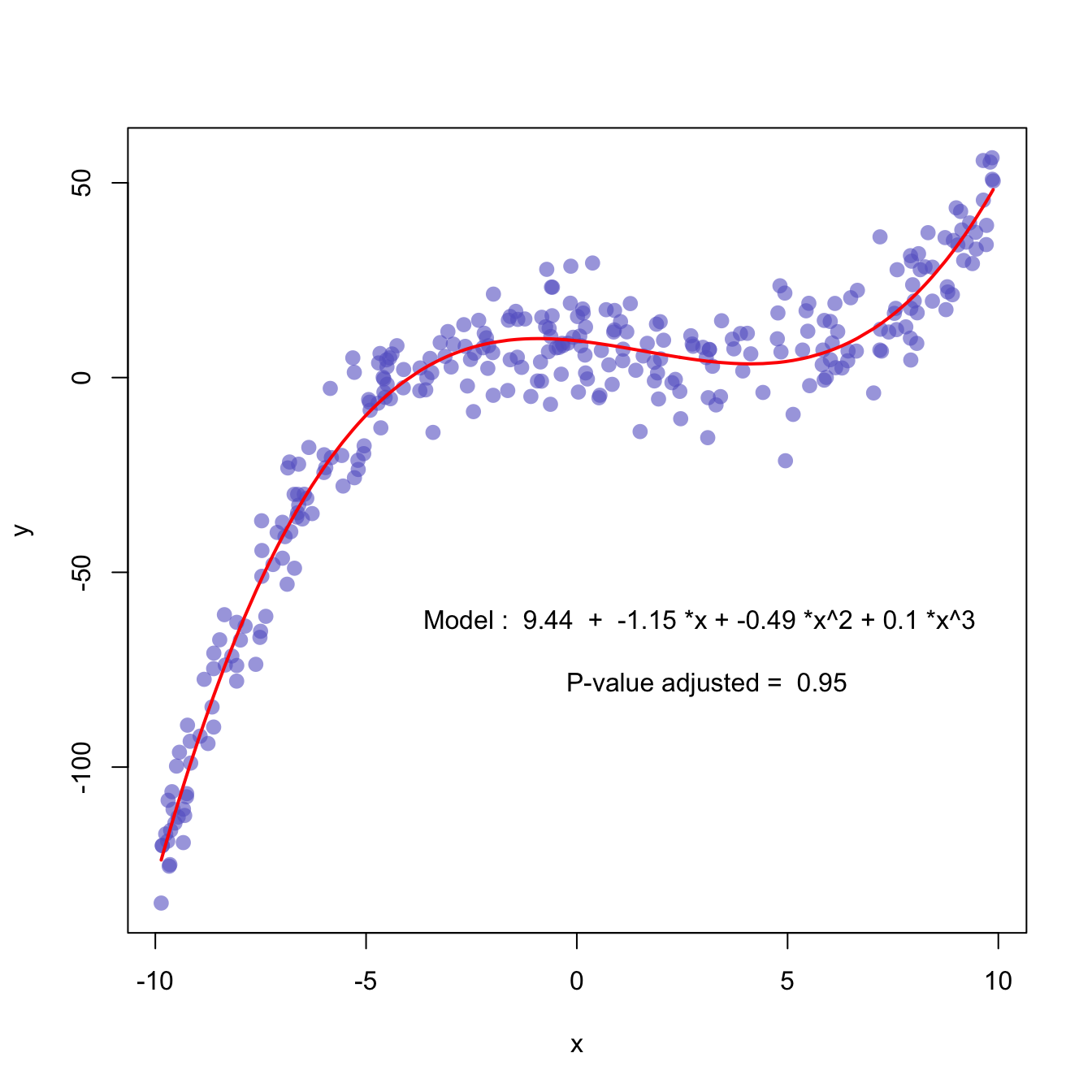
First of all, a scatterplot is built using the native R
plot() function. Then, a polynomial model is fit thanks
to the lm() function. It is possible to have the
estimated Y value for each step of the X axis using the
predict() function, and plot it with
line().
It is a good practice to add the equation of the model with
text().
Note: You can also add a confidence interval around the model as described in chart #45.
x <- runif(300,  min=-10, max=10)
y <- 0.1*x^3 - 0.5 * x^2 - x + 10 + rnorm(length(x),0,8)

# plot of x and y :
plot(x,y,col=rgb(0.4,0.4,0.8,0.6),pch=16 , cex=1.3)

# Can we find a polynome that fit this function ?
model <- lm(y ~ x + I(x^2) + I(x^3))

# I can get the features of this model :
#summary(model)
#model$coefficients
#summary(model)$adj.r.squared

# For each value of x, I can get the value of y estimated by the model, and add it to the current plot !
myPredict <- predict( model )
ix <- sort(x,index.return=T)$ix
lines(x[ix], myPredict[ix], col=2, lwd=2 )

# I add the features of the model to the plot
coeff <- round(model$coefficients , 2)
text(3, -70 , paste("Model : ",coeff[1] , " + " , coeff[2] , "*x"  , "+" , coeff[3] , "*x^2" , "+" , coeff[4] , "*x^3" , "\n\n" , "P-value adjusted = ",round(summary(model)$adj.r.squared,2)))