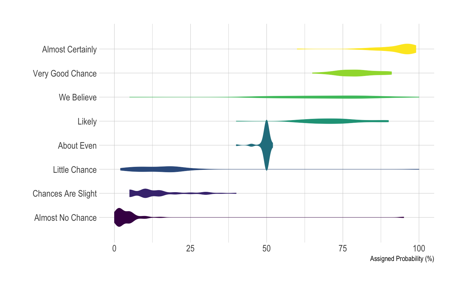
Building a violin plot with
ggplot2 is pretty straightforward thanks to the dedicated
geom_violin() function. Here, calling
coord_flip() allows to flip X and Y axis and thus get a
horizontal version of the chart. Moreover, note the use of the
theme_ipsum of the hrbrthemes library that
improves general appearance.
# Libraries
library(ggplot2)
library(dplyr)
library(tidyr)
library(forcats)
library(hrbrthemes)
library(viridis)

# Load dataset from github
data <- read.table("https://raw.githubusercontent.com/zonination/perceptions/master/probly.csv", header=TRUE, sep=",")

# Data is at wide format, we need to make it 'tidy' or 'long'
data <- data %>%
  gather(key="text", value="value") %>%
  mutate(text = gsub("\\.", " ",text)) %>%
  mutate(value = round(as.numeric(value),0)) %>%
  filter(text %in% c("Almost Certainly","Very Good Chance","We Believe","Likely","About Even", "Little Chance", "Chances Are Slight", "Almost No Chance"))

# Plot
p <- data %>%
  mutate(text = fct_reorder(text, value)) %>% # Reorder data
  ggplot( aes(x=text, y=value, fill=text, color=text)) +
    geom_violin(width=2.1, size=0.2) +
    scale_fill_viridis(discrete=TRUE) +
    scale_color_viridis(discrete=TRUE) +
    theme_ipsum() +
    theme(
      legend.position="none"
    ) +
    coord_flip() + # This switch X and Y axis and allows to get the horizontal version
    xlab("") +
    ylab("Assigned Probability (%)")

p