About
This page showcases the work of Cédric Scherer, built for the TidyTuesday initiative. You can find the original code on his Github repository here.
Thanks to him for accepting sharing his work here! Thanks also to Tomás Capretto who split the original code into this step-by-step guide! 🙏🙏
As a teaser, here is the plot we’re gonna try building:

Load packages
Let’s start by loading the packages needed to build the figure.
ggtext, and
patchwork
stand out today. ggtext makes it very easy to style text
with Markdown or HTML, and patchwork allows us to compose
ggplot2 figures very smoothly.
library(tidyverse)
library(ggtext)
library(patchwork)
Today, the plot is going to be based on the
Roboto Mono font family. If you are unsure about how
to work with custom fonts in R,
this post
is for you.
Load and prepare the data
This guide shows how to create a beautiful multipanel circular lollipop plot to visualize password popularity and strengths.
The data for this post comes from Information is Beautiful. This guide uses the dataset released for the TidyTuesday initiative on the week of 2020-01-14. You can find the original announcement and more information about the data here. Thank you all for making this guide possible!
Let’s start by loading the dataset:
df_pw <- readr::read_csv('https://raw.githubusercontent.com/rfordatascience/tidytuesday/master/data/2020/2020-01-14/passwords.csv') %>%
  # Remove rows where the password is missing
  filter(!is.na(password))
From all the columns in the data frame, only rank,
password, category, value, and
time_unit are going to be used. Let’s see what they mean:
-
rankPopularity in the database of released passwords passwordThe text of the password-
categoryThe category where the password falls into valueTime to crack by online guessingtime_unitTime unit to match with value
The next step is to convert all the time values to a common unit such
as seconds. This task suits very well for the
case_when() function.
df_pw_time <-
  df_pw %>%
  mutate(
    time = case_when(
      time_unit == "seconds" ~ value,
      time_unit == "minutes" ~ value * 60,
      time_unit == "hours" ~ value * 60 * 60,
      time_unit == "days" ~ value * 60 * 24,
      time_unit == "weeks" ~ value * 60 * 24 * 7,
      time_unit == "months" ~ value * 60 * 24 * 30,
      time_unit == "years" ~ value * 60 * 24 * 365,
      TRUE ~ NA_real_
    )
  )
Next, a fixed value of 1000 is added to all the times. This is going to leave the extra space needed for the labels within the circle.
plus <- 1000
df_pw_plot <-
  df_pw_time %>%
  mutate(time = time + plus) %>%
  add_row(rank = 501, time = 1)
And finally, create a data frame with all the information required to place labels for passwords that were really hard to crack.
labels <-
  df_pw_plot %>%
  # Value > 90 selects those above 90 years!
  filter(value > 90) %>%
  # Create label out of the password and its rank
  mutate(label = glue::glue("<b>{password}</b><br><span style='font-size:18pt'>Rank: {rank}</span>")) %>%
  # These columns give the position of the labels
  add_column(
    x = c(33, 332, 401, 492),
    y = c(75000000, 90000000, 45000000, 48498112)
  )
Did you note that HTML within the label string? That is one of the
many ways to tell ggtext how to customize the text in the
plot. That library is great!
Basic circular plot
Let’s start by creating the circular plot on the top panel:
main <- ggplot(df_pw_plot, aes(rank, time, color = category)) +
  # This segment represents the vertical lines
  geom_segment(
    aes(x = rank, xend = rank, y = 0, yend = time),
    size = 1.2
  ) +
  # This rect is converted into the inner circle where we're going to place text
  # when converting the plot to circular coordinates.
  geom_rect(
    aes(xmin = 1, xmax = 501, ymin = 0, ymax = plus),
    fill = "grey97", color = "grey97"
  ) +

  # Add our custom grid lines for the radial axis.
  # These lines indicate one day, one week, one month and one year.
  geom_hline(aes(yintercept = (1 * 24 * 60 + plus)), color = "grey88") +
  geom_hline(aes(yintercept = (7 * 24 * 60 + plus)), color = "grey85") +
  geom_hline(aes(yintercept = (30 * 24 * 60 + plus)), color = "grey82") +
  geom_hline(aes(yintercept = (365 * 24 * 60 + plus)), color = "grey79") +

  # Add points on the end of each line
  geom_point(aes(size = time)) +

  # Polar axis (y-axis) is in log10 scale
  scale_y_log10(expand = c(0, 0)) +

  # Use the Prism color scale for the categories
  rcartocolor::scale_color_carto_d(palette = "Prism", guide = "none") +

  # Assign a range for the size of the dots
  scale_size(
    range = c(1, 8),
    limits = c(plus, max(df_pw_plot$time)),
    guide = "none"
  ) +

  # Make it circular!
  coord_polar()

main

Converting a plot from cartesian to circular (polar) coordinates in
ggplot2 is as easy as adding a
coord_polar() call to the plot. So neat!
Add text annotations
The plot obtained so far looks quite nice, but it’s not done. It still lacks something that indicates how to read the story this chart is trying to tell and the labels that highlight those very hard to crack passwords. Let’s do it!
main <- main +
  # Add labels with `geom_richtext()`
  geom_richtext(
    data = labels,
    aes(x = x, y = y, label = label, color = category),
    lineheight = 0.8,
    size = 8,
    family = "Roboto Mono",
    label.color = NA
  ) +
  # Regular text with `geom_text()`
  # Note that coordinates are explicitly passed here.
  geom_text(
    x = 500, y = 1.2,
    label = "********\nCracking\nYour Favorite\nPassword",
    family = "Roboto Mono Medium",
    size = 20,
    lineheight = 0.87,
    color = "grey60"
  ) +
  geom_text(
    x = 250, y = 0.25,
    label = "********",
    family = "Roboto Mono Medium",
    size = 20,
    lineheight = 0.87,
    color = "grey60"
  ) +
  geom_text(
    x = 250, y = 1.1,
    label = "Time it takes to crack the 500 most\ncommon passwords by online guessing.\nSorted by rank and colored by category.",
    family = "Roboto Mono",
    size = 7,
    lineheight = 0.87,
    color = "grey73"
  ) +
  geom_text(
    x = 250, y = 1.95,
    label = "Time is displayed on a logarithmic scale\nwith the rings representing one day,\none week, one month, and one year\n(from inner to outer ring).",
    family = "Roboto Mono",
    size = 6,
    lineheight = 0.87,
    color = "grey73"
  )

main

geom_richtext() is kind of magical. Just give it got some
text formatted with HTML and it takes care of everything needed to
succesfully protray the formatted label in the figure.
So far, this is enough for the top-panel figure. Further modifications such as a different background color and margin adjustments are going to happen when this plot is composed with the lower-panel figures.
Multi panel plot
The original plot we’re trying to replicate consists of several panels
and all the work above only replicates the bigger panel on top. The
good news is that ggplot2 makes it really easy to reuse
existing code for a plot and convert it into a plot made of multiple
panels.
First of all, it’s necessary to add line breaks to some existing category names so they fit within the inner circle.
facet_data <-
  df_pw_plot %>%
  add_row(rank = 501, time = 1, category = unique(df_pw_plot$category)) %>%
  # This is where we add line breaks
  mutate(
    cat_label = case_when(
      category == "cool-macho" ~ "cool-\nmacho",
      category == "nerdy-pop" ~ "nerdy-\npop",
      category == "password-related" ~ "password-\nrelated",
      category == "rebellious-rude" ~ "rebel-\nlious-\nrude",
      category == "simple-alphanumeric" ~ "simple-\nalpha-\nnumeric",
      TRUE ~ category
    )
  ) %>%
  filter(!is.na(category))
And now let’s make the plot!
# Much of the code is the same than the code above.

facet <- ggplot(facet_data, aes(rank, time, color = category)) +
  geom_segment(
    aes(x = rank, xend = rank, y = 0, yend = time),
    size = 0.6
  ) +
  geom_rect(
    aes(xmin = 1, xmax = 501, ymin = 0, ymax = plus),
    fill = "grey97", color = "grey97"
  ) +
  geom_hline(aes(yintercept = (1 * 24 * 60 + plus)), color = "grey82", size = 0.2) +
  geom_hline(aes(yintercept = (7 * 24 * 60 + plus)), color = "grey79", size = 0.2) +
  geom_hline(aes(yintercept = (30 * 24 * 60 + plus)), color = "grey76", size = 0.2) +
  geom_hline(aes(yintercept = (365 * 24 * 60 + plus)), color = "grey73", size = 0.2) +
  geom_point(aes(size = time)) +

  # This is what adds the label within each circle
  geom_text(
    aes(label = cat_label, color = category),
    x = 500, y = 0,
    family = "Roboto Mono Medium",
    size = 8,
    lineheight = 0.87
  ) +
  # This is what wraps the panels for the categories into a layout of 2 rows
  facet_wrap(~ category, nrow = 2) +
  coord_polar() +
  scale_y_log10(expand = c(0, 0)) +
  rcartocolor::scale_color_carto_d(palette = "Prism", guide = "none") +
  scale_size(
    range = c(0.5, 7),
    limits = c(plus, max(df_pw_plot$time)),
    guide = "none"
  ) +
  theme(
    strip.text = element_blank(),
  )

facet
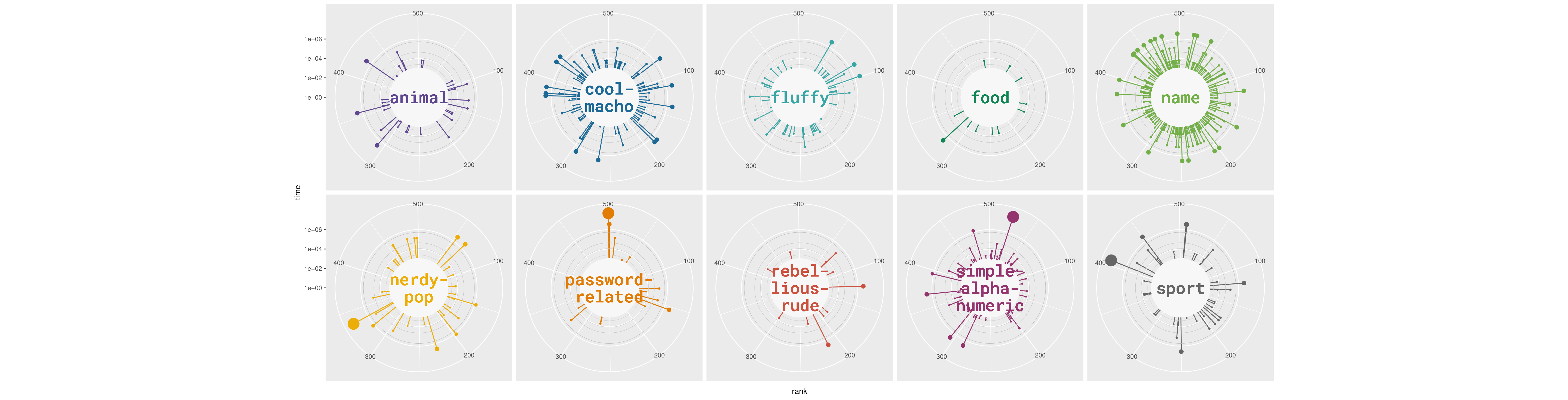
Did you spot the difference in the code? Just adding
facet_wrap(~ category, nrow = 2) tells
ggplot2 to create a plot for each level in the
category variable and arrange them in a 2-row layout.
Final chart
The two plots obtained above can be composed very easily into a single
figure thanks to the patchwork package. At this stage, it
is also important to adjust the margins and the space between the
panels to obtain a better appearece. Are you ready to finish? Let’s
go!
# Customize the main panel (top-panel)
main <- main +
  # This 'theme_void' adds a completely empty theme
  theme_void() +
  # These negative margins are VERY important to obtain a tight layout.
  theme(
    plot.margin = margin(-50, -180, -70, -180, "lines"),
  )

facet <- facet +
  # Same theme_void for the lower panels
  theme_void() +
  theme(
    # Negative spacing between panels, which means they overlap
    panel.spacing = unit(-8, "lines"),
    # Negative margin on top, to decrease blank space between these panels
    # and the main plot on top
    plot.margin = margin(-40, 50, 10, 50)
  ) +
  # Adjust settings for the caption
  theme(
    plot.caption = element_text(
      family = "Roboto Mono Medium",
      size = 20,
      color = "grey60",
      hjust = 0.5,
      margin = margin(-50, 10, 30, 10)
    )
  ) +
  # Add caption
  labs(caption = "Visualization by Cédric Scherer ∙ Data by Knowledge is Beautiful")


# Combine the two plots
# The '+' means to 'add' the two ggplot2 plots together.
panel <- (main + facet) +
  plot_layout(
    ncol = 1, # Results in one plot on top and another on the bottom.
    heights = c(1, 0.28) # Height assigned to each plot
  )
panel

Awesome, we nailed it!!🥳


