About
This page showcases the work of
Tuo Wang that introduces
packages to make
ggplot2
plots more beautiful. You can find the original code on Tuo’s blog
here.
Thanks to him for accepting sharing his work here! Thanks also to Tomás Capretto who split the original code into this step-by-step guide!
Load packages
As usual, it is first necessary to load some packages before
building the figure.
ggrepel
provides geoms for ggplot2 to repel overlapping text
labels. Text labels repel away from each other, away from data
points, and away from edges of the plotting area in an automatic
fashion. Also,
randomNames
is used to generate random names that will be the text labels in the
chart.
Note: randomNames is only available
for R > 4.0.0.
library(ggrepel)
library(palmerpenguins)
library(randomNames)
library(tidyverse)
Load and prepare the dataset
The palmerpenguins data were collected and made available by
Dr. Kristen Gorman
and the
Palmer Station, Antarctica LTER, a member of the
Long Term Ecological Research Network. This dataset was popularized by
Allison Horst in her R
package
palmerpenguins
with the goal to offer an alternative to the iris dataset for data
exploration and visualization.
data("penguins", package = "palmerpenguins")First of all, observations with missing values are discarded from the dataset.
penguins <- drop_na(penguins)
Then, each observation is assined a random name. A new variable
highlight is added to the dataset to indicate which names
are highlighted in the plot. These are the names starting with the
letter "C".
## Generate random names
# The results of set.seed may depends on R version.
set.seed(2021+03+27)
name_vector <- randomNames(nrow(penguins), which.names = "first")

## Create 'highlight' indicator variable
penguins <- penguins %>%
  mutate(
    name = name_vector,
    highlight = case_when(
      str_starts(name, "C") ~ name,
      TRUE ~ ""
      )
    )
Basic chart
Today’s chart is a scatterplot that shows the association between
the flip length and the bill length of the penguins in the dataset.
Point are colored according to the species to add an extra layer of
information to the vizualisation. The first step is to create a
basic colored scatterplot with ggplot2. Let’s get
started!
# Note `color = species` and s`hape = species`.
# This means each species will have BOTH  a different color and shape.
plt <- ggplot(penguins, aes(x = flipper_length_mm, y = bill_length_mm)) +
  geom_point(
    aes(color = species, shape = species),
    size = 1.5,
    alpha = 0.8 # It's nice to add some transparency because there may be overlap.
  ) +
  # Use custom colors
  scale_color_manual(
    values = c("#386cb0", "#fdb462", "#7fc97f")
  )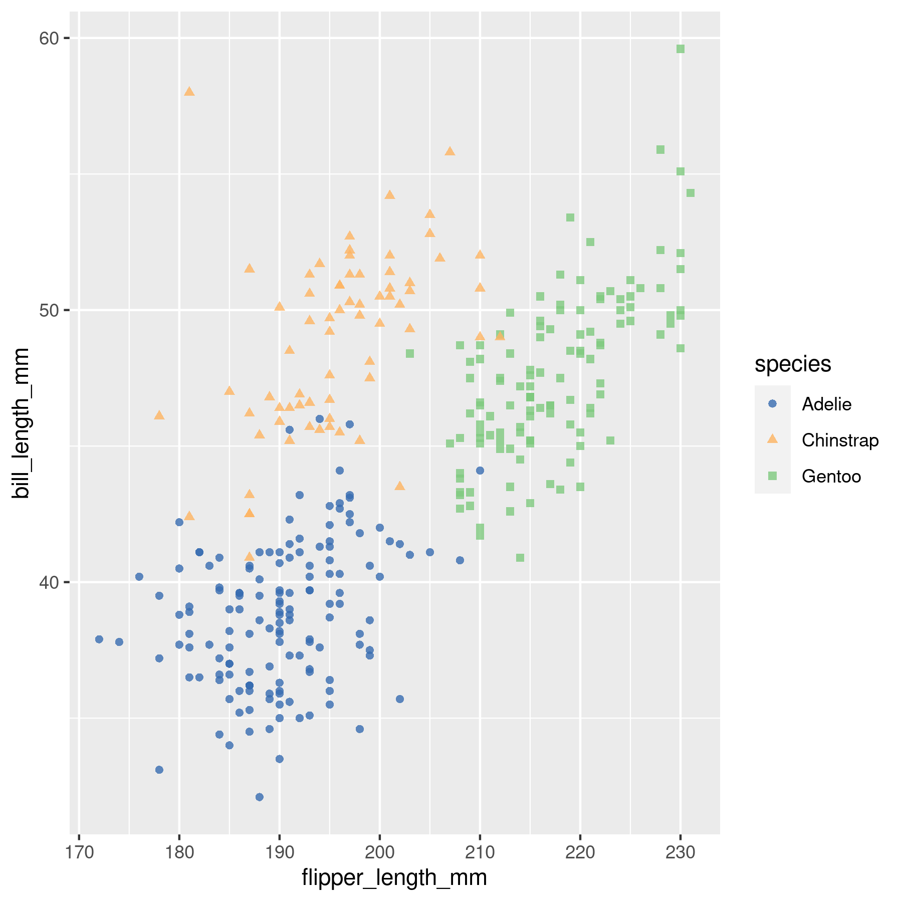
That’s a pretty good start, but let’s make it better!
Add labels with no overlap
What’s truely missing here are labels. It’s very frustrating not knowing which item is hidden under a data point, isn’t it!?
It is pretty challenging to add many labels on a plot since labels
tend to overlap each other, making the figure unreadable.
Fortunately, the ggrepel package is here to help us. It
provides an algorithm that will automatically place the labels for
us. Let’s do it!
plt <- plt +
  geom_text_repel(
    aes(label = highlight),
    family = "Poppins",
    size = 3,
    min.segment.length = 0,
    seed = 42,
    box.padding = 0.5,
    max.overlaps = Inf,
    arrow = arrow(length = unit(0.010, "npc")),
    nudge_x = .15,
    nudge_y = .5,
    color = "grey50"
  )
Isn’t it wonderful how well ggrepel works?
Final chart
The chart above is pretty close from being publication ready. What’s needed now is a good title, a legend to make color and shapes more insightful, and some axis customization:
plt <- plt +
  # Add axes labels, title, and subtitle
  labs(
    title = "Palmer Penguins Data Visualization",
    subtitle = "Scatter plot of flipper lenth vs bill length",
    x = "flip length (mm)",
    y = "bill length (mm)"
  ) +
  theme(
    # The default font when not explicitly specified
    text = element_text(family = "Lobster Two", size = 8, color = "black"),

    # Customize legend text, position, and background.
    legend.text = element_text(size = 9, family = "Roboto"),
    legend.title = element_text(face = "bold", size=12, family = "Roboto"),
    legend.position = c(1, 0),
    legend.justification = c(1, 0),
    legend.background = element_blank(),
    # This one removes the background behind each key in the legend
    legend.key = element_blank(),

    # Customize title and subtitle font/size/color
    plot.title = element_text(
      family = "Lobster Two",
      size = 20,
      face = "bold",
      color = "#2a475e"
    ),
    plot.subtitle = element_text(
      family = "Lobster Two",
      size = 15,
      face = "bold",
      color = "#1b2838"
    ),
    plot.title.position = "plot",

    # Adjust axis parameters such as size and color.
    axis.text = element_text(size = 10, color = "black"),
    axis.title = element_text(size = 12),
    axis.ticks = element_blank(),
    # Axis lines are now lighter than default
    axis.line = element_line(colour = "grey50"),

    # Only keep y-axis major grid lines, with a grey color and dashed type.
    panel.grid.minor = element_blank(),
    panel.grid.major.x = element_blank(),
    panel.grid.major.y = element_line(color = "#b4aea9", linetype ="dashed"),

    # Use a light color for the background of the plot and the panel.
    panel.background = element_rect(fill = "#fbf9f4", color = "#fbf9f4"),
    plot.background = element_rect(fill = "#fbf9f4", color = "#fbf9f4")
  )
What a lovely plot!


