About
This chart has been realised by Benjamin Nowak. Thanks to him for sharing this content!
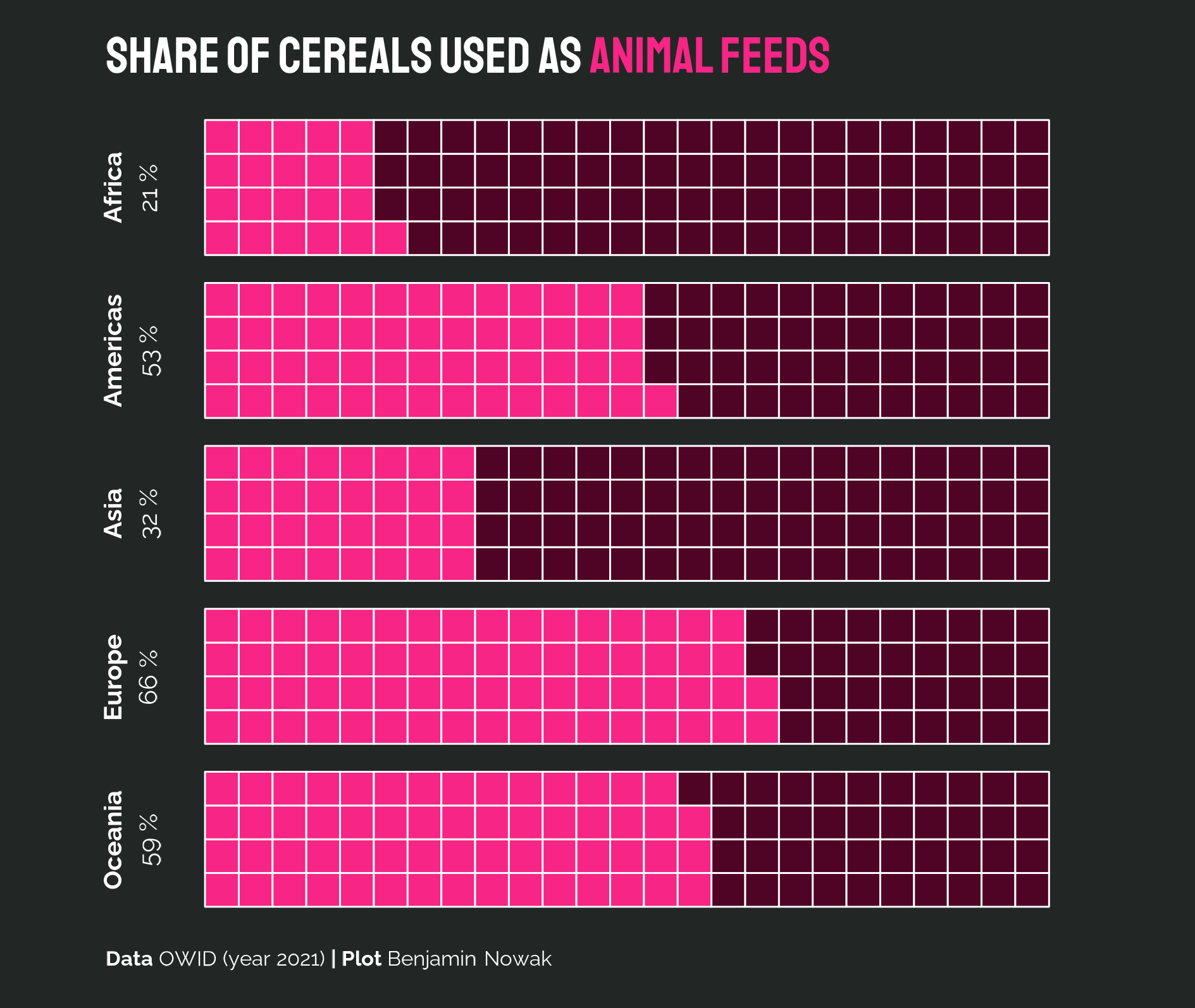
As a teaser, here is the chart we are going to build:
Load packages
In R, waffle charts may be created with the waffle package. In addition to this library, we will load several packages that we will need for this tutorial:
Data
The dataset contains 1 one row per continent, with the share of cereals used as animal feed.
You can directly load the data from the gallery’s repo:
Settings
Before actually creating the waffle chart, we need to set the fonts and the plot size. This is done as follows:
Make waffle chart for wheat
The waffle chart is created using the
geom_waffle() function. Here are the main arguments:
-
fill: the color of the waffle chart. -
values: the value to represent. Here, it is the percentage of cereals used as animal feed. -
n_rows: the number of rows in the waffle chart. -
flip: whether to flip the waffle chart. size: the size of the waffle chart.-
colour: the color of the border of the waffle chart.
ggplot(data, aes(fill = type, values = percent))+
  geom_waffle(na.rm=TRUE, n_rows=4, flip=F, size = 0.33, colour = "white")+
  facet_wrap(~reorder(lab, percent),ncol=1,strip.position = "left")+
  coord_equal()+
  guides(fill='none')+
  labs(
    title="<b>Share of cereals used as <span style='color:#f72585;'>animal feeds</span></b>",
    caption="<b>Data</b> OWID (year 2021) <b>| Plot</b> Benjamin Nowak"
  )+
  scale_fill_manual(values=c('#f72585','#4F0325'))+
  theme_void()+
  theme(
    plot.background = element_rect(fill="#222725",color=NA),
    plot.title = element_markdown(size=60,family='sta',margin=margin(0.5,0,0.5,-0.75,'cm'),color='white'),
    strip.text = element_markdown(hjust=0.5,size=30,family='ral',angle=90,margin=margin(0,0,0,0,'cm'),lineheight = 0.45,color='white'),
    plot.caption = element_markdown(size=25,family='ral',margin=margin(0.5,0,0.5,-0.75,'cm'),hjust=0,color='white'),
  )

# Save the plot
ggsave("img/graph/web-waffle-chart-share.png", width = 16, height = 13.5, units = "cm")
Going further
This post explains how to create a waffle chart as a way to visualize the distribution of various groups.
If you want to learn more, you can check the waffle section of the gallery and how to play with subgroups and colors in waffle charts.


