Interactive Data Visualization with esquisse


The esquisse package in R is a powerful tool that provides an interactive interface for creating ggplot2 charts, making data visualization accessible to users of all skill levels.

This post showcases the key features of esquisse and provides a step-by-step guide on how to use the package.
Documentation

{esquisse}

About esquisse


The esquisse package is an R tool that provides a user-friendly interface for creating ggplot2 charts. It’s designed to make data visualization accessible to both beginners and experienced R users.

✍️ author β†’ Victor Perrier

πŸ“˜ documentation β†’ Github

⭐️ more than 1800 stars on github

Installation


Install the package from CRAN with install.packages("esquisse")

How to Use


esquisse::esquisser()
  1. Load your data into R
  2. Run esquisse::esquisser()
  3. Select your dataset
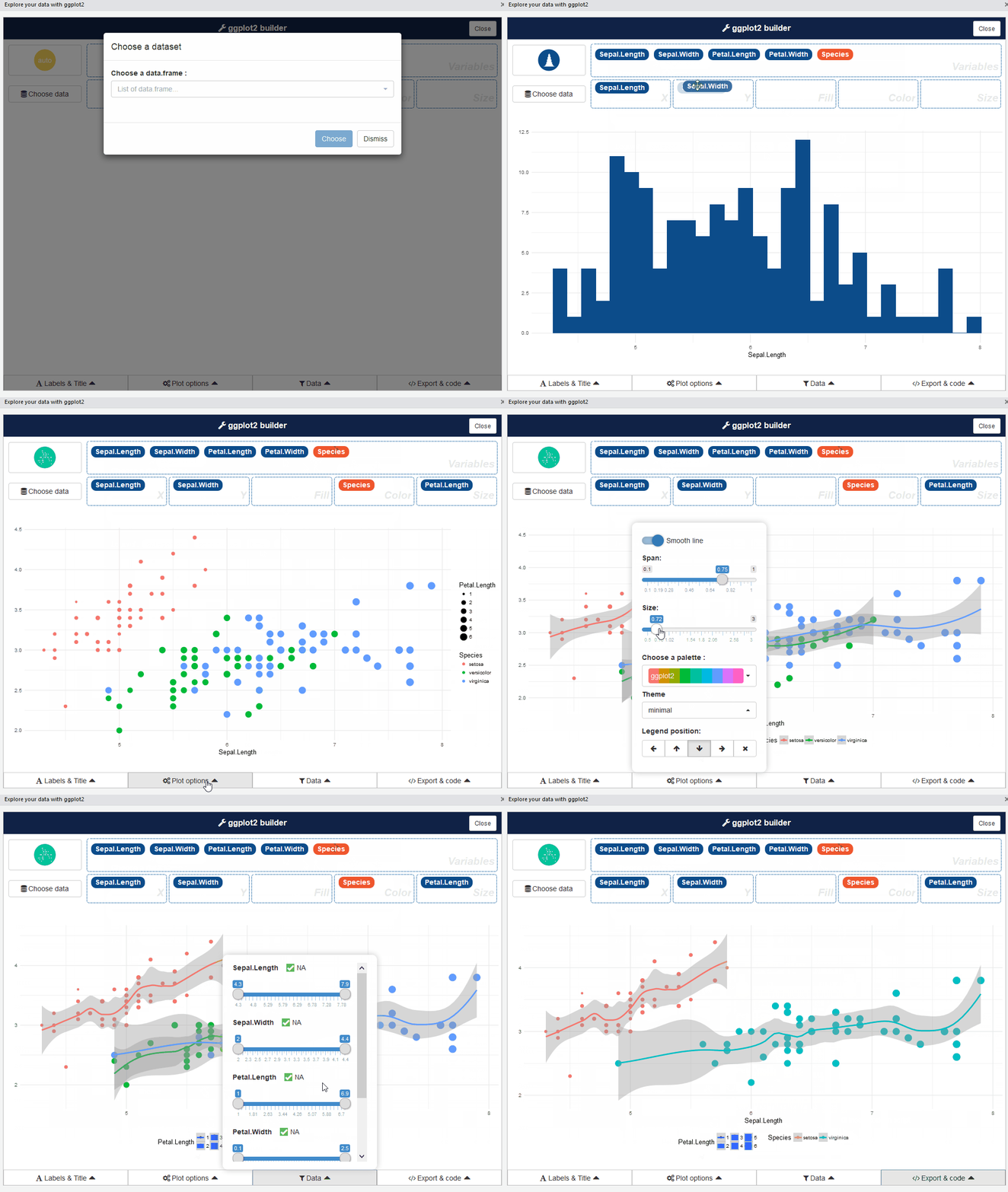
  4. Drag and drop variables to create your plot
  5. Customize colors, labels, and other features
  6. Export your plot or the R code

Video Tutorial


For a quick demonstration of how to use esquisse, check out this video from the official documentation.

This video walks through a simple use case, showing how to create a scatter plot using the built-in iris dataset.

Key Features


Why Use esquisse?


Esquisse is an excellent tool for those new to R and data visualization, as well as experienced users looking to speed up their workflow. Give it a try and simplify your plotting process!

Going further


Esquisse is a tool that helps you to create ggplot2 charts. It is a user-friendly interface that allows you to create plots without having to write any code.

If you want to do more custom stuff, we have a dedicated page to learn more about ggplot2.


❀️ 10 best R tricks ❀️

πŸ‘‹ After crafting hundreds of R charts over 12 years, I've distilled my top 10 tips and tricks. Receive them via email! One insight per day for the next 10 days! πŸ”₯