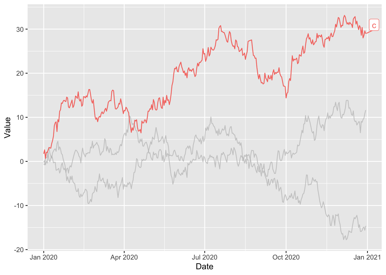
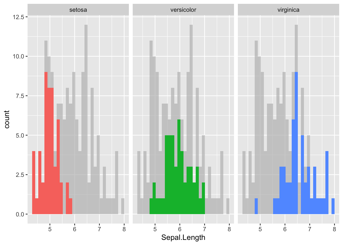
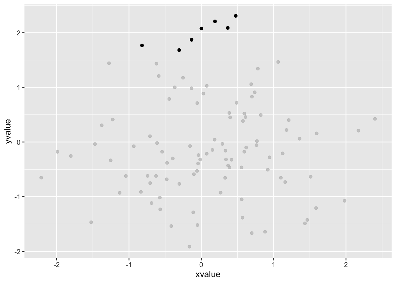
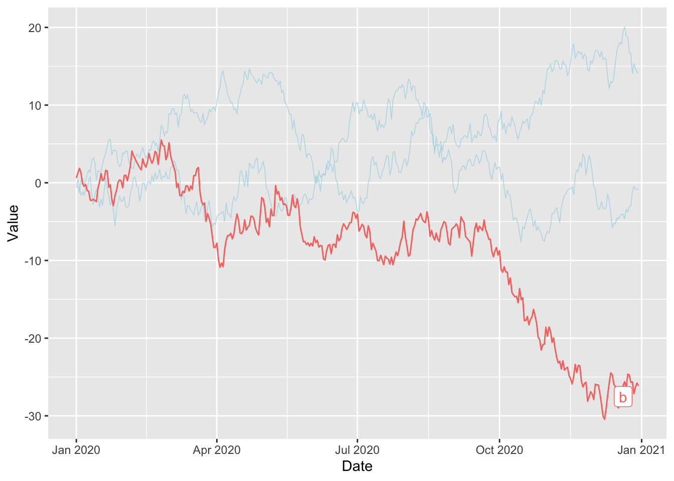
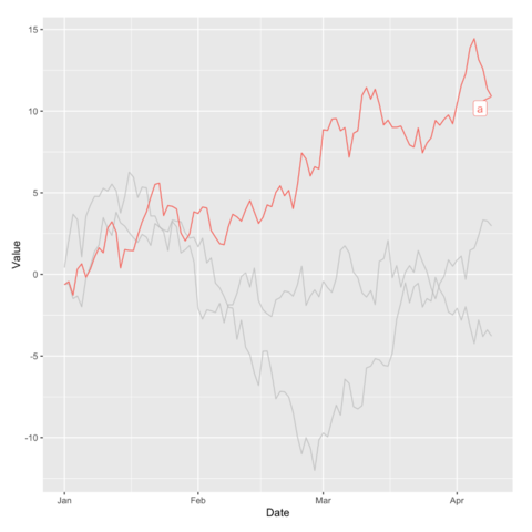
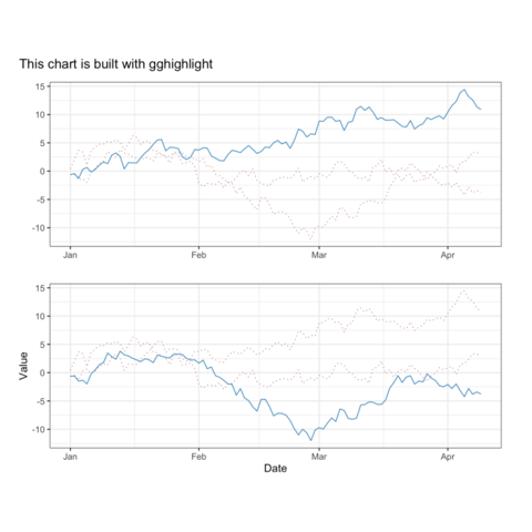
The gghighlight
package in R is
an extension of the ggplot2
package, designed to simplify the process of
highlighting elements.
This post showcases the
key features of gghighlight
and provides a
set of graph examples using the package.
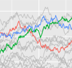
{gghighlight}
The gghighlight
package in R is an extension of the ggplot2
package, designed to simplify the process of
highlighting elements.
It mainly offers a gghighlight()
function that
highlights geoms.
βοΈ author β Hiroaki Yutani
π documentation β github
βοΈ more than 500 stars on github
To get started with gghighlight
, you can install it
directly from CRAN using the install.packages
function:
The gghighlight
package allows you to showcase specific
elements in your ggplot2 charts.
Hereβs a basic example on a line charts with multiple lines. At the
end of the usual ggplot2
call, the
gghighlight()
function is called with a single
argument.
This argument is the condition that a group should respect to be highlighted.
library(ggplot2)
library(gghighlight)
# dataset with 3 lines named "a", "b" and "c"
set.seed(1)
period <- 365
df <- data.frame(
Date = seq(as.Date("2020-01-01"),
by = "day",
length.out = period
),
Value = c(
cumsum(rnorm(period)),
cumsum(rnorm(period))
),
Type = c(
rep("a", period),
rep("b", period),
rep("c", period)
)
)
ggplot(df) +
geom_line(aes(Date, Value, colour = Type)) +
gghighlight(min(Value) < -15) # highlight the group if its min value is below -15
Use a facetted version with facet_wrap(~ Species)
and
the gghighlight feature allow us to showcase distribution of each group
while maintaining the background distributions for
other variables.
Example:
library(ggplot2)
library(gghighlight)
# load the iris dataset
data(iris)
# show distribution of Sepal.Length of each species
ggplot(iris, aes(Sepal.Length, fill = Species)) +
geom_histogram() +
gghighlight() +
facet_wrap(~Species)
You can highlight specific points by indicating the properties of the points in question.
Example:
library(ggplot2)
library(gghighlight)
# create dataset
set.seed(1)
df_scatter <- data.frame(
xvalue = rnorm(n = 100),
yvalue = rnorm(n = 100)
)
# show distribution of Sepal.Length of each species
ggplot(df_scatter, aes(xvalue, yvalue)) +
geom_point() +
gghighlight(yvalue > 1.5, xvalue < 1)
You can define the style of elements outside your filters using the
unhighlighted_params
argument.
Example:
library(ggplot2)
library(gghighlight)
ggplot(df) +
geom_line(aes(Date, Value, colour = Type)) +
gghighlight(min(Value) < -15,
unhighlighted_params = list(
linewidth = 0.3,
colour = alpha("lightblue", 0.8)
)
)
π After crafting hundreds of R charts over 12 years, I've distilled my top 10 tips and tricks. Receive them via email! One insight per day for the next 10 days! π₯