Create Flow Diagrams with ggsankey


The ggsankey package in R is an extension of the ggplot2 package, designed to create flow visualizations.
This post showcases the key features of ggsankey and provides a set of diagram examples using the package.

Documentation

{ggsankey}

Quick start


The ggsankey package in R is an extension of the ggplot2 package, designed to create flow visualizations.

It offers a set of functions that make it easy to specify flow diagrams in a declarative manner.

✍️ author → David Sjoberg

📘 documentationgithub

⭐️ more than 250 stars on github

Installation


To get started with ggsankey, you can install its developpment version directly from Github using the install_github() function:

# install.packages("devtools")
devtools::install_github("davidsjoberg/ggsankey")

Basic usage


The ggsankey package extends the grammar of graphics to include the description of flow diagrams, specifically, sankey, alluvial and sankey bump diagrams. You start with a dataframe in wide format, transform it using the make_long() function, and then add flow-specific layers to your ggplot.

Here’s a basic example where we show how dimensions are linked using a sankey diagram:

library(tidyverse)
library(ggsankey)

# Create a simple dataset about education and career paths
df <- data.frame(
  education = c(rep("High School", 40), rep("Bachelor", 35), rep("Master", 25)),
  field = c(rep("Science", 20), rep("Arts", 20), rep("Business", 30), rep("Engineering", 30)),
  job = c(rep("Research", 25), rep("Teaching", 25), rep("Industry", 30), rep("Consulting", 20))
)

# Convert to long format for Sankey diagram
df_long <- df %>%
  make_long(education, field, job)

# Create the diagram
ggplot(df_long, 
       aes(x = x, 
           next_x = next_x, 
           node = node, 
           next_node = next_node,
           fill = factor(node))) +
  geom_sankey() +
  scale_fill_discrete(drop=FALSE)

Key features


→ Embellishment

Labels with geom_sankey_label()nicely places labels in the center of nodes if given the same aesthetics.

ggsankey also comes with custom minimalistic themes that can be used. Here we use theme_sankey():

ggplot(df_long, 
       aes(x = x, 
           next_x = next_x, 
           node = node, 
           next_node = next_node,
           fill = factor(node))) +
  geom_sankey(alpha = 0.8) +
  scale_fill_viridis_d(option = "plasma", name = "Category") +
  theme_sankey(base_size = 14) +
  labs(title = "Education to Career Path Flow",
       x = NULL) +
  theme(legend.position = "bottom",
        legend.title = element_text(hjust = 0.5),
        legend.box.just = "center",
        plot.title = element_text(hjust = 0.5),
        axis.text.y = element_blank(),
        axis.ticks = element_blank()) +
  scale_x_discrete(labels = c("Education", "Field", "Job"))


→ Continuous stacking versus centered gaps

Alluvial diagrams are very similiar to sankey diagrams but have no spaces between nodes and start at y = 0, instead of being centered around the x-axis.

This diagram shows how individuals progress from their education level through their field of study to their eventual job role. The geom_alluvial() function creates smooth flowing bands between the nodes, with the width of each band representing the number of individuals following each path.

ggplot(df_long, 
       aes(x = x, 
           next_x = next_x, 
           node = node, 
           next_node = next_node,
           fill = factor(node),
           label = node)) +
  geom_alluvial(flow.alpha = .6) +
  geom_alluvial_text(size = 3, color = "black", space = 0.5) +  # Adjusted space and changed text color
  scale_fill_viridis_d(option = "plasma", drop = FALSE) +
  theme_alluvial(base_size = 18) +
  labs(x = NULL) +
  theme(legend.position = "none",
        plot.title = element_text(hjust = .5)) +
  ggtitle("Education to Career Pathways") +
  scale_x_discrete(labels = c("Education", "Field", "Job"))


→ Intersecting flows show changing ranks

Sankey bump plots combine characteristics of bump charts and Sankey diagrams, visualizing how rankings and volumes change over time. When a group’s value surpasses another, it shifts upward in the visualization, creating a distinctive “bumping” effect.

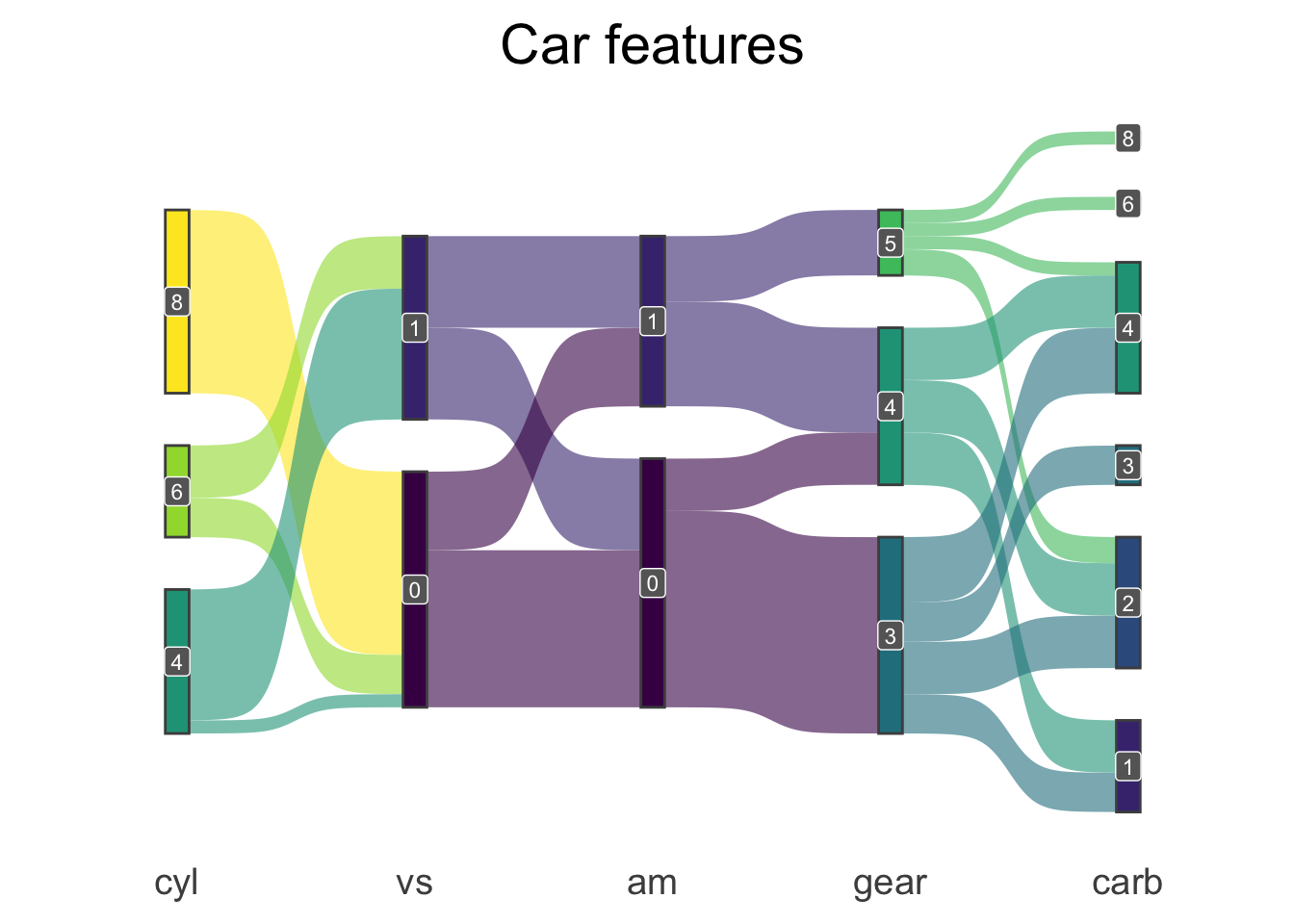
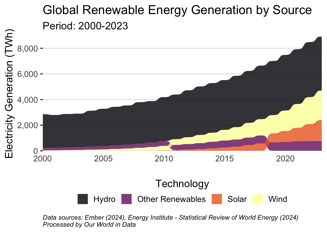
This visualization shows how different renewable energy sources have contributed to global electricity generation from 2000 to 2023. The geom_sankey_bump() function creates flowing streams that expand or contract to show changes in generation capacity, with technologies shifting positions when their relative contribution changes over time.

library(tidyverse)
library(ggsankey)

# Read and prepare the data
renewable_data <- read.csv("https://ourworldindata.org/grapher/modern-renewable-prod.csv?v=1&csvType=filtered&useColumnShortNames=true") %>%
  # Select last 10 years for better visualization
  filter(Year >= 2000) %>%
  pivot_longer(
    cols = c(wind_generation__twh, hydro_generation__twh, 
             solar_generation__twh, other_renewables_including_bioenergy_generation__twh),
    names_to = "technology",
    values_to = "generation"
  ) %>%
  mutate(
    technology = case_when(
      technology == "wind_generation__twh" ~ "Wind",
      technology == "hydro_generation__twh" ~ "Hydro",
      technology == "solar_generation__twh" ~ "Solar",
      technology == "other_renewables_including_bioenergy_generation__twh" ~ "Other Renewables"
    )
  )

# Create the plot
ggplot(renewable_data, 
       aes(x = Year,
           node = technology,
           fill = technology,
           value = generation)) +
  geom_sankey_bump(space = 0, 
                   type = "alluvial", 
                   color = "transparent", 
                   smooth = 6) +
  scale_fill_viridis_d(option = "inferno", alpha = .8)  +
  scale_x_continuous(breaks = scales::pretty_breaks(), expand = c(0,0)) + 
  scale_y_continuous(labels = scales::comma, expand = c(0,0)) +
  theme_sankey_bump(base_size = 16) +
  labs(x = NULL,
       y = "Electricity Generation (TWh)",
       fill = "Technology",
       title = "Global Renewable Energy Generation by Source",
       subtitle = "Period: 2000-2023",
       caption = "Data sources: Ember (2024), Energy Institute - Statistical Review of World Energy (2024)\nProcessed by Our World in Data") +
  theme(legend.position = "bottom",
        legend.title = element_text(hjust = 0.5),
        legend.title.position = "top",
        plot.caption = element_text(hjust = 0, size = 10, face = "italic"))


❤️ 10 best R tricks ❤️

👋 After crafting hundreds of R charts over 12 years, I've distilled my top 10 tips and tricks. Receive them via email! One insight per day for the next 10 days! 🔥