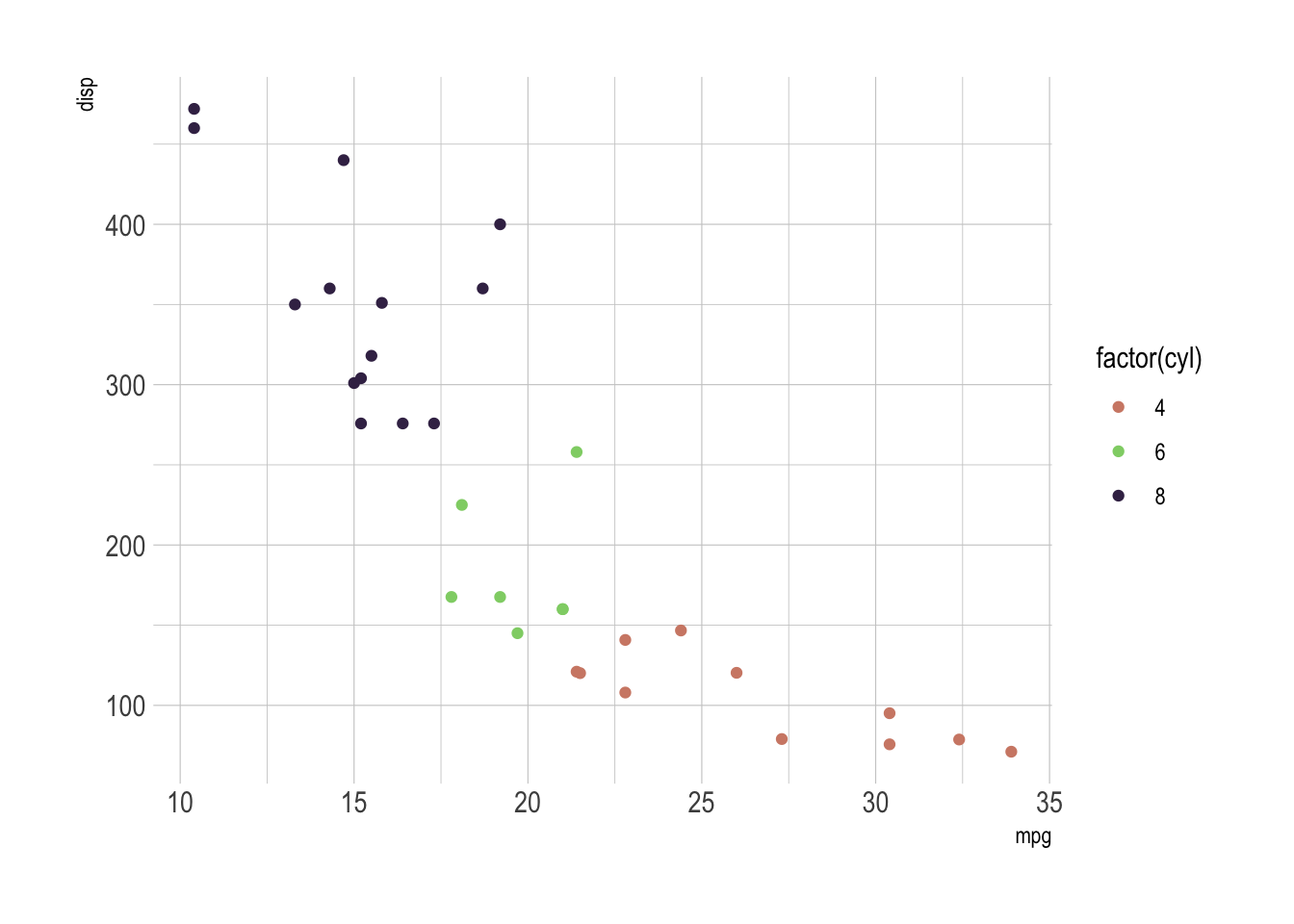
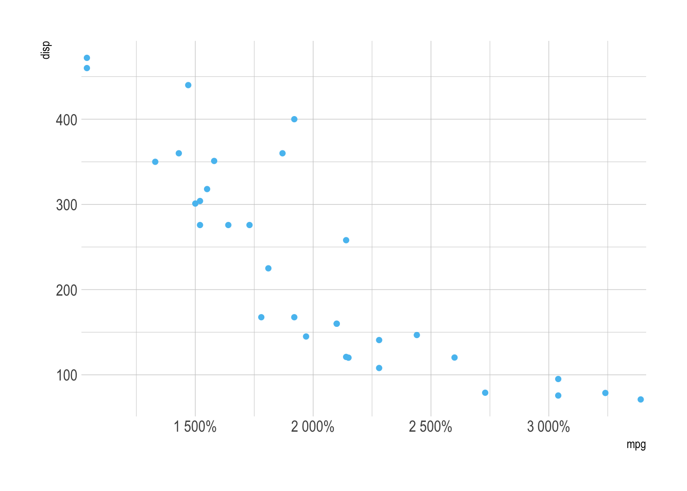
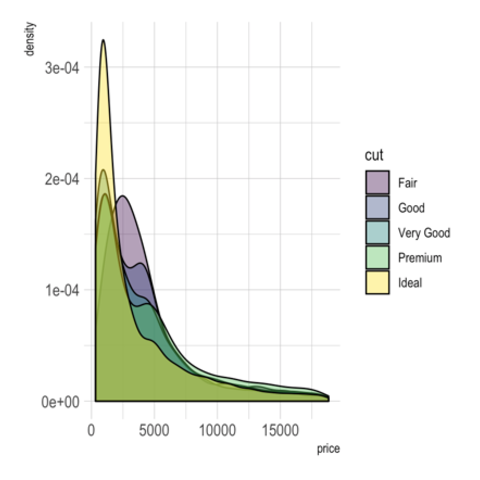
Elevate Your ggplot2 Visuals with hrbrthemes


The hrbrthemes package in R is a powerful extension of the ggplot2 package. It aims to provide opinionated themes and typography to make your ggplot2 plots more visually appealing and publication-ready.
This post will delve into the key features of hrbrthemes, offering a comprehensive set of graph examples and explanations.

Documentation

{hrbrthemes}

Introduction


The hrbrthemes package in R serves as a valuable extension to the renowned ggplot2 package. Created by Bob Rudis, hrbrthemes offers a collection of opinionated themes and typography settings that aim to elevate the visual appeal of your ggplot2 plots. Whether you are a data scientist, a researcher, or anyone interested in data visualization, this package helps you create publication-quality plots with minimal effort.

The package is particularly useful for those who want to create publication-quality plots without spending too much time on customization. It provides a set of themes that are not only visually appealing but also adhere to good visualization practices.

✍️ author → Bob Rudis

📘 documentationgithub

⭐️ more than 1000 stars on github

Installation and Setup


Before diving into the features, let’s discuss how to get started with hrbrthemes. The package can be easily installed from CRAN using the install.packages function. Once installed, you can load it into your R session along with ggplot2 to start enhancing your plots.

install.packages("hrbrthemes")
library(hrbrthemes)
library(ggplot2)

Basic usage

The hrbrthemes package offers a collection of opinionated themes that can be applied to your ggplot2 plots. These themes are designed to be visually appealing and publication-ready. They come with a set of pre-configured settings like font sizes, colors, and grid lines that adhere to good visualization practices.

Here’s how you can apply the theme_ipsum() to a scatter plot:

ggplot(mtcars, aes(x=mpg, y=disp)) + geom_point() + theme_ipsum()

In-Depth Look at Features


Opinionated Themes

One of the standout features of hrbrthemes is its collection of opinionated themes. These themes, such as theme_ipsum(), theme_modern_rc(), and theme_ft_rc(), are designed to be visually appealing and publication-ready. They come with a set of pre-configured settings like font sizes, colors, and grid lines that adhere to good visualization practices.

Here’s how you can apply the theme_modern_rc() to a scatter plot:

ggplot(mtcars, aes(x=mpg, y=disp)) + geom_point() + theme_modern_rc()

Typography Settings

Another key feature of hrbrthemes is its typography settings. These settings allow you to customize the fonts and font sizes of your plots. For example, you can change the font family of your plot to serif and increase the font size of the axis labels to 14 points.

ggplot(mtcars, aes(x=mpg, y=disp)) +
  geom_point() +
  theme_ipsum_rc(base_family = "serif", base_size = 14)

Grid Lines

hrbrthemes also offers a set of grid line settings that allow you to customize the grid lines of your plots. For example, you can change the color of the grid lines to lightblue and increase the thickness of the grid lines to 1.2 points. We have to use the theme() function to apply these settings, to both the major and minor grid lines.

ggplot(mtcars, aes(x=mpg, y=disp)) +
  geom_point() +
  theme_ipsum() +
  theme(panel.grid.major = element_line(size = 1.2, color = "lightblue")) +
  theme(panel.grid.minor = element_line(size = 1.2, color = "lightblue"))

Custom Colors

The hrbrthemes package also offers a set of custom colors that can be used in your plots. You can use functions such as scale_color_ipsum() and scale_fill_ipsum() to apply these colors to your plots. For example, you can use the scale_color_ipsum() function to apply the ipsum_blue() color to the points in a scatter plot.

ggplot(mtcars, aes(x=mpg, y=disp)) +
  geom_point(aes(color = factor(cyl))) +
  scale_color_ipsum() +
  theme_ipsum()

Percent and comma scales

hrbrthemes also offers a set of percent and comma scales that can be used in your plots. These scales allow you to format the axis labels of your plots to include a percent sign or a comma. For example, you can use the scale_x_percent() function to format the x-axis labels of a scatter plot to include a percent sign.

ggplot(mtcars, aes(x=mpg, y=disp)) +
  geom_point() +
  scale_x_percent() +
  theme_ipsum()

Conclusion


The hrbrthemes package is a must-have for anyone looking to create visually appealing, publication-quality plots in R. Its opinionated themes and enhanced typography settings make it easier than ever to produce stunning visualizations with ggplot2. Whether you are a seasoned data visualization expert or a beginner, hrbrthemes offers something for everyone.


Contact

This document is a work by Yan Holtz. Any feedback is highly encouraged. You can fill an issue on Github, drop me a message on Twitter, or send an email pasting yan.holtz.data with gmail.com.

Github Twitter