Scatterplot matrix with ggpairs()
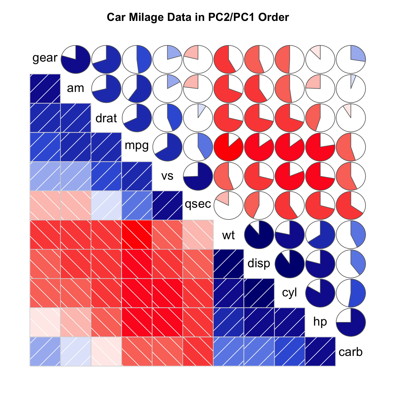
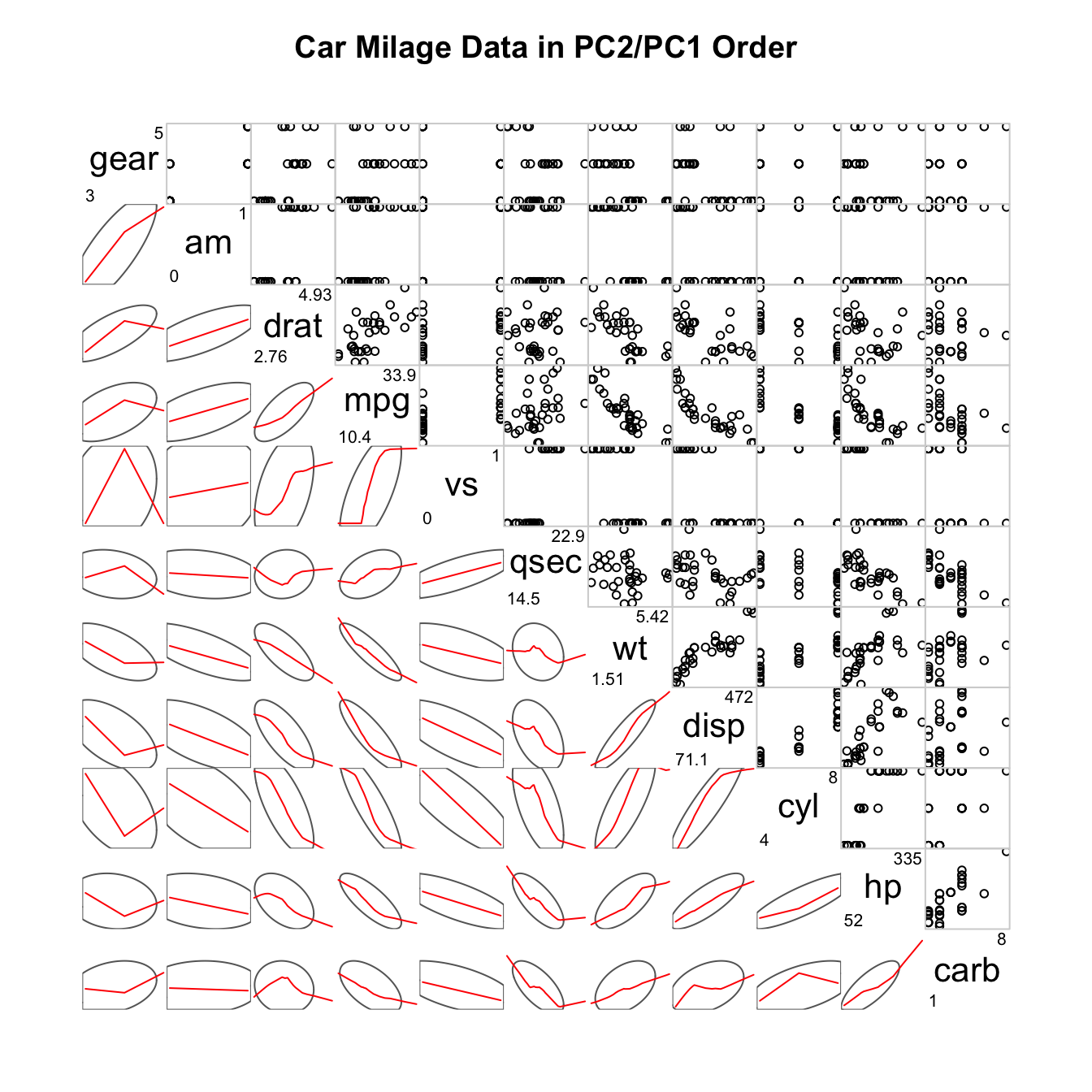
The corrgram package allows to build
correlogram. The output allows to check
the relationship between each pair of a set of numeric variable.
Relationship can be visualized with different methods:
panel.ellipseto display ellipsespanel.shadefor coloured squarespanel.piefor pie chartspanel.ptsfor scatterplots
# Corrgram library
library(corrgram)
# mtcars dataset is natively available in R
# head(mtcars)
# First
corrgram(mtcars, order=TRUE, lower.panel=panel.shade, upper.panel=panel.pie, text.panel=panel.txt, main="Car Milage Data in PC2/PC1 Order")
# Second
corrgram(mtcars, order=TRUE, lower.panel=panel.ellipse, upper.panel=panel.pts, text.panel=panel.txt, diag.panel=panel.minmax, main="Car Milage Data in PC2/PC1 Order")
# Third
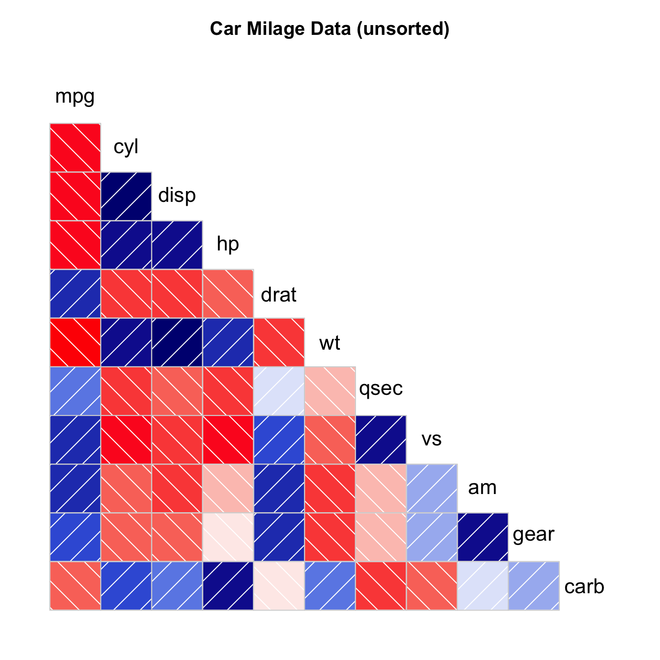
corrgram(mtcars, order=NULL, lower.panel=panel.shade, upper.panel=NULL, text.panel=panel.txt, main="Car Milage Data (unsorted)")
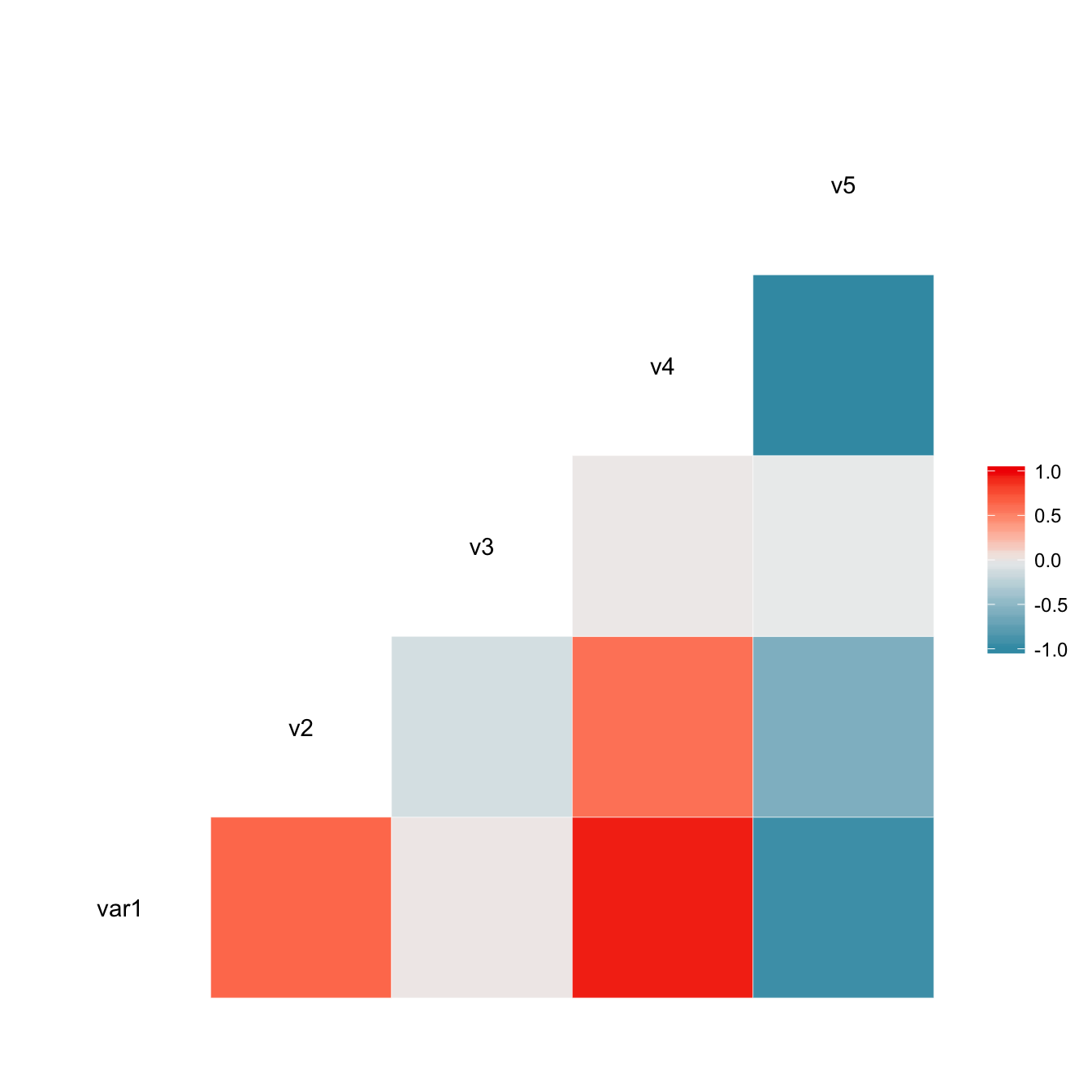
Visualize correlation with ggcorr()
The ggcorr() function allows to visualize the
correlation of each pair of variable as a square. Note that the
method argument allows to pick the correlation type you
desire.
# Quick display of two cabapilities of GGally, to assess the distribution and correlation of variables
library(GGally)

# Create data
data <- data.frame( var1 = 1:100 + rnorm(100,sd=20), v2 = 1:100 + rnorm(100,sd=27), v3 = rep(1, 100) + rnorm(100, sd = 1))
data$v4 = data$var1 ** 2
data$v5 = -(data$var1 ** 2)

# Check correlation between variables
#cor(data)

# Nice visualization of correlations
ggcorr(data, method = c("everything", "pearson"))
Split by group
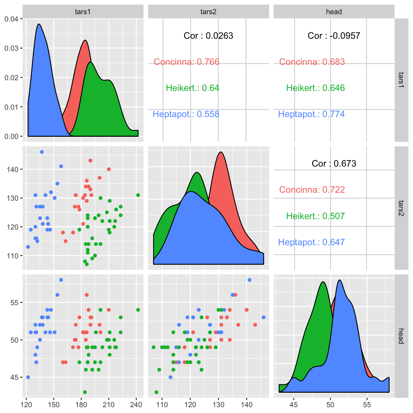
It is possible to use ggplot2 aesthetics on the chart, for instance to color each category.
# Quick display of two cabapilities of GGally, to assess the distribution and correlation of variables
library(GGally)

# From the help page:
data(flea)
ggpairs(flea, columns = 2:4, ggplot2::aes(colour=species))
Change plot types
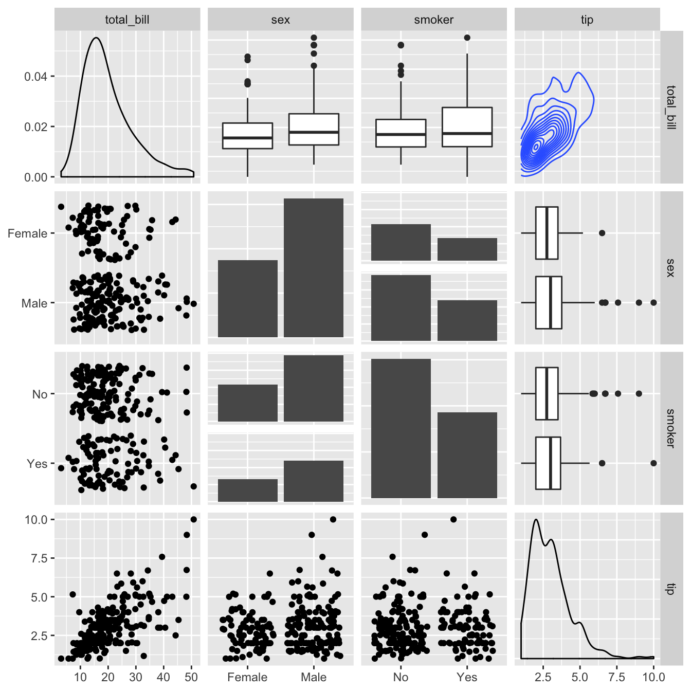
Change the type of plot used on each part of the
correlogram. This is done with the
upper and lower argument.
# Quick display of two cabapilities of GGally, to assess the distribution and correlation of variables
library(GGally)

# From the help page:
data(tips, package = "reshape")
ggpairs(
  tips[, c(1, 3, 4, 2)],
  upper = list(continuous = "density", combo = "box_no_facet"),
  lower = list(continuous = "points", combo = "dot_no_facet")
)