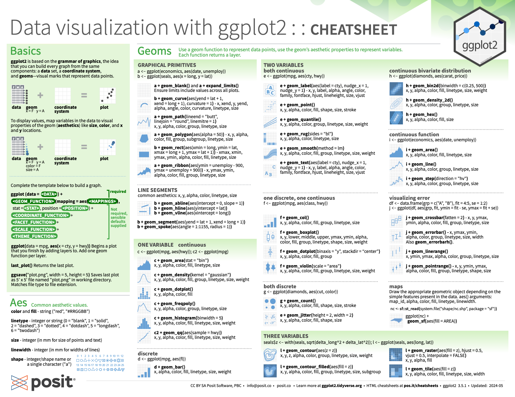
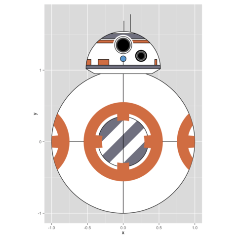
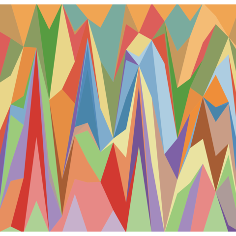
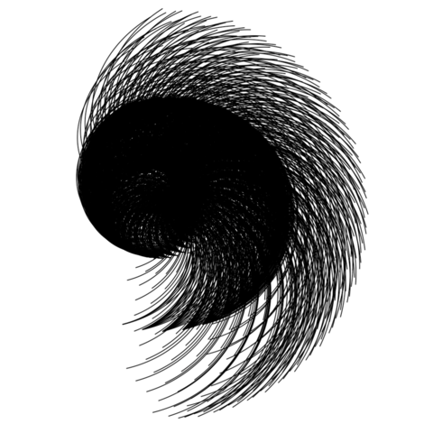
ggplot2


ggplot2 is a R package dedicated to data visualization. It can greatly improve the quality and aesthetics of your graphics, and will make you much more efficient in creating them.

ggplot2 allows to build almost any type of chart. The R graph
gallery focuses on it so almost every section there starts with ggplot2 examples.

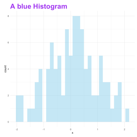
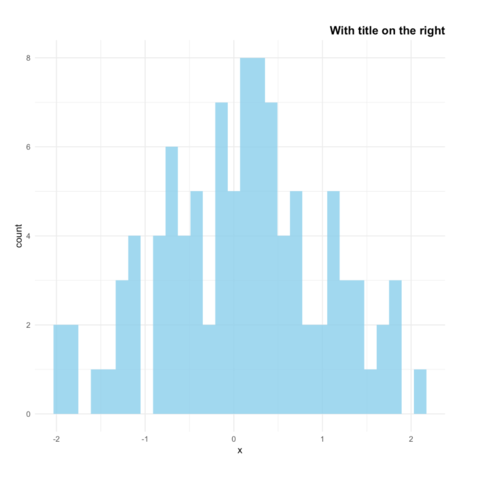
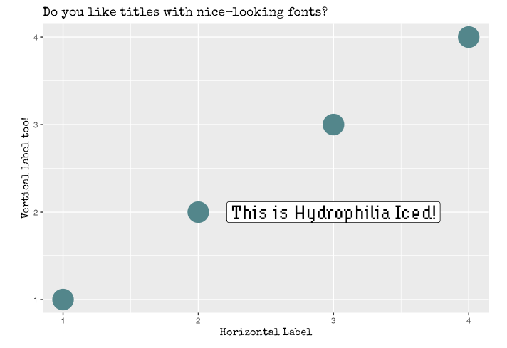
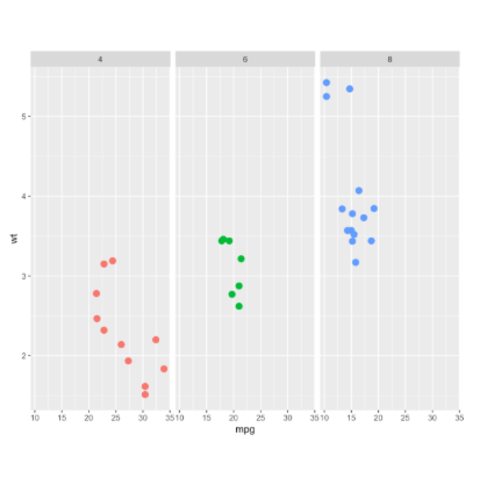
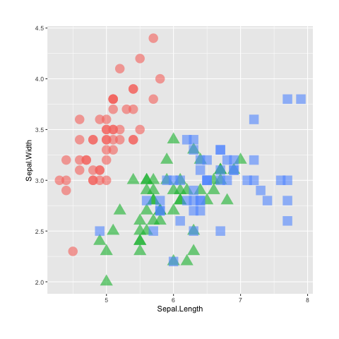
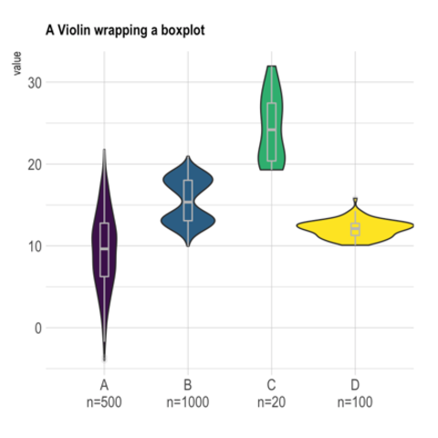
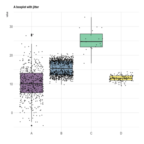
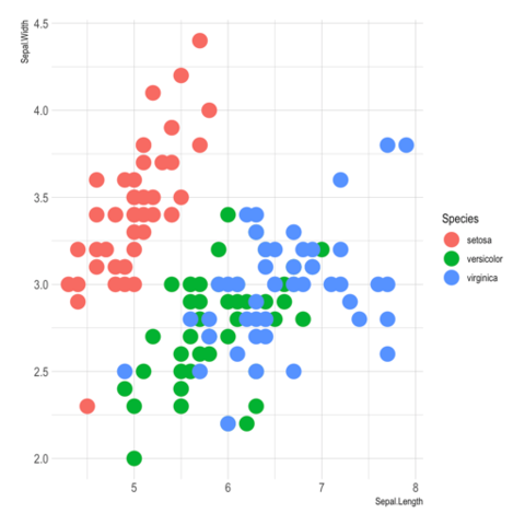
This page is dedicated to general 
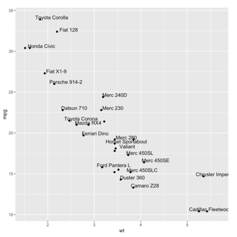
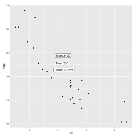
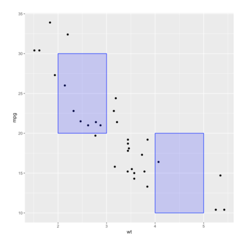
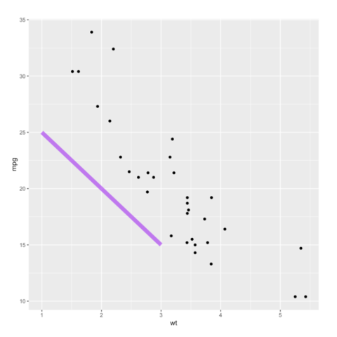
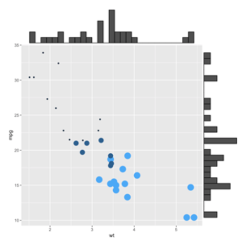
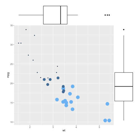
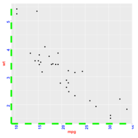
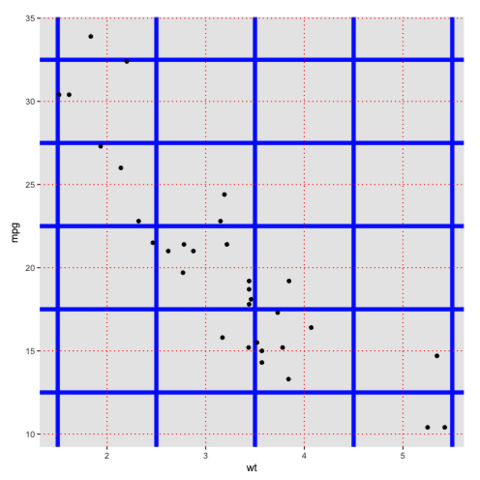
ggplot2 tips that you can apply to any chart, like customizing a title, adding annotation, or using
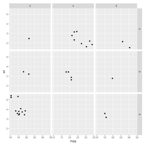
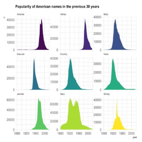
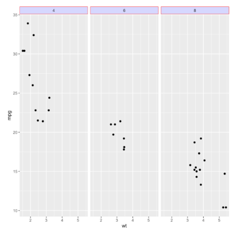
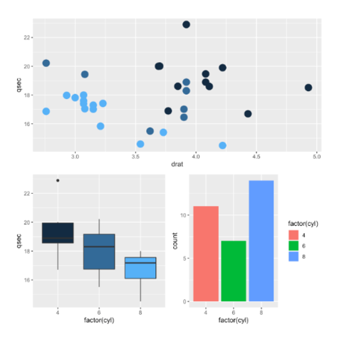
 faceting.
If you love ggplot2, you will love my productive r workflow project where I show how it interacts with Quarto, Git and Github! ❤️
A world of geom

ggplot2 builds charts through layers using geom_ functions. Here is a list of the different available geoms. Click one to see an example using it.

geom_bar geom_bin geom_boxplot geom_density geom_error geom_hex geom_hist geom_hline geom_jitter geom_label geom_line geom_point geom_polygon geom_rect geom_ribbon geom_rug geom_segment geom_smooth geom_text geom_tile geom_violin geom_vline
Annotation with ggplot2

Annotation is a key step in data visualization. It allows to highlight the main message of the chart, turning a messy figure in an insightful medium. ggplot2 offers many function for this purpose, allowing to add all sorts of text and shapes.


Marginal plot

Marginal plots are not natively supported by ggplot2, but their realisation is straightforward thanks to the ggExtra library as illustrated in graph #277.


ggplot2 chart appearance

The theme() function of ggplot2 allows to customize the chart appearance. It controls 3 main types of components:

Re-ordering with ggplot2


When working with categorical variables (= factors), a common struggle is to manage the order of entities on the plot.

Post #267 is dedicated to reordering. It describes 3 different way to arrange groups in a ggplot2 chart:


Read post
ggplot2 title

The ggtitle() function allows to add a title to the chart. The following post will guide you through its usage, showing how to control title main features: position, font, color, text and more.


Use custom fonts with ggplot2

If you don't want your plot to look like any others, you'll definitely be interested in using custom fonts for your title and labels! This is totally possible thanks to 2 main packages: ragg and showtext. The blog-post below should help you using any font in minutes.


Small multiples: facet_wrap() and facet_grid()

Small multiples is a very powerful dataviz technique. It split the chart window in many small similar charts: each represents a specific group of a categorical variable. The following post describes the main use cases using facet_wrap() and facet_grid() and should get you started quickly.

A set of pre-built themes

It is possible to customize any part of a ggplot2 chart thanks to the theme() function. Fortunately, heaps of pre-built themes are available, allowing to get a good style with one more line of code only. Here is a glimpse of the available themes. See code

plotly: turn your ggplot interactive

Another awesome feature of ggplot2 is its link with the plotly library. If you know how to make a ggplot2 chart, you are 10 seconds away to rendering an interactive version. Just call the ggplotly() function, and you’re done. Visit the interactive graphic section of the gallery for more.

library(ggplot2)
library(plotly)
library(gapminder)

p <- gapminder %>%
  filter(year==1977) %>%
  ggplot( aes(gdpPercap, lifeExp, size = pop, color=continent)) +
  geom_point() +
  theme_bw()

ggplotly(p)

this chart is interactive: hover, drag, zoom, export and more.


An overview of ggplot2 possibilities

Each section of the gallery provides several examples implemented with ggplot2. Here is an overview of my favorite examples:


Data art

Sometimes programming can be used to generate figures that are aestetically pleasing, but don't bring any insight. Here are a few pieces of data art built from R and ggplot2. Visit data-to-art.com for more.

Related chart types


Ggplot2
Animation
Interactivity
3D
Caveats
Data art