This section is tightly linked with other sections. A connected scatterplot is almost the same thing, but each observation is represented as a dot. An area chart fills the surface between the line and the X axis. More generally, the time series section can interest you.
connected scatter area chart time seriesggplot2
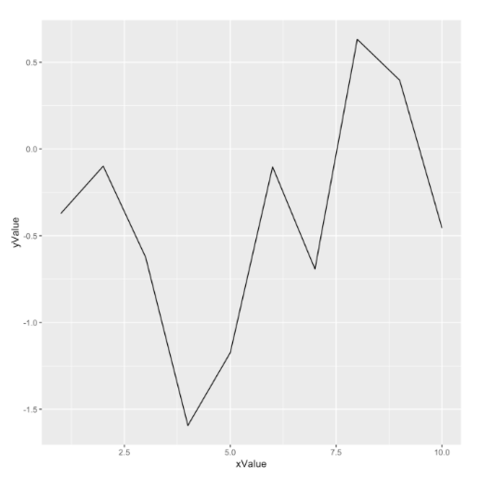
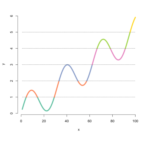
ggplot2 allows to draw line charts thanks to the
geom_line() function. It expects as input a data frame
with 2 numeric variables, one displayed on each axis. Start your
journey with the
most basic line chart.
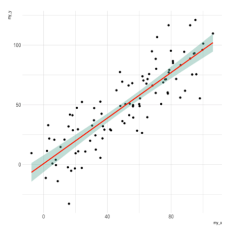

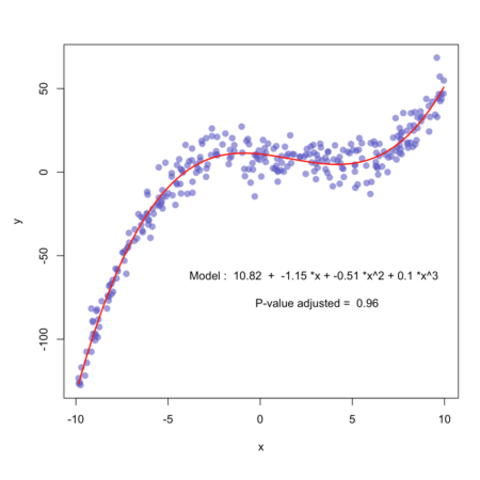
geom_ribbon and geom_smooth
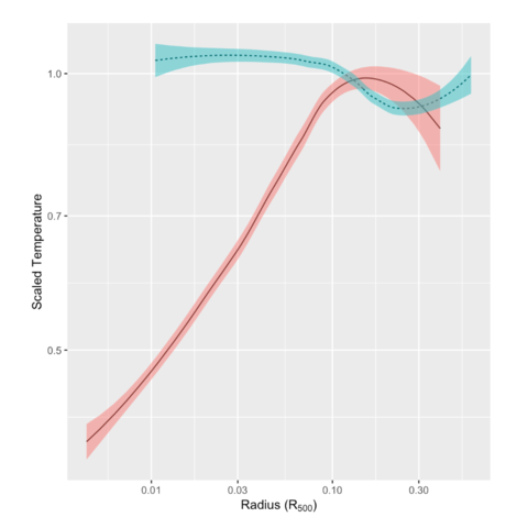
Line charts are often displayed together with confidence intervals.
ggplot2 offers 2 main functions to build them.
geom_ribbon allows to build the area around the curve
from precomputed values. geom_smooth will compute a
model for you and plot the result directly.
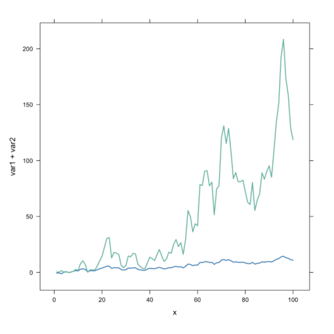
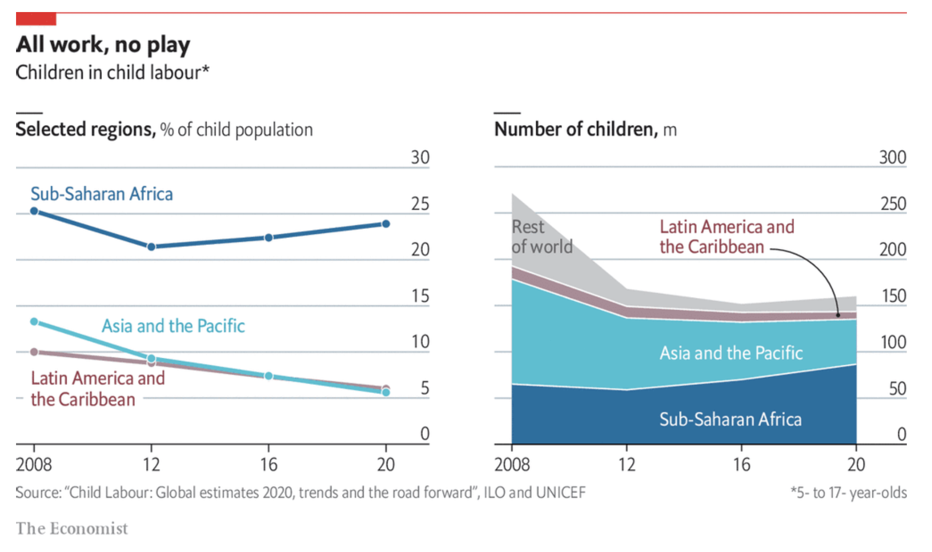
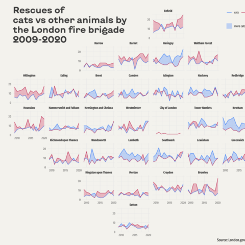
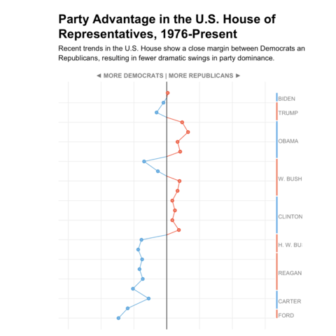
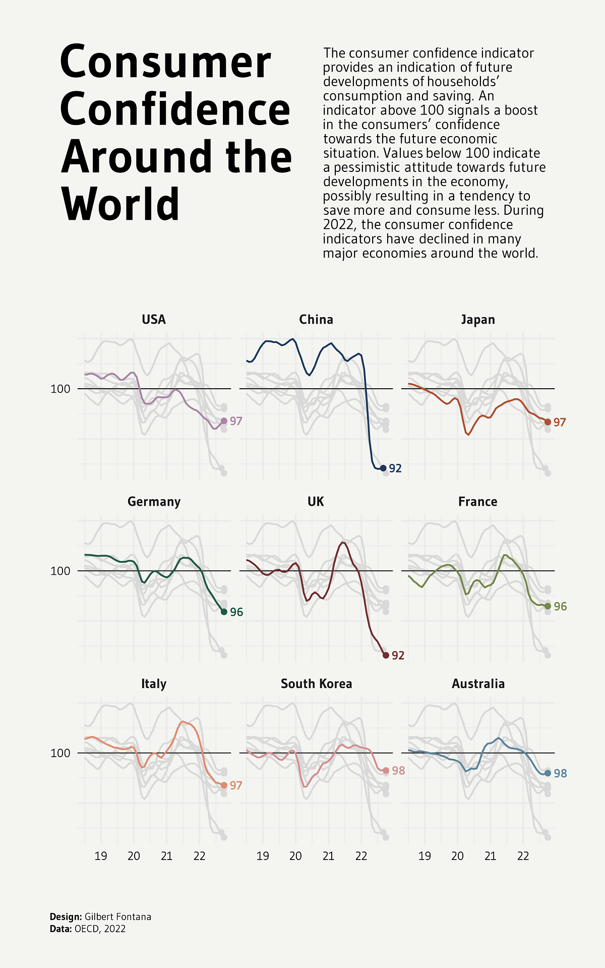
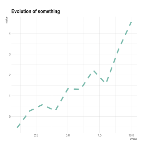
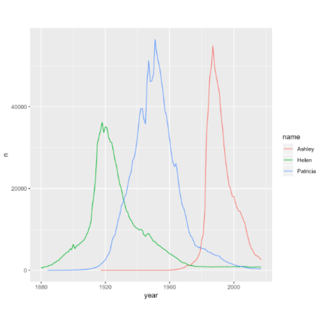
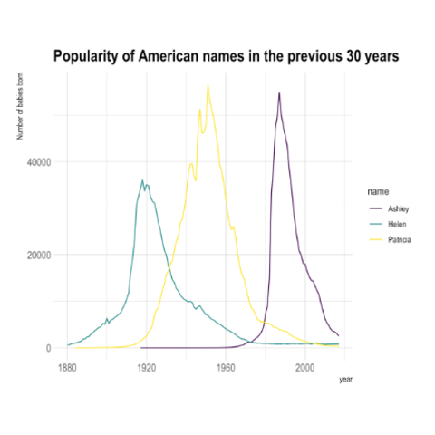
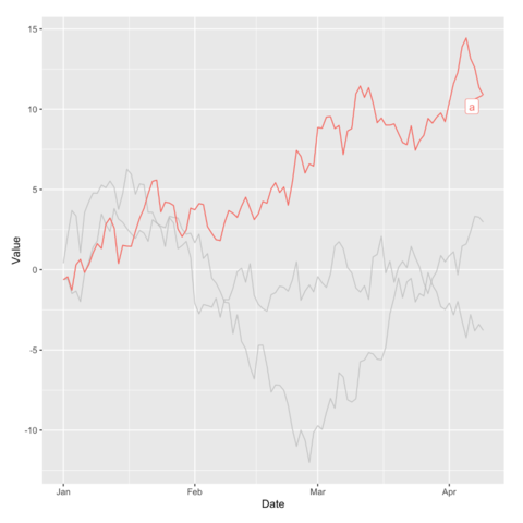
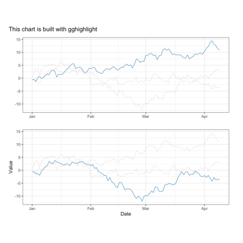
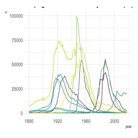
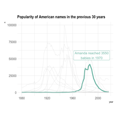
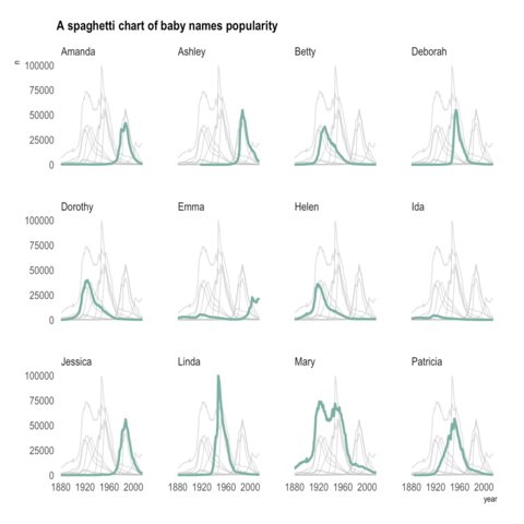
ggplot2)When too many groups are displayed on the same line chart it gets very hard to get insight from the figure. This is commonly called a spaghetti chart. Here are a few alternatives using ggplot2: annotation and small multiple.
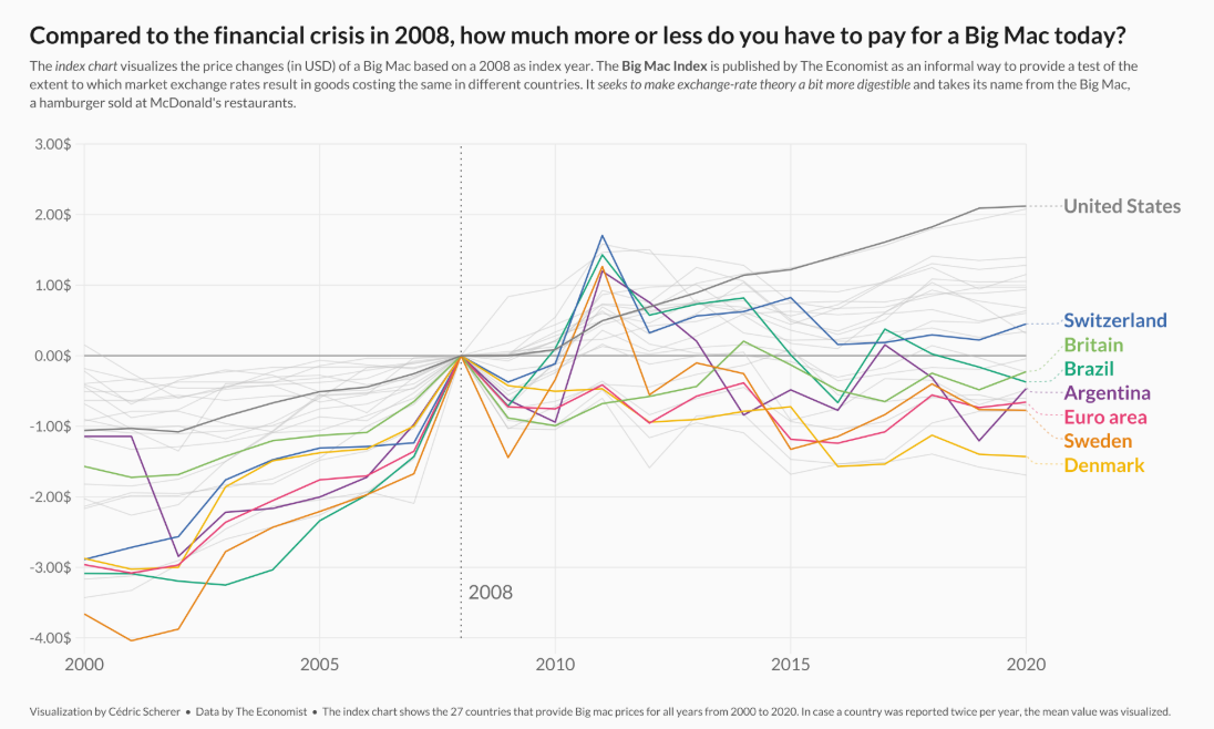
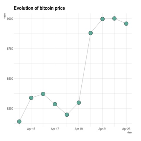
Another solution to the spaghetti problem is interactivity! The chart below is made via ggiraph with some additional CSS. Try hovering over it!
Code
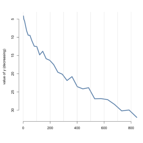
In base R, the line function allows to build quality line
charts.
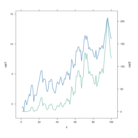
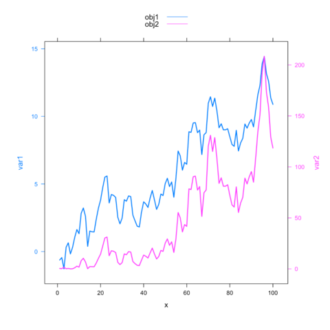
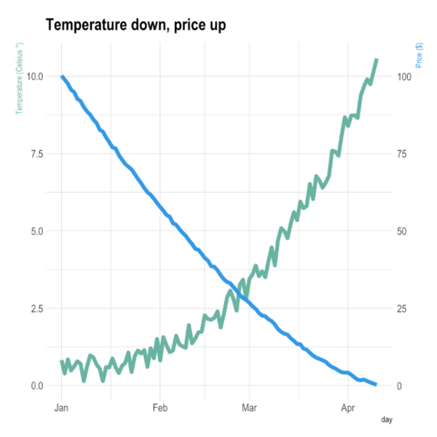
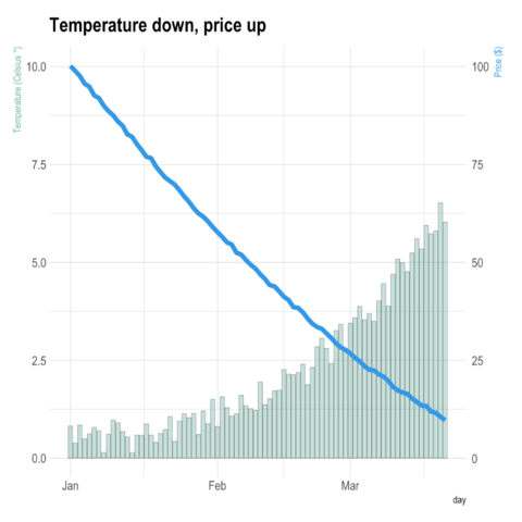
ggplot2Warning: a dual Y axis line chart represents the evolution of 2 series, each plotted according to its own Y scale. This kind of chart must be avoided, since playing with Y axis limits can lead to completely different conclusions. Visit data-to-viz for more info.
Why you should avoid it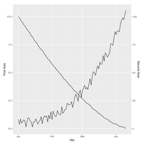
latticeExtra
Warning: a dual Y axis line chart represents the evolution of 2 series, each plotted according to its own Y scale. This kind of chart must be avoided, since playing with Y axis limits can lead to completely different conclusions. Visit data-to-viz for more info.
Why you should avoid it