Basic line chart with ggplot2 and geom_line()
This graph has been made by Alastair Sanderson. You can have a look to his gallery here.
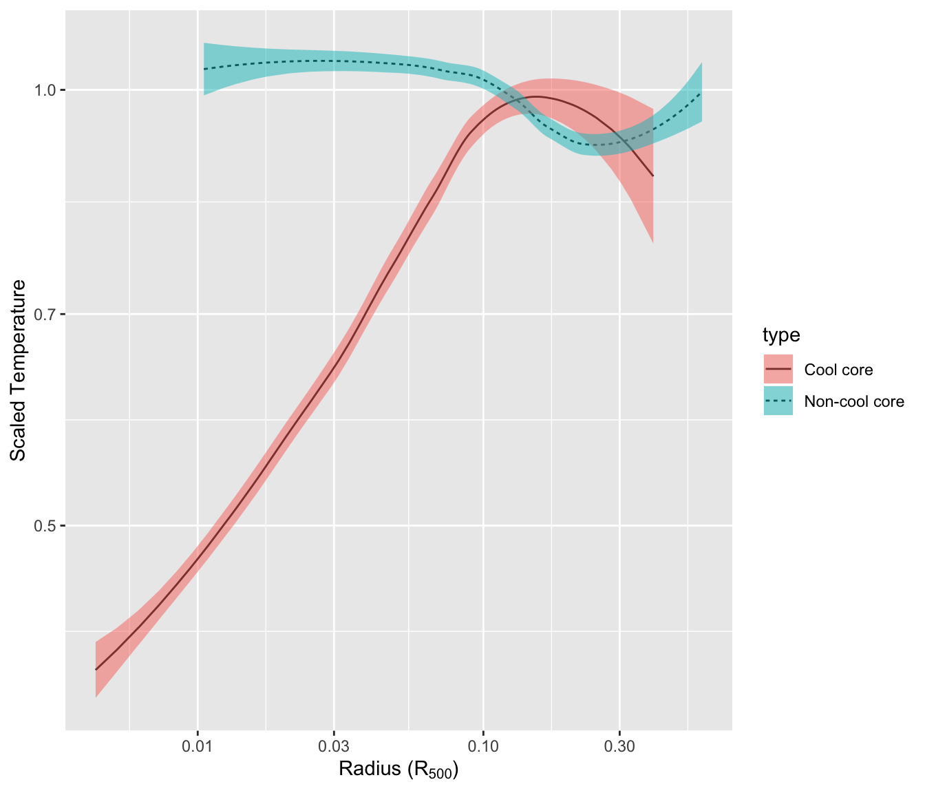
It shows mean temperature profiles and their error envelopes, using
the ggplot2 package and its
geom_ribbon() function.
Note that geom_ribbon is used since upper and lower
values of the envelop are available in the input data. As an
alternative, the
geom_smooth
function autamatically draw an error envelop using different
statistical models.
library(ggplot2)

# Get the data from the web !
CC <- read.table("http://www.sr.bham.ac.uk/~ajrs/papers/sanderson06/mean_Tprofile-CC.txt" ,  header=TRUE)
nCC <- read.table("http://www.sr.bham.ac.uk/~ajrs/papers/sanderson06/mean_Tprofile-nCC.txt" , header=TRUE)
CC$type <- "Cool core"
nCC$type <- "Non-cool core"
A <- rbind(CC, nCC)


# Make the plot
ggplot(data=A, aes(x=r.r500, y=sckT, ymin=sckT.lo, ymax=sckT.up, fill=type, linetype=type)) +
 geom_line() +
 geom_ribbon(alpha=0.5) +
 scale_x_log10() +
 scale_y_log10() +
 xlab(as.expression(expression( paste("Radius (", R[500], ")") ))) +
 ylab("Scaled Temperature")