Most basic connected scatterplot: geom_point() and
geom_line()
A connected scatterplot is
basically a hybrid between a
scatterplot and a
line plot. Thus, you just have to add a
geom_point() on top of the geom_line() to
build it.
# Libraries
library(ggplot2)
library(dplyr)
# Load dataset from github
data <- read.table("https://raw.githubusercontent.com/holtzy/data_to_viz/master/Example_dataset/3_TwoNumOrdered.csv", header=T)
data$date <- as.Date(data$date)
# Plot
data %>%
tail(10) %>%
ggplot( aes(x=date, y=value)) +
geom_line() +
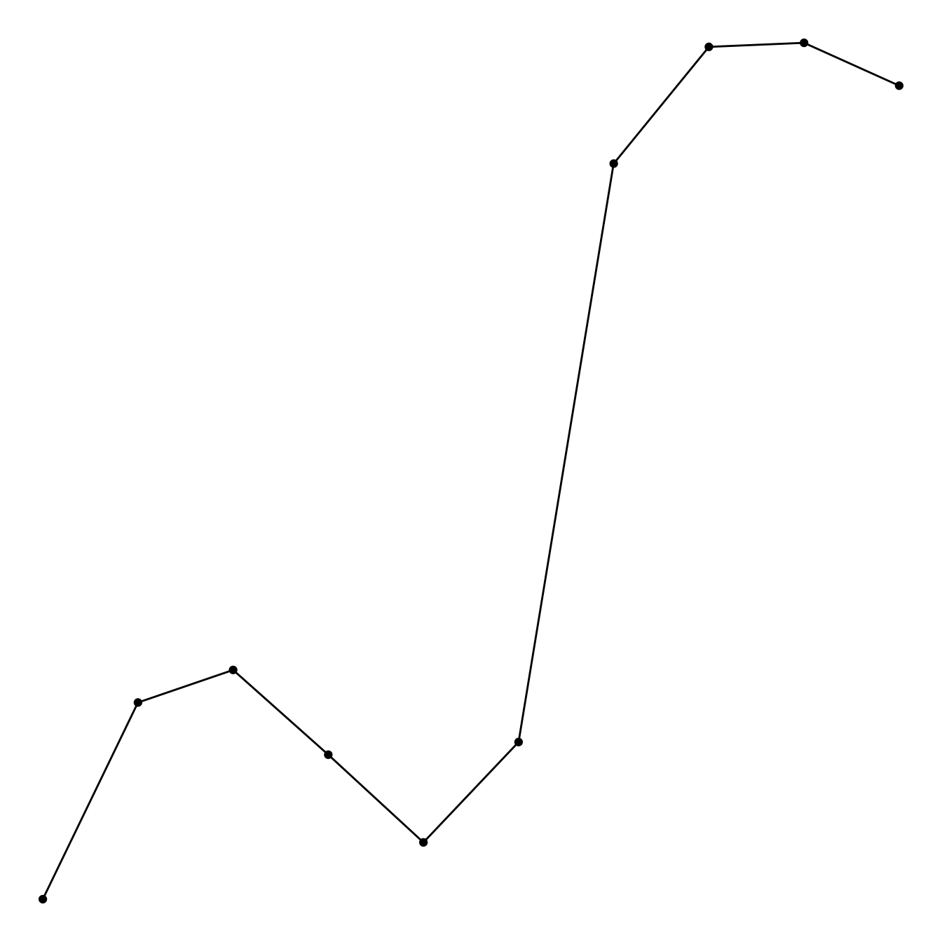
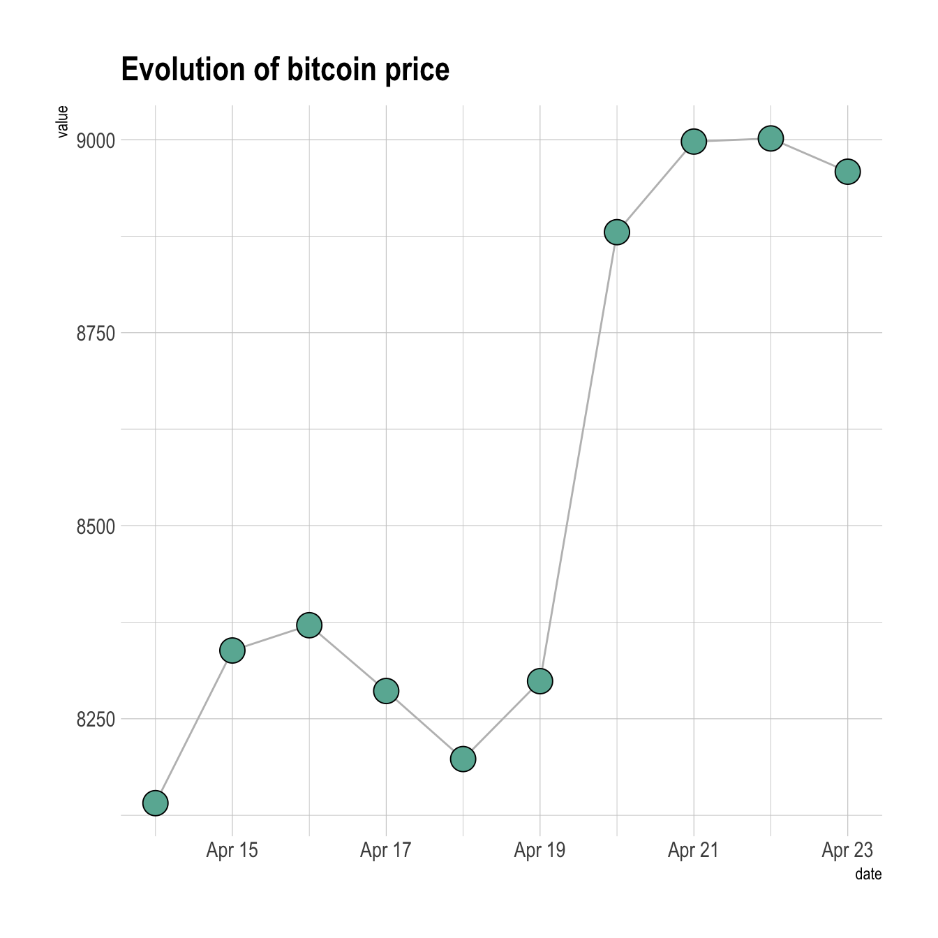
geom_point()Customize the connected scatterplot
Custom the general theme with the
theme_ipsum() function of the
hrbrthemes package. Add a title with
ggtitle(). Custom circle and line with arguments like
shape, size, color and more.
# Libraries
library(ggplot2)
library(dplyr)
library(hrbrthemes)

# Load dataset from github
data <- read.table("https://raw.githubusercontent.com/holtzy/data_to_viz/master/Example_dataset/3_TwoNumOrdered.csv", header=T)
data$date <- as.Date(data$date)

# Plot
data %>%
  tail(10) %>%
  ggplot( aes(x=date, y=value)) +
    geom_line( color="grey") +
    geom_point(shape=21, color="black", fill="#69b3a2", size=6) +
    theme_ipsum() +
    ggtitle("Evolution of bitcoin price")
Connected scatterplot to show an evolution
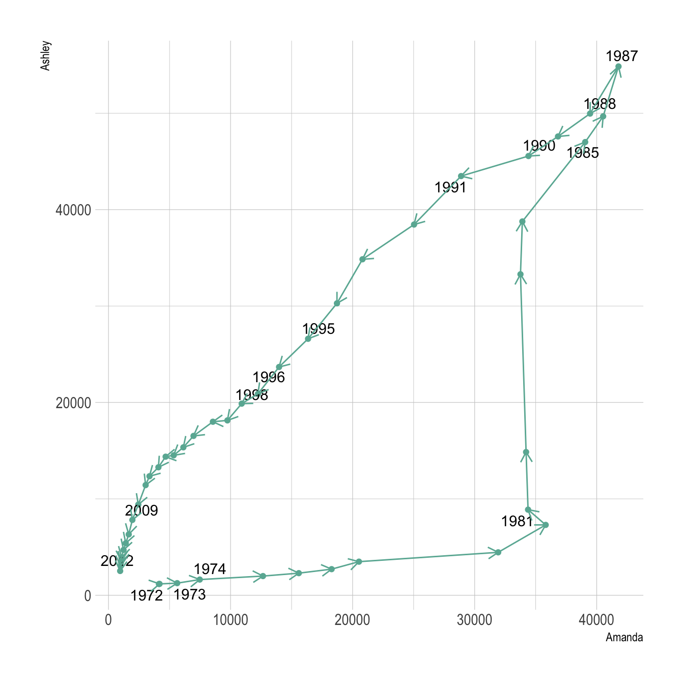
The connected scatterplot can also be a powerfull technique to tell a story about the evolution of 2 variables. Let???s consider a dataset composed of 3 columns:
- Year
- Number of baby born called Amanda this year
- Number of baby born called Ashley
The scatterplot beside allows to understand the evolution of these 2
names. Note that the code is pretty different in this case.
geom_segment() is used of geom_line().
This is because geom_line() automatically sort data
points depending on their X position to link them.
# Libraries
library(ggplot2)
library(dplyr)
library(babynames)
library(ggrepel)
library(tidyr)
# data
data <- babynames %>%
filter(name %in% c("Ashley", "Amanda")) %>%
filter(sex=="F") %>%
filter(year>1970) %>%
select(year, name, n) %>%
spread(key = name, value=n, -1)
# plot
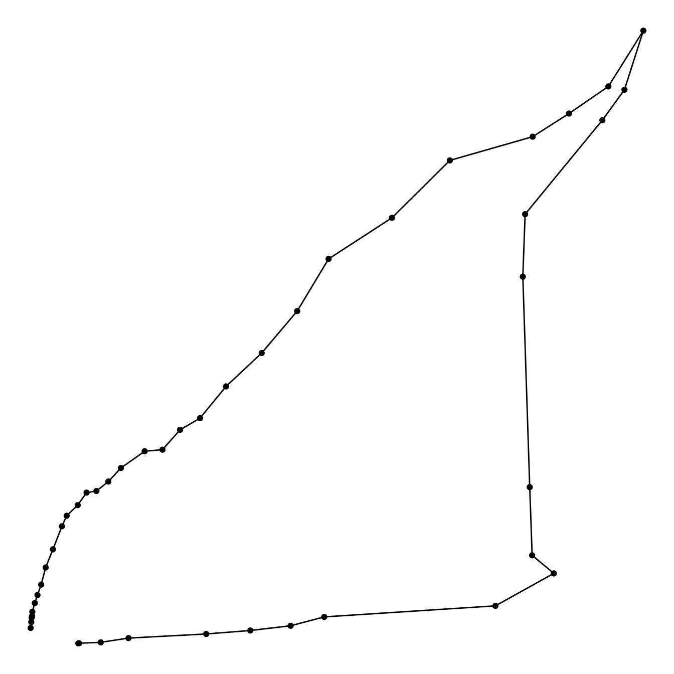
data %>%
ggplot(aes(x=Amanda, y=Ashley, label=year)) +
geom_point() +
geom_segment(aes(
xend=c(tail(Amanda, n=-1), NA),
yend=c(tail(Ashley, n=-1), NA)
)
) It makes sense to add arrows and labels to guide the reader in the chart:
# Libraries
library(ggplot2)
library(dplyr)
library(babynames)
library(ggrepel)
library(tidyr)

# data
data <- babynames %>%
  filter(name %in% c("Ashley", "Amanda")) %>%
  filter(sex=="F") %>%
  filter(year>1970) %>%
  select(year, name, n) %>%
  spread(key = name, value=n, -1)

# Select a few date to label the chart
tmp_date <- data %>% sample_frac(0.3)

# plot
data %>%
  ggplot(aes(x=Amanda, y=Ashley, label=year)) +
     geom_point(color="#69b3a2") +
     geom_text_repel(data=tmp_date) +
     geom_segment(color="#69b3a2",
                  aes(
                    xend=c(tail(Amanda, n=-1), NA),
                    yend=c(tail(Ashley, n=-1), NA)
                  ),
                  arrow=arrow(length=unit(0.3,"cm"))
      ) +
      theme_ipsum()