Visualizing 2 series with R and ggplot2
Let’s consider a dataset with 3 columns:
date-
first serie to display: fake
temperature. Range from 0 to 10. -
second serie: fake
price. Rangee from 0 to 100.
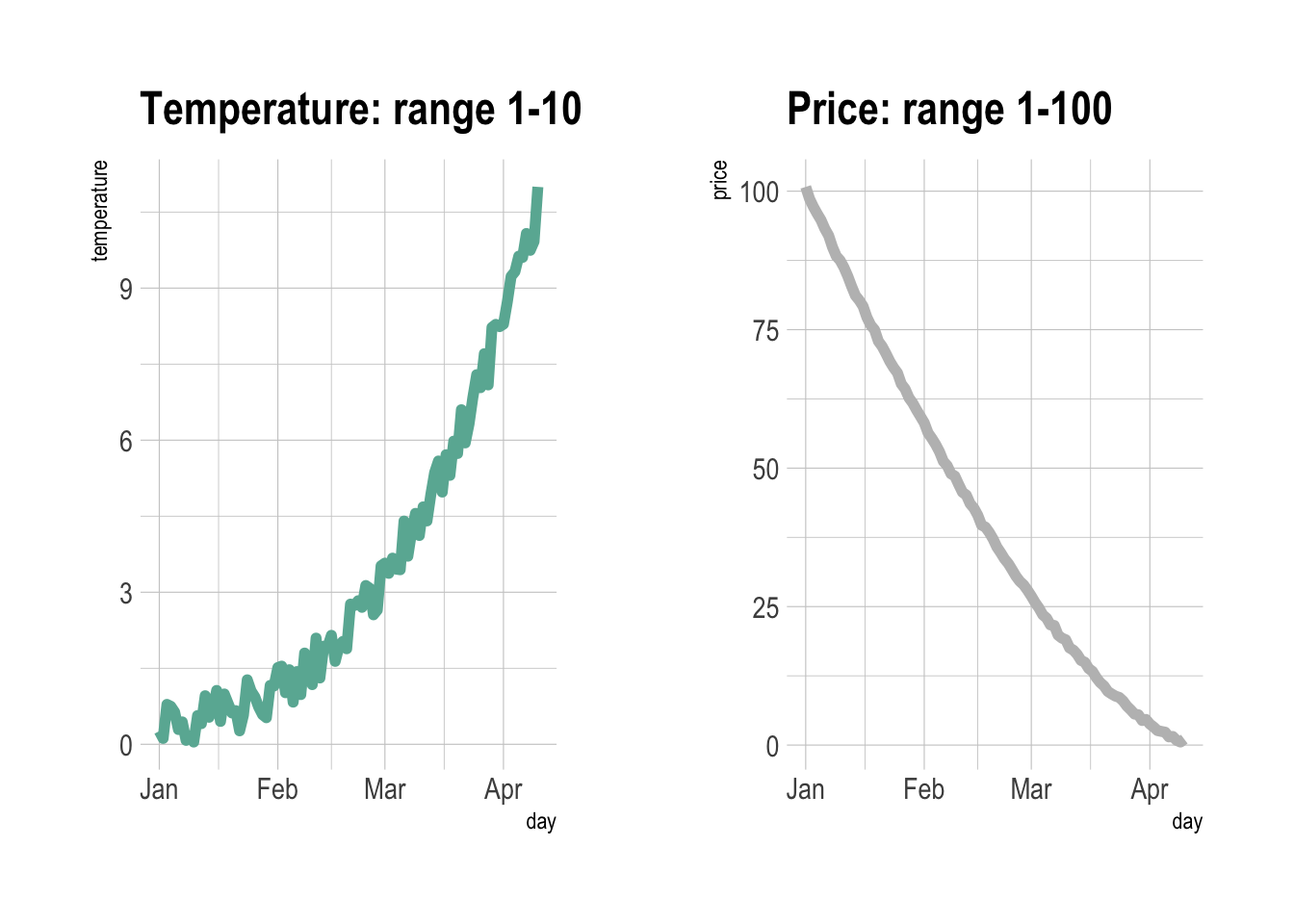
One could easily build 2 line charts to study the evolution of those 2 series using the code below.
But even if strongly unadvised, one sometimes wants to display both series on the same chart, thus needing a second Y axis.
# Libraries
library(ggplot2)
library(dplyr)
library(patchwork) # To display 2 charts together
library(hrbrthemes)

# Build dummy data
data <- data.frame(
  day = as.Date("2019-01-01") + 0:99,
  temperature = runif(100) + seq(1,100)^2.5 / 10000,
  price = runif(100) + seq(100,1)^1.5 / 10
)

# Most basic line chart
p1 <- ggplot(data, aes(x=day, y=temperature)) +
  geom_line(color="#69b3a2", size=2) +
  ggtitle("Temperature: range 1-10") +
  theme_ipsum()

p2 <- ggplot(data, aes(x=day, y=price)) +
  geom_line(color="grey",size=2) +
  ggtitle("Price: range 1-100") +
  theme_ipsum()

# Display both charts side by side thanks to the patchwork package
p1 + p2
Adding a second Y axis with sec.axis(): the idea
sec.axis() does not allow to build an entirely new Y
axis. It just builds a second Y axis based on the first one,
applying a mathematical transformation.
In the example below, the second Y axis simply represents the first
one multiplied by 10, thanks to the trans argument that
provides the ~.*10 mathematical statement.
Note that because of that you can’t easily control the second axis lower and upper boundaries. We’ll see a trick below in the tweaking section.

# Start with a usual ggplot2 call:
ggplot(data, aes(x=day, y=temperature)) +

  # Custom the Y scales:
  scale_y_continuous(

    # Features of the first axis
    name = "First Axis",

    # Add a second axis and specify its features
    sec.axis = sec_axis( trans=~.*10, name="Second Axis")
  ) +

  theme_ipsum()
Show 2 series on the same line chart thanks to sec.axis()
We can use this sec.axis mathematical transformation to
display 2 series that have a different range.
Since the price has a maximum value that is 10 times biggeer than the maximum temperature:
-
the second Y axis is like the first multiplied by 10
(
trans=~.*10). -
the value be display in the second variable
geom_line()call must be divided by 10 to mimic the range of the first variable.

# Value used to transform the data
coeff <- 10

ggplot(data, aes(x=day)) +

  geom_line( aes(y=temperature)) +
  geom_line( aes(y=price / coeff)) + # Divide by 10 to get the same range than the temperature

  scale_y_continuous(

    # Features of the first axis
    name = "First Axis",

    # Add a second axis and specify its features
    sec.axis = sec_axis(~.*coeff, name="Second Axis")
  )
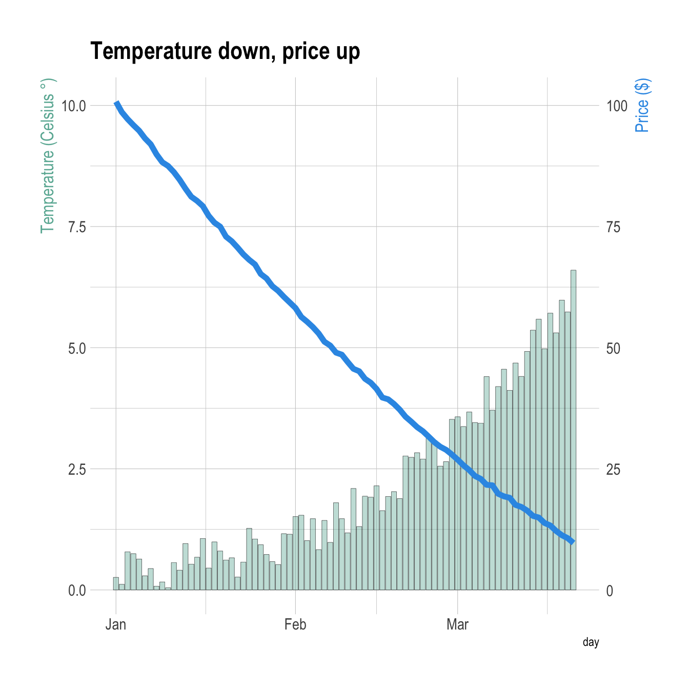
Dual Y axis customization with ggplot2
A feew usual tricks to make the chart looks better:
-
ipsumtheme to remove the black background and improve the general style - add a title
- customize the Y axes to pair them with their related line.

# Value used to transform the data
coeff <- 10

# A few constants
temperatureColor <- "#69b3a2"
priceColor <- rgb(0.2, 0.6, 0.9, 1)

ggplot(data, aes(x=day)) +

  geom_line( aes(y=temperature), size=2, color=temperatureColor) +
  geom_line( aes(y=price / coeff), size=2, color=priceColor) +

  scale_y_continuous(

    # Features of the first axis
    name = "Temperature (Celsius °)",

    # Add a second axis and specify its features
    sec.axis = sec_axis(~.*coeff, name="Price ($)")
  ) +

  theme_ipsum() +

  theme(
    axis.title.y = element_text(color = temperatureColor, size=13),
    axis.title.y.right = element_text(color = priceColor, size=13)
  ) +

  ggtitle("Temperature down, price up")
Barplot with overlapping line chart
It is totally possible to usee the same tricks with other
geoms.
Here is an example displaying a line chart on top of a barplot.
# Value used to transform the data
coeff <- 10

# A few constants
temperatureColor <- "#69b3a2"
priceColor <- rgb(0.2, 0.6, 0.9, 1)

ggplot(head(data, 80), aes(x=day)) +

  geom_bar( aes(y=temperature), stat="identity", size=.1, fill=temperatureColor, color="black", alpha=.4) +
  geom_line( aes(y=price / coeff), size=2, color=priceColor) +

  scale_y_continuous(

    # Features of the first axis
    name = "Temperature (Celsius °)",

    # Add a second axis and specify its features
    sec.axis = sec_axis(~.*coeff, name="Price ($)")
  ) +

  theme_ipsum() +

  theme(
    axis.title.y = element_text(color = temperatureColor, size=13),
    axis.title.y.right = element_text(color = priceColor, size=13)
  ) +

  ggtitle("Temperature down, price up")