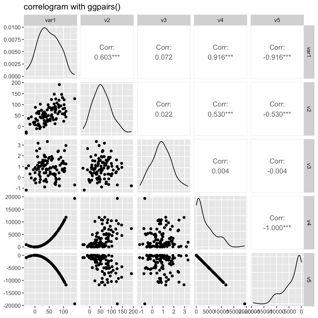
Scatterplot matrix with ggpairs()
The ggpairs() function of the
GGally package allows to build a great
scatterplot matrix.
Scatterplots of each pair of numeric variable are drawn on the left part of the figure. Pearson correlation is displayed on the right. Variable distribution is available on the diagonal.
Visualize correlation with ggcorr()
The ggcorr() function allows to visualize the
correlation of each pair of variable as a square. Note that the
method argument allows to pick the correlation type
you desire.

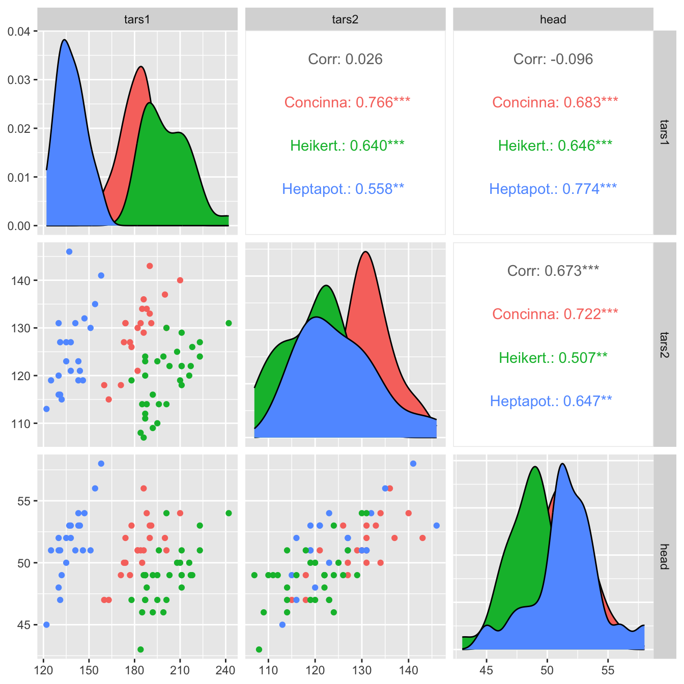
Split by group
It is possible to use ggplot2 aesthetics on the chart, for instance to color each category.
Change plot types
upper and lower argument.
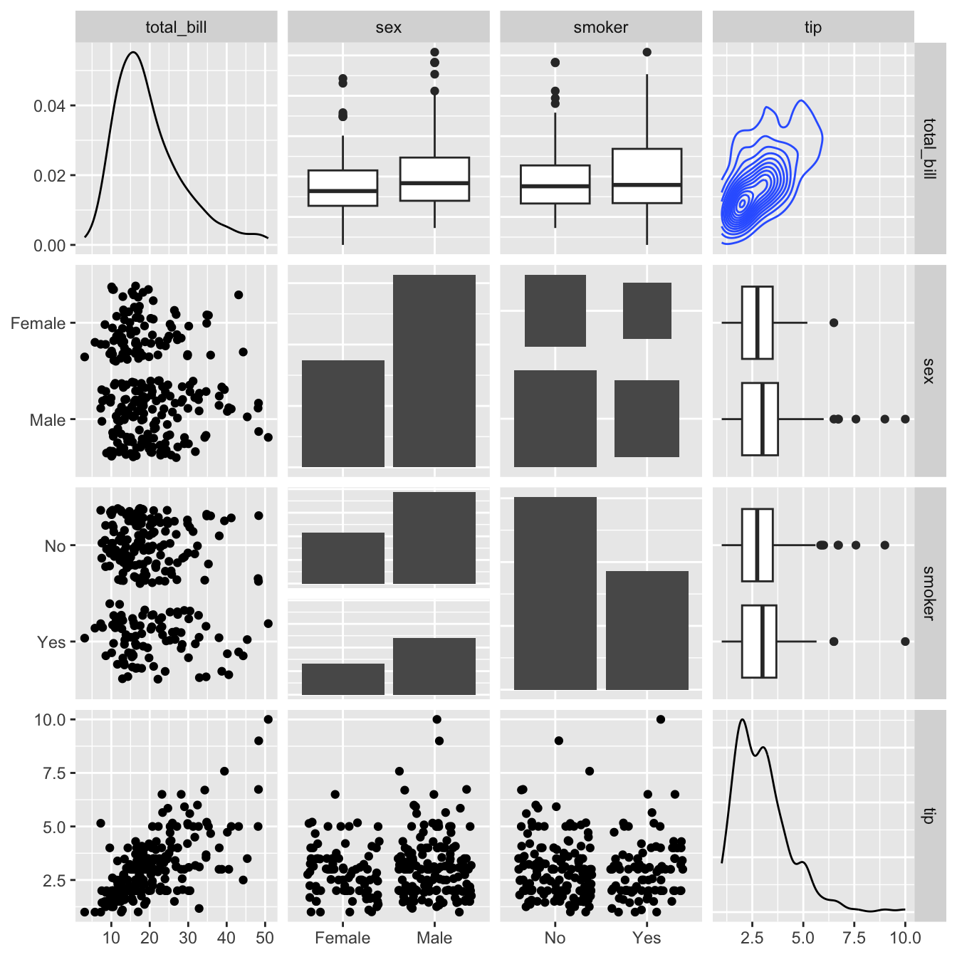
# Quick display of two cabapilities of GGally, to assess the distribution and correlation of variables
library(GGally)

# From the help page:
data(tips, package = "reshape")
ggpairs(
  tips[, c(1, 3, 4, 2)],
  upper = list(continuous = "density", combo = "box_no_facet"),
  lower = list(continuous = "points", combo = "dot_no_facet")
)