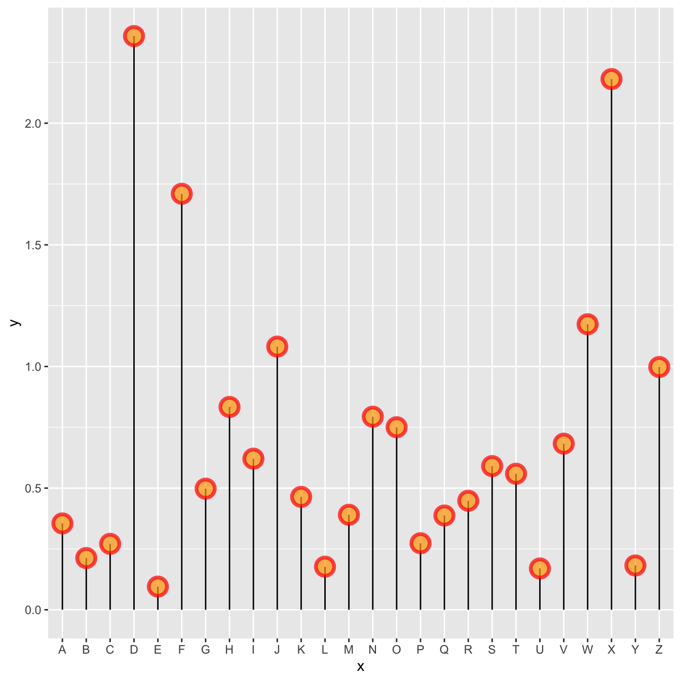
Marker
A lollipop plot is constituted of a marker and a stem. You can customize the marker as usual with ggplot2:
size,coloralpha→ transparency-
shape→ see list of available shape here -
strokeandfill→ only for shapes that have stroke, like the21
# Library
library(tidyverse)

# Create data
data <- data.frame(
  x=LETTERS[1:26],
  y=abs(rnorm(26))
)

# plot
ggplot(data, aes(x=x, y=y)) +
  geom_segment( aes(x=x, xend=x, y=0, yend=y)) +
  geom_point( size=5, color="red", fill=alpha("orange", 0.3), alpha=0.7, shape=21, stroke=2)
Stem
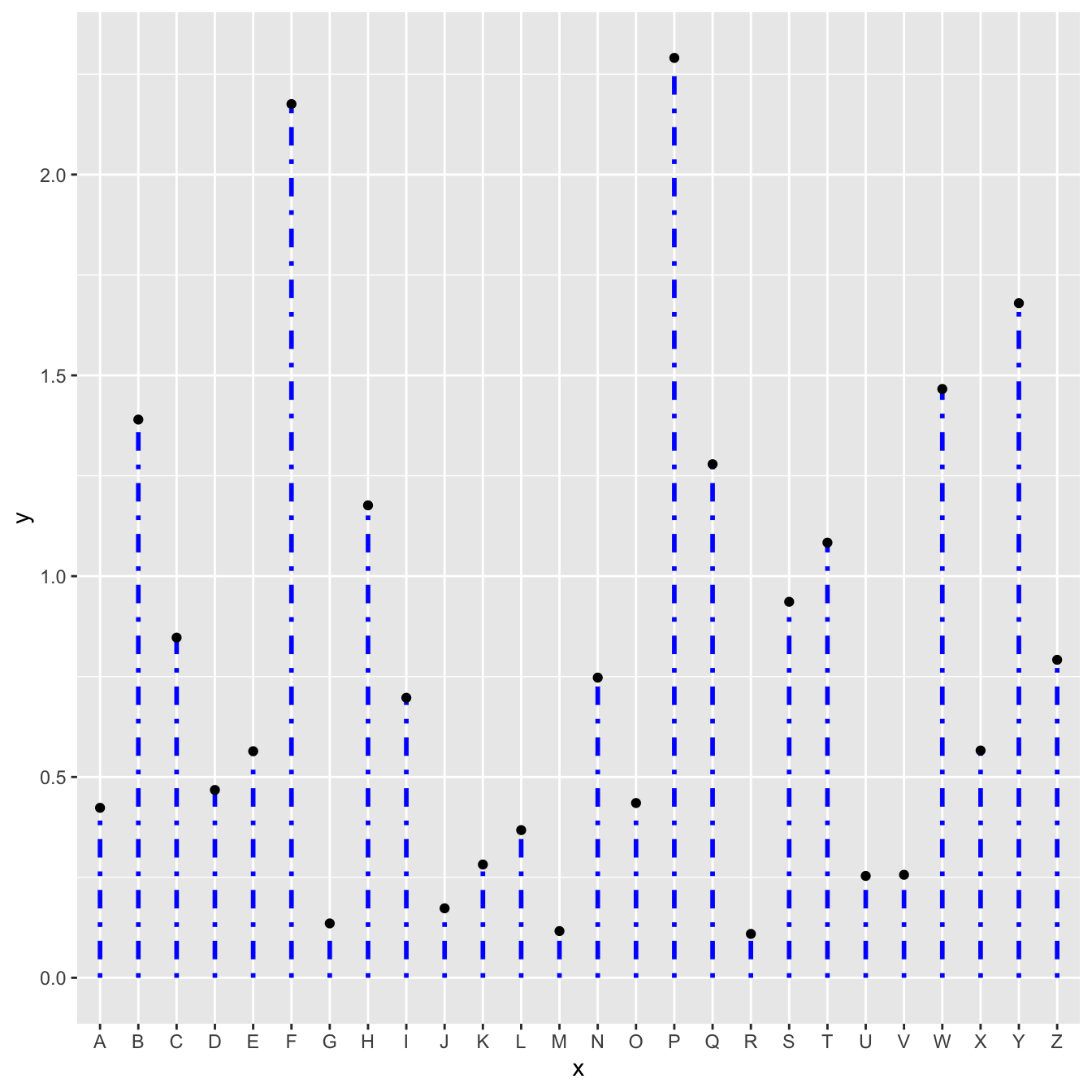
The stem is built using geom_segment() and can be
customized as well:
size,color-
linetype→ can be an integer (see list), a word likedotted,dashed,dotdashand more (typehelp(linetype))
# Libraries
library(ggplot2)
# Create data
data <- data.frame(
x=LETTERS[1:26],
y=abs(rnorm(26))
)
# Plot
ggplot(data, aes(x=x, y=y)) +
geom_segment( aes(x=x, xend=x, y=0, yend=y) , size=1, color="blue", linetype="dotdash" ) +
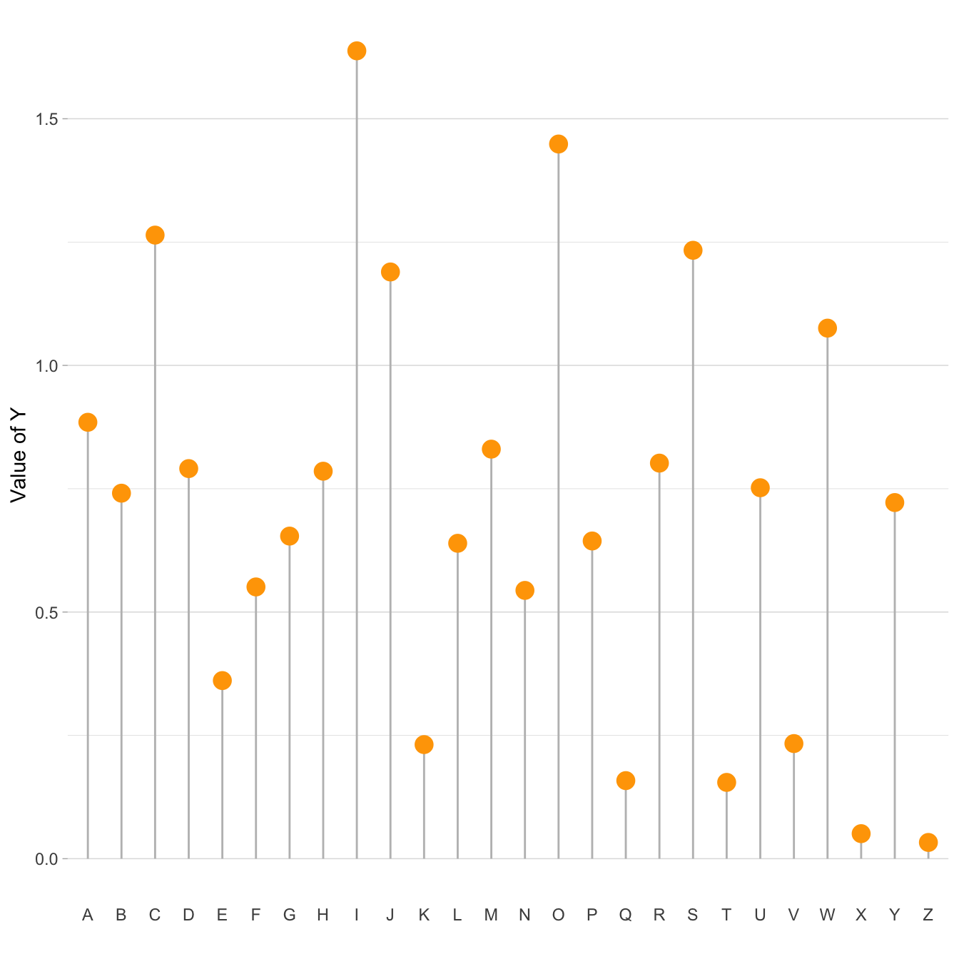
geom_point()General appearance with theme()
As usual, you can customize the general appearance of the chart
using the theme() function.
Note: another solution is to use the pre-built
theme_ipsum() offered in the
hrbrthemes package.
# Libraries
library(ggplot2)

# Create data
data <- data.frame(
  x=LETTERS[1:26],
  y=abs(rnorm(26))
)

# Plot
ggplot(data, aes(x=x, y=y)) +
  geom_segment( aes(x=x, xend=x, y=0, yend=y), color="grey") +
  geom_point( color="orange", size=4) +
  theme_light() +
  theme(
    panel.grid.major.x = element_blank(),
    panel.border = element_blank(),
    axis.ticks.x = element_blank()
  ) +
  xlab("") +
  ylab("Value of Y")
Horizontal version
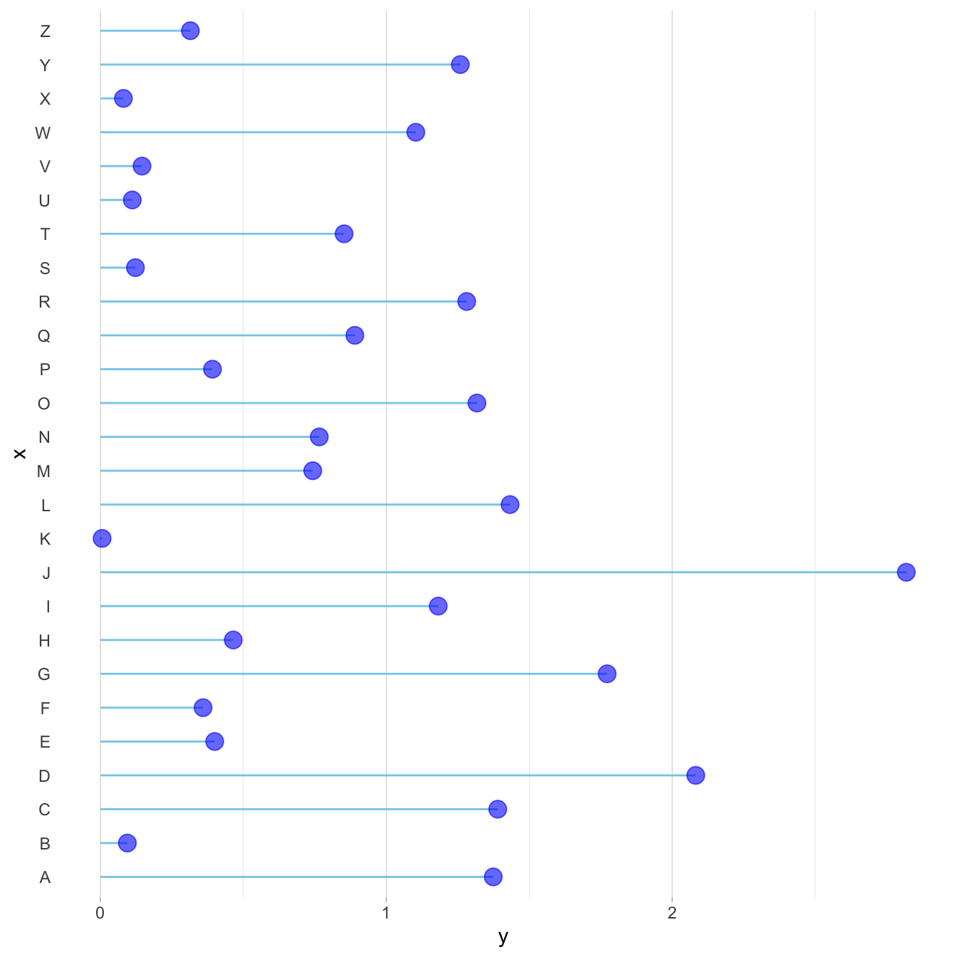
It is pretty straightforward to flip the chart using the
coord_flip() function.
It makes sense to do so if you have long labels → they will be much easier to read.
# Libraries
library(ggplot2)

# Create data
data <- data.frame(
  x=LETTERS[1:26],
  y=abs(rnorm(26))
)

# Horizontal version
ggplot(data, aes(x=x, y=y)) +
  geom_segment( aes(x=x, xend=x, y=0, yend=y), color="skyblue") +
  geom_point( color="blue", size=4, alpha=0.6) +
  theme_light() +
  coord_flip() +
  theme(
    panel.grid.major.y = element_blank(),
    panel.border = element_blank(),
    axis.ticks.y = element_blank()
  )
Baseline
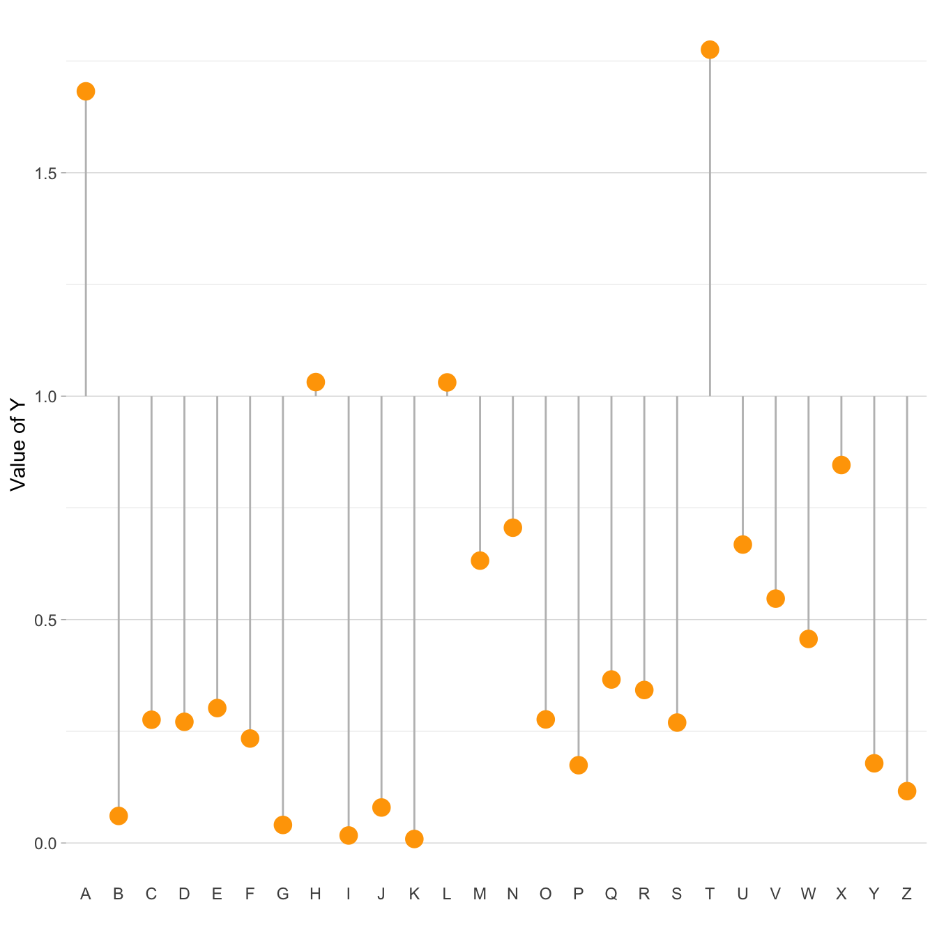
Lastly, you can easily change the baseline of the chart. It gives more insight to the figure if there is a specific threshold in the data that interests you.
You just have to change the y argument in the
geom_segment() call.
# Libraries
library(ggplot2)

# Create data
data <- data.frame(
  x=LETTERS[1:26],
  y=abs(rnorm(26))
)

# Change baseline
ggplot(data, aes(x=x, y=y)) +
  geom_segment( aes(x=x, xend=x, y=1, yend=y), color="grey") +
  geom_point( color="orange", size=4) +
  theme_light() +
  theme(
    panel.grid.major.x = element_blank(),
    panel.border = element_blank(),
    axis.ticks.x = element_blank()
  ) +
  xlab("") +
  ylab("Value of Y")
What’s next
The lollipop chart is one of my favourite. There is so much to do with
it and it is under-utilized in favor of barplot. Visit the
dedicated section for more examples
produced with R, or
data-to-viz
to learn about the available variations and caveats to avoid.


