This graph comes from the probability and statistics blog of Matt Asher Thanks for this contribution !
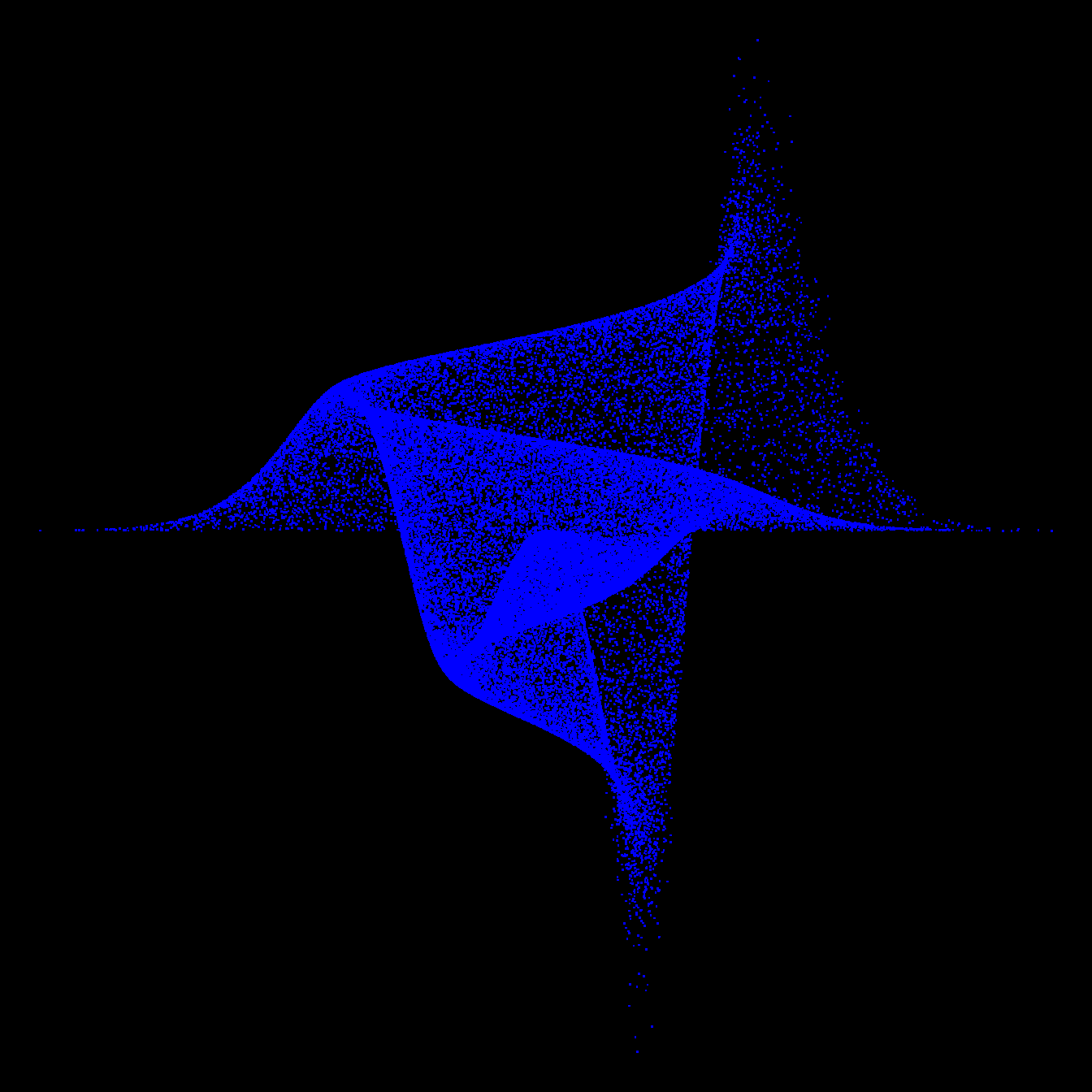
A graph by Matt Asher showing probability function in a data art fashion.
This graph comes from the probability and statistics blog of Matt Asher Thanks for this contribution !
Related chart types


👋 After crafting hundreds of R charts over 12 years, I've distilled my top 10 tips and tricks. Receive them via email! One insight per day for the next 10 days! 🔥