The Vioplot library builds the
violin plot as a boxplot with a rotated
kernel density plot on each side. If you want to represent several
groups, the trick is to use the with function as
demonstrated below.
Note: consider using the ggplot2 package as shown in graph #95.
## [1] 1 17
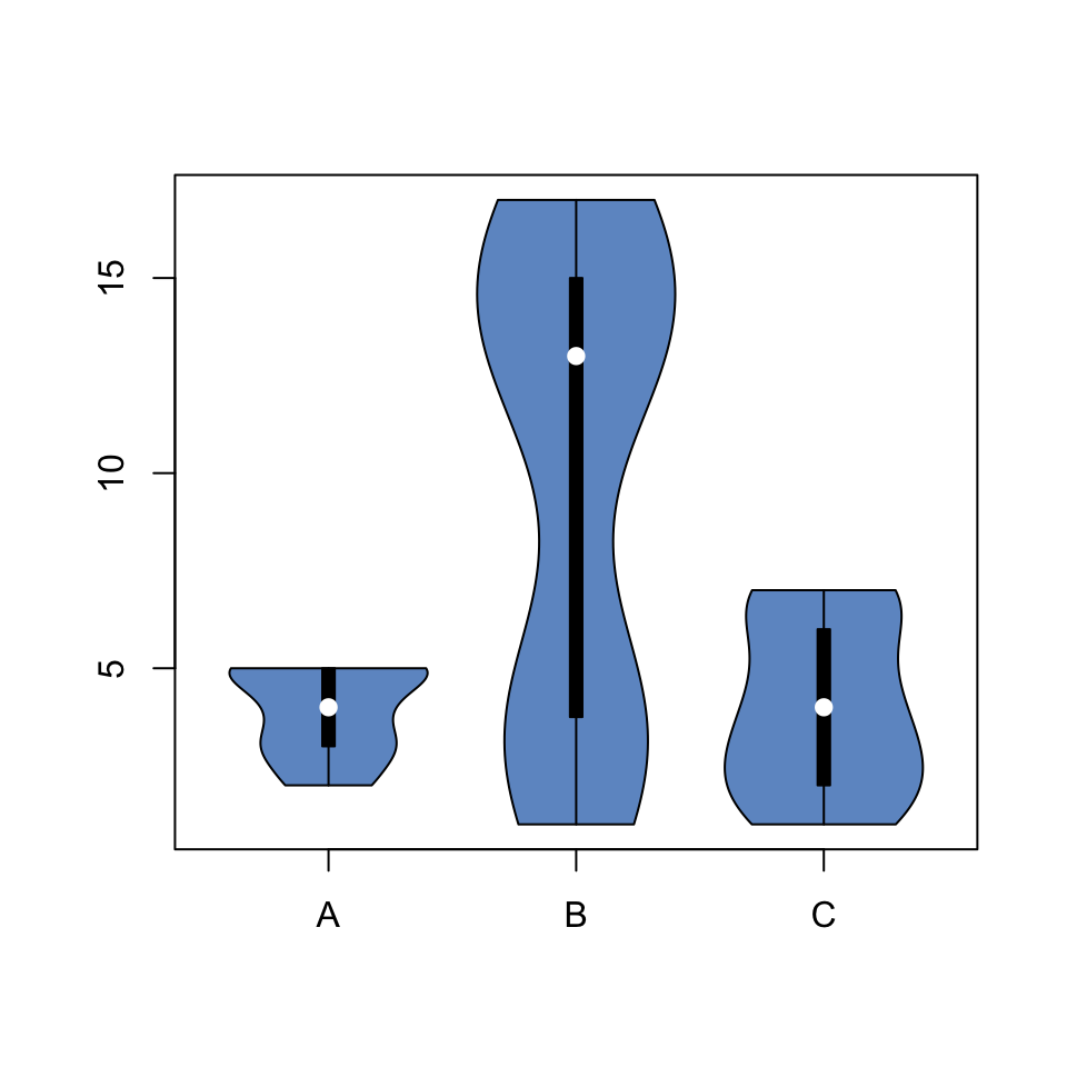
# Load the vioplot library
library(vioplot)

# Create data
treatment <- c(rep("A", 40) , rep("B", 40) , rep("C", 40) )
value <- c( sample(2:5, 40 , replace=T) , sample(c(1:5,12:17), 40 , replace=T), sample(1:7, 40 , replace=T) )
data <- data.frame(treatment,value)

# Draw the plot
with(data , vioplot(
  value[treatment=="A"] , value[treatment=="B"], value[treatment=="C"],
  col=rgb(0.1,0.4,0.7,0.7) , names=c("A","B","C")
))