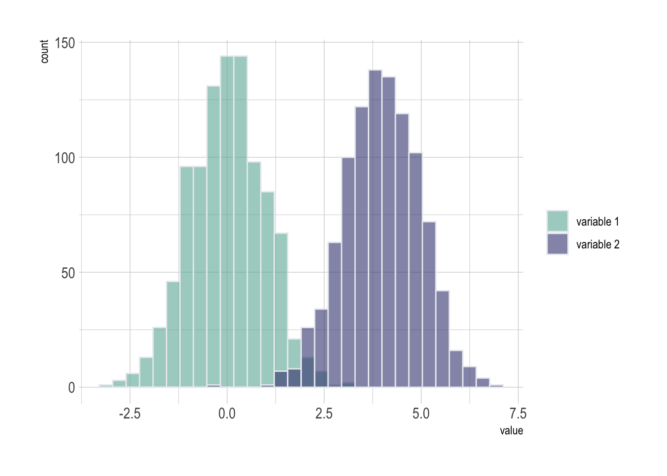
Several histograms on the same axis
If the number of group or variable you have is relatively low, you can display all of them on the same axis, using a bit of transparency to make sure you do not hide any data.
Note: with 2 groups, you can also build a mirror histogram
# library
library(ggplot2)
library(dplyr)
library(hrbrthemes)

# Build dataset with different distributions
data <- data.frame(
  type = c( rep("variable 1", 1000), rep("variable 2", 1000) ),
  value = c( rnorm(1000), rnorm(1000, mean=4) )
)

# Represent it
p <- data %>%
  ggplot( aes(x=value, fill=type)) +
    geom_histogram( color="#e9ecef", alpha=0.6, position = 'identity') +
    scale_fill_manual(values=c("#69b3a2", "#404080")) +
    theme_ipsum() +
    labs(fill="")
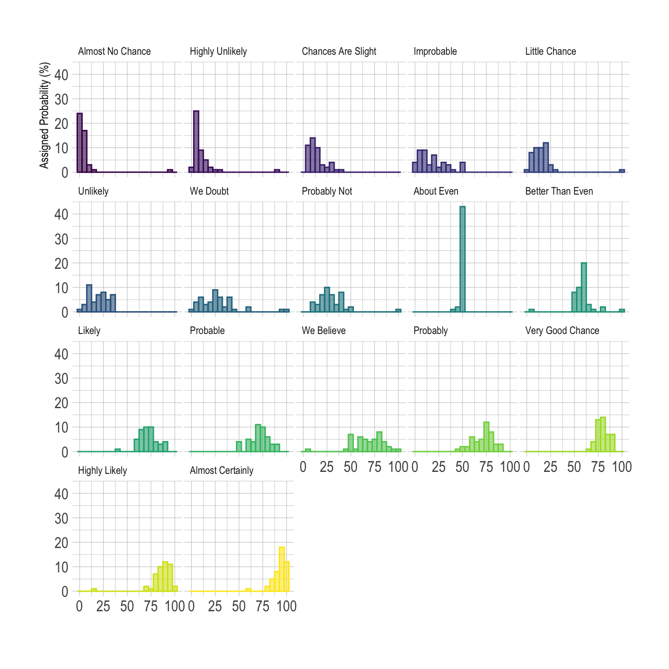
Using small multiple
If the number of group you need to represent is high, drawing them on the same axis often results in a cluttered and unreadable figure.
A good workaroung is to use small multiple where each group
is represented in a fraction of the plot window, making the figure
easy to read. This is pretty easy to build thanks to the
facet_wrap() function of ggplot2.
Note: read more about the dataset used in this example here.
# Libraries
library(tidyverse)
library(hrbrthemes)
library(viridis)
library(forcats)

# Load dataset from github
data <- read.table("https://raw.githubusercontent.com/zonination/perceptions/master/probly.csv", header=TRUE, sep=",")
data <- data %>%
  gather(key="text", value="value") %>%
  mutate(text = gsub("\\.", " ",text)) %>%
  mutate(value = round(as.numeric(value),0))

# plot
p <- data %>%
  mutate(text = fct_reorder(text, value)) %>%
  ggplot( aes(x=value, color=text, fill=text)) +
    geom_histogram(alpha=0.6, binwidth = 5) +
    scale_fill_viridis(discrete=TRUE) +
    scale_color_viridis(discrete=TRUE) +
    theme_ipsum() +
    theme(
      legend.position="none",
      panel.spacing = unit(0.1, "lines"),
      strip.text.x = element_text(size = 8)
    ) +
    xlab("") +
    ylab("Assigned Probability (%)") +
    facet_wrap(~text)