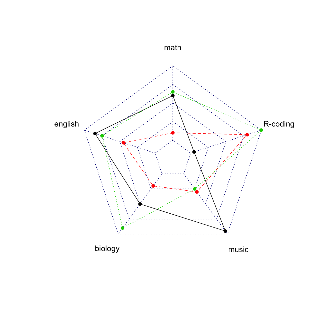
Multi-group spider chart, no options
If you’re using the fmsb package for the first time,
have a look to the
most basic radar chart
first, it explains how the data must be formatted for the
radarchart() function.
If you have several individuals, the code looks pretty much the same as shown below.
Note: don’t show more that 2 or 3 groups on the same web chart, it would make it unreadable. Read more about radar chart caveats.
# Library
library(fmsb)

# Create data: note in High school for several students
set.seed(99)
data <- as.data.frame(matrix( sample( 0:20 , 15 , replace=F) , ncol=5))
colnames(data) <- c("math" , "english" , "biology" , "music" , "R-coding" )
rownames(data) <- paste("mister" , letters[1:3] , sep="-")

# To use the fmsb package, I have to add 2 lines to the dataframe: the max and min of each variable to show on the plot!
data <- rbind(rep(20,5) , rep(0,5) , data)

# plot with default options:
radarchart(data)
Customization
The radarchart() function offers several options to
customize the chart:
-
Polygon features:
pcol→ line colorpfcol→ fill colorplwd→ line width
-
Grid features:
cglcol→ color of the net-
cglty→ net line type (see possibilities) axislabcol→ color of axis labels-
caxislabels→ vector of axis labels to display cglwd→ net width
-
Labels:
vlcex→ group labels size
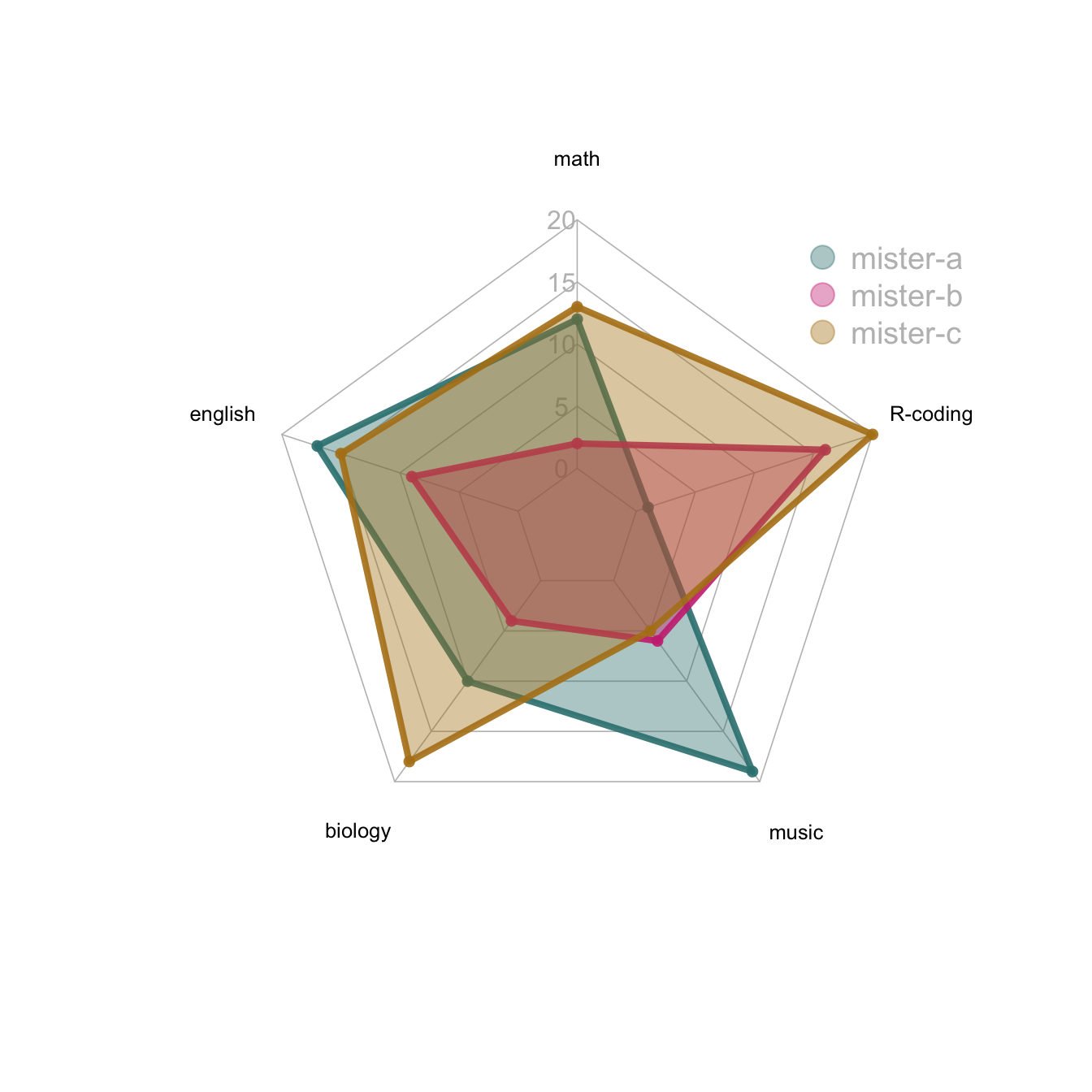
# Library
library(fmsb)

# Create data: note in High school for several students
set.seed(99)
data <- as.data.frame(matrix( sample( 0:20 , 15 , replace=F) , ncol=5))
colnames(data) <- c("math" , "english" , "biology" , "music" , "R-coding" )
rownames(data) <- paste("mister" , letters[1:3] , sep="-")

# To use the fmsb package, I have to add 2 lines to the dataframe: the max and min of each variable to show on the plot!
data <- rbind(rep(20,5) , rep(0,5) , data)

# Color vector
colors_border=c( rgb(0.2,0.5,0.5,0.9), rgb(0.8,0.2,0.5,0.9) , rgb(0.7,0.5,0.1,0.9) )
colors_in=c( rgb(0.2,0.5,0.5,0.4), rgb(0.8,0.2,0.5,0.4) , rgb(0.7,0.5,0.1,0.4) )

# plot with default options:
radarchart( data  , axistype=1 ,
    #custom polygon
    pcol=colors_border , pfcol=colors_in , plwd=4 , plty=1,
    #custom the grid
    cglcol="grey", cglty=1, axislabcol="grey", caxislabels=seq(0,20,5), cglwd=0.8,
    #custom labels
    vlcex=0.8
    )

# Add a legend
legend(x=0.7, y=1, legend = rownames(data[-c(1,2),]), bty = "n", pch=20 , col=colors_in , text.col = "grey", cex=1.2, pt.cex=3)
About axis limits
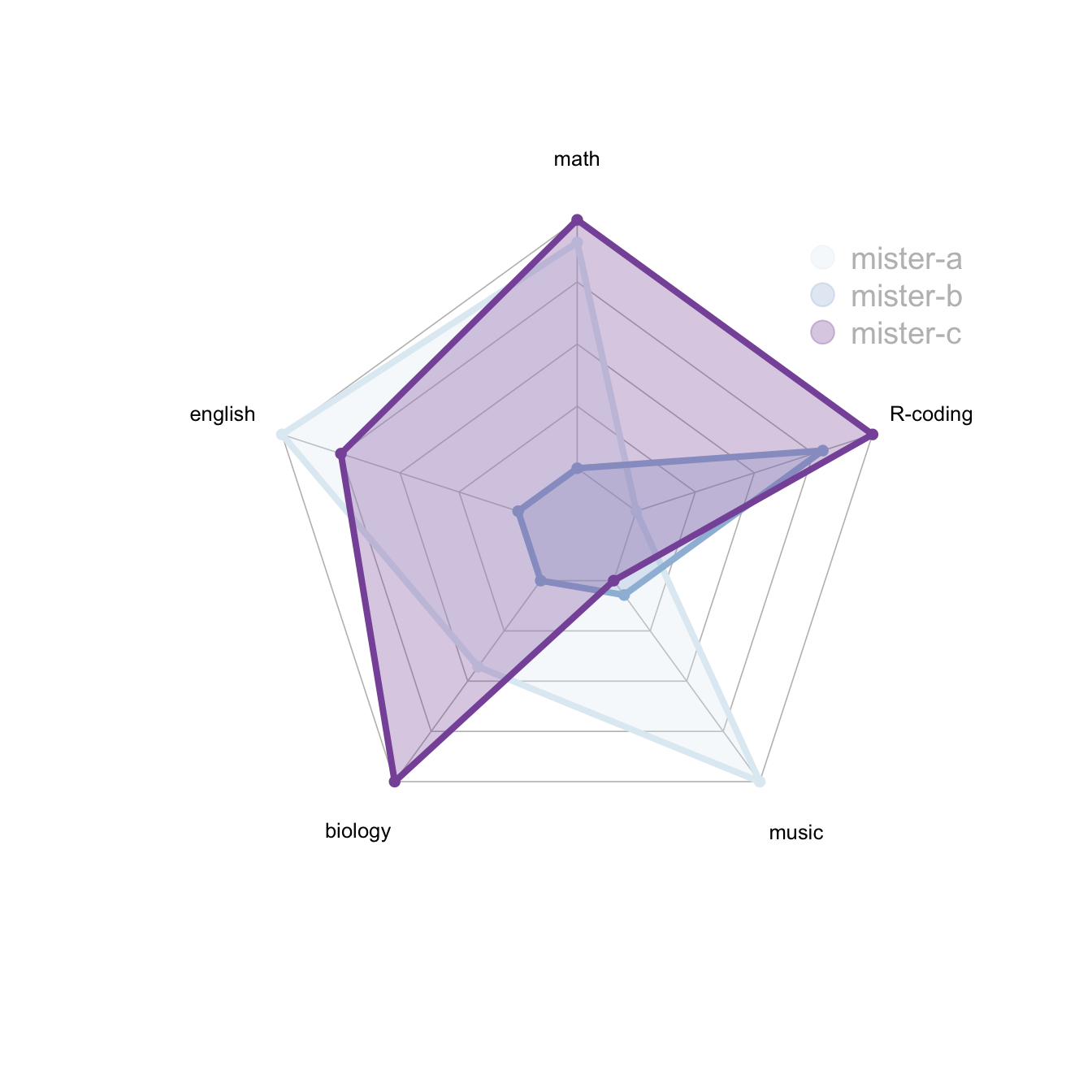
In the previous examples, axis limits were set in the 2 first rows of the input dataset.
If you do not specify these values, the axis limits will be computed automatically, as shown below.
# Library
library(fmsb)

# Create data: note in High school for several students
set.seed(99)
data <- as.data.frame(matrix( sample( 0:20 , 15 , replace=F) , ncol=5))
colnames(data) <- c("math" , "english" , "biology" , "music" , "R-coding" )
rownames(data) <- paste("mister" , letters[1:3] , sep="-")

# To use the fmsb package, I have to add 2 lines to the dataframe: the max and min of each variable to show on the plot!
data <- rbind(rep(20,5) , rep(0,5) , data)

# Set graphic colors
library(RColorBrewer)
coul <- brewer.pal(3, "BuPu")
colors_border <- coul
library(scales)
colors_in <- alpha(coul,0.3)

# If you remove the 2 first lines, the function compute the max and min of each variable with the available data:
radarchart( data[-c(1,2),]  , axistype=0 , maxmin=F,
    #custom polygon
    pcol=colors_border , pfcol=colors_in , plwd=4 , plty=1,
    #custom the grid
    cglcol="grey", cglty=1, axislabcol="black", cglwd=0.8,
    #custom labels
    vlcex=0.8
    )

# Add a legend
legend(x=0.7, y=1, legend = rownames(data[-c(1,2),]), bty = "n", pch=20 , col=colors_in , text.col = "grey", cex=1.2, pt.cex=3)
Warning
There is a lot of criticism going around spider chart. Before using it in a project, you probably want to learn more about it.


