Important note about the lubridate() library.
I strongly advise to have a look to the
lubridate() library. It allows to easily manipulate the
date format, and is very powerfull in conjunction with
ggplot2. Have a look to the
time series section of the gallery.
Is your date recognized as a date?
R offers a special data type for dates. It is important to use it since it will make the creation of charts lot easier.
The str() function allows to check the type of each
column. In the example beside, the date column is
recognized as a factor
# Create data
set.seed(124)
date <- paste(   "2015/03/" , sample(seq(1,31),6) , sep="")
value <- sample(seq(1,100) , 6)
data <- data.frame(date,value)

# Date and time are recognized as factor:
str(data)
## 'data.frame': 6 obs. of 2 variables:
## $ date : Factor w/ 6 levels "2015/03/12","2015/03/13",..: 4 2 3 1 5 6
## $ value: int 59 49 91 28 75 82Why it matters
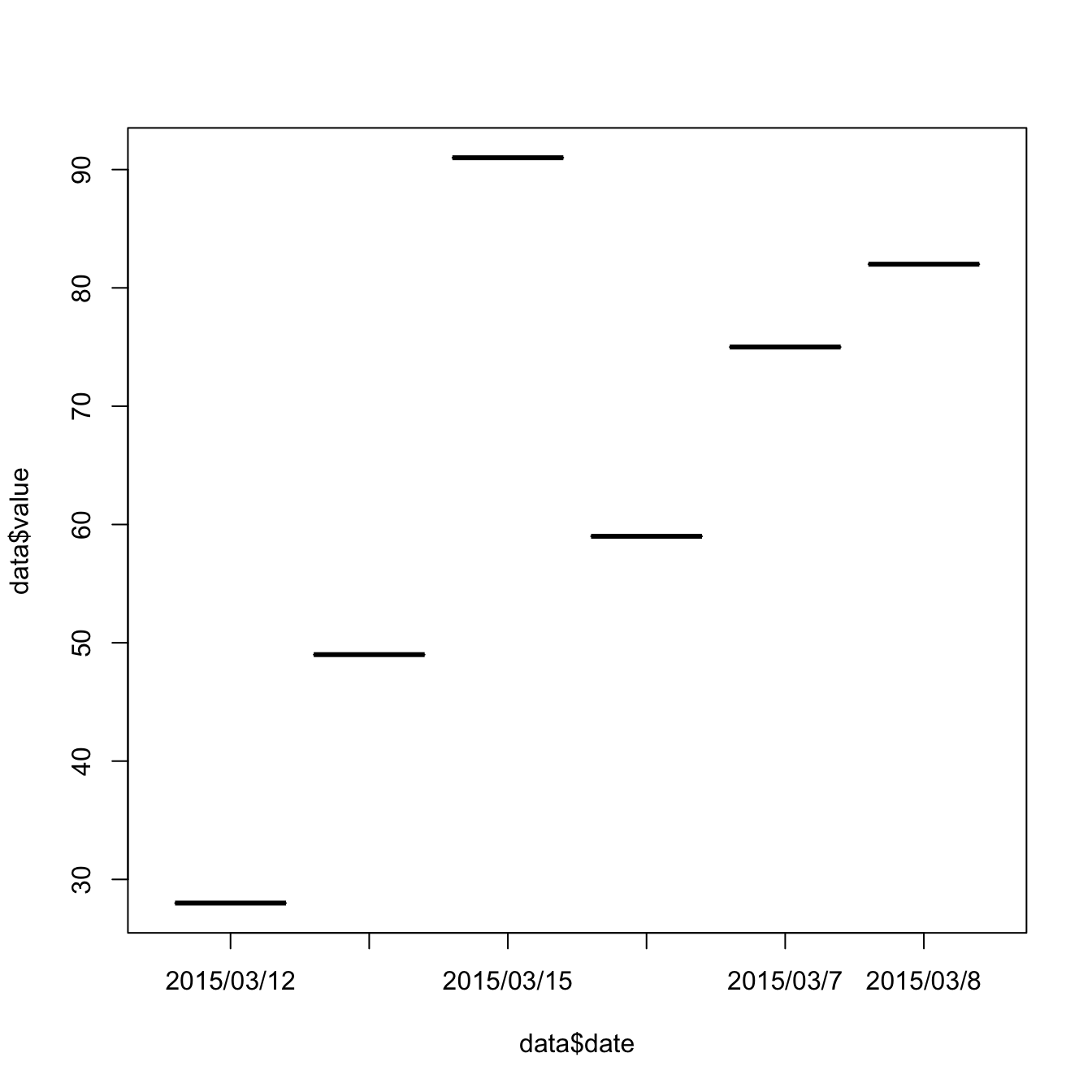
The issue is that your plot is gonna be very disapointing if the date is not recognized properly, as shown beside.
# Create data
set.seed(124)
date <- paste(   "2015/03/" , sample(seq(1,31),6) , sep="")
value <- sample(seq(1,100) , 6)
data <- data.frame(date,value)

# Date and time are recognized as factor:
#str(data)

# So ploting them works bad --> wrong order, date without value are not represented,
plot(data$value~data$date, type="b")
Switch to date format
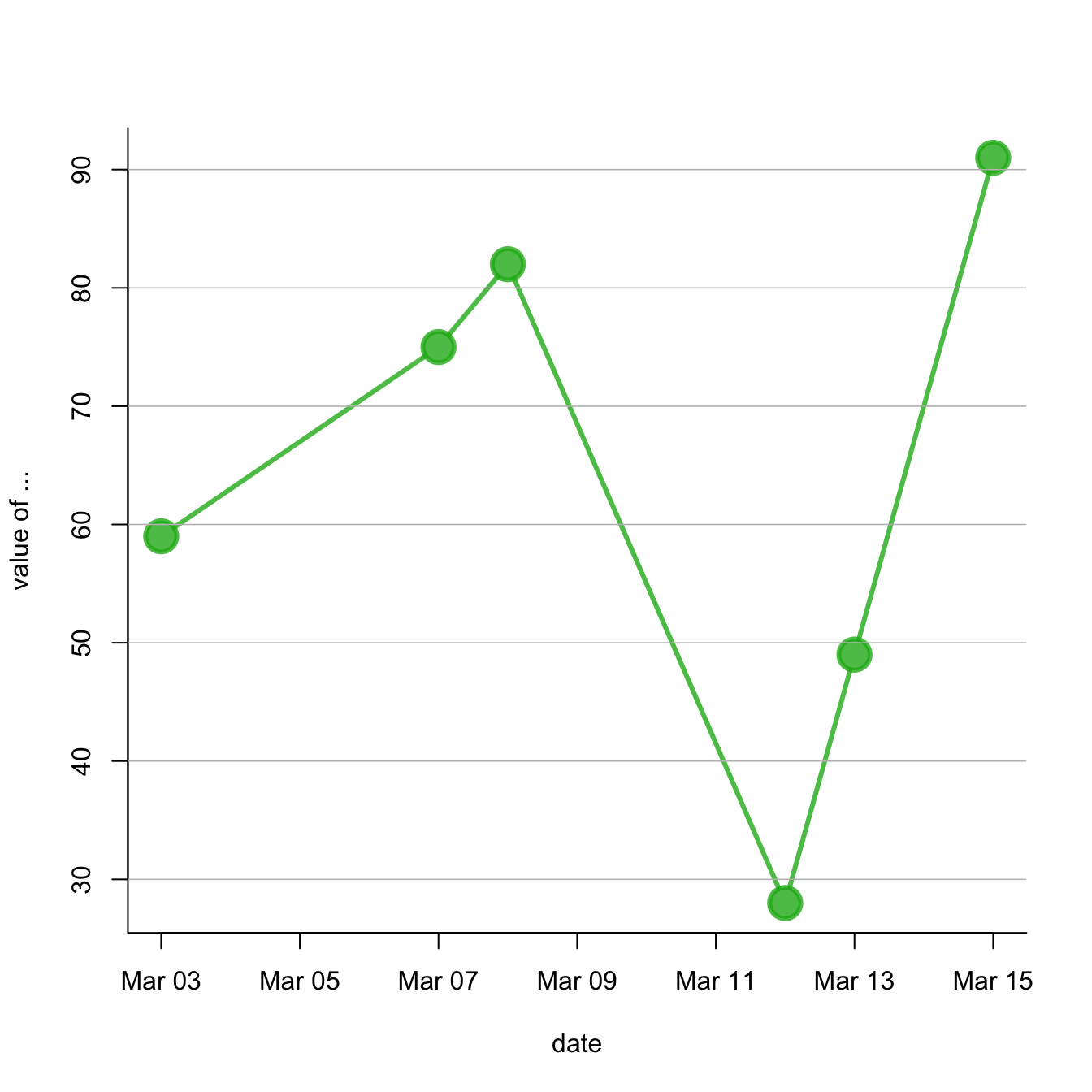
You can use the as.Date() function to specify that a
column is at the date format. Now, with a bit of customization, we
can get a nice
connected scatterplot from
our data:
# Create data
set.seed(124)
date <- paste(   "2015/03/" , sample(seq(1,31),6) , sep="")
value <- sample(seq(1,100) , 6)
data <- data.frame(date,value)

# Let's change the date to the "date" format:
data$date <- as.Date(data$date)

# So we can sort the table:
data <- data[order(data$date) , ]

# Easy to make it better now:
plot(data$value~data$date , type="b" , lwd=3 , col=rgb(0.1,0.7,0.1,0.8) , ylab="value of ..." , xlab="date" , bty="l" , pch=20 , cex=4)
abline(h=seq(0,100,10) , col="grey", lwd=0.8)