Circular Scatterplot
Circular scatterplot has already been extensively described in chart #224 and #225.
Here is a reminder:
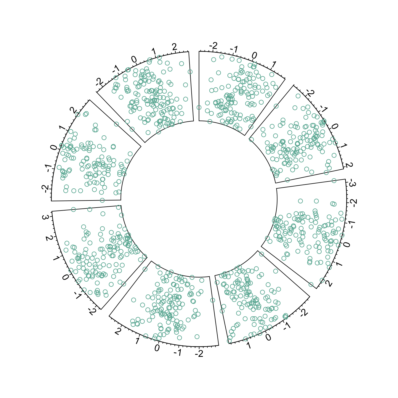
# Upload library
library(circlize)
circos.par("track.height" = 0.4)

# Create data
data = data.frame(
    factor = sample(letters[1:8], 1000, replace = TRUE),
    x = rnorm(1000),
    y = runif(1000)
    )

# Step1: Initialise the chart giving factor and x-axis.
circos.initialize( factors=data$factor, x=data$x )

# Step 2: Build the regions.
circos.trackPlotRegion(factors = data$factor, y = data$y, panel.fun = function(x, y) {
    circos.axis()
    })

# Step 3: Add points
circos.trackPoints(data$factor, data$x, data$y, col="#69b3a2")
Circular Line chart
It is possible to switch to line chart using the
circos.trackLines() function. Visit the
line chart section of the gallery to
learn how to customize that kind of chart.
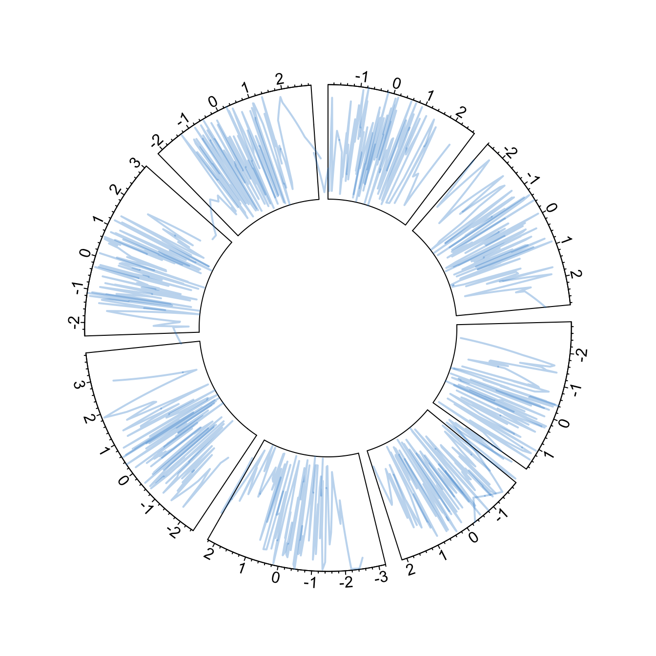
# Upload library
library(circlize)
circos.par("track.height" = 0.4)

# Create data
data = data.frame(
    factor = sample(letters[1:8], 1000, replace = TRUE),
    x = rnorm(1000),
    y = runif(1000)
    )

# Step1: Initialise the chart giving factor and x-axis.
circos.initialize( factors=data$factor, x=data$x )

# Step 2: Build the regions.
circos.trackPlotRegion(factors = data$factor, y = data$y, panel.fun = function(x, y) {
    circos.axis()
    })

# Step 3: Add points
circos.trackLines(data$factor, data$x[order(data$x)], data$y[order(data$x)], col = rgb(0.1,0.5,0.8,0.3), lwd=2)
Vertical ablines
The circos.trackLines() function can also be used to
display vertical ablines.
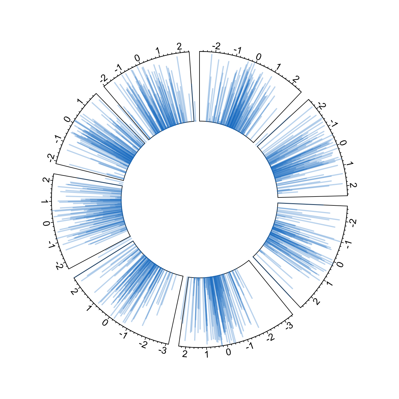
# Upload library
library(circlize)
circos.par("track.height" = 0.4)

# Create data
data = data.frame(
    factor = sample(letters[1:8], 1000, replace = TRUE),
    x = rnorm(1000),
    y = runif(1000)
    )

# Step1: Initialise the chart giving factor and x-axis.
circos.initialize( factors=data$factor, x=data$x )

# Step 2: Build the regions.
circos.trackPlotRegion(factors = data$factor, y = data$y, panel.fun = function(x, y) {
    circos.axis()
    })

# Step 3: Add points
circos.trackLines(data$factor, data$x[order(data$x)], data$y[order(data$x)], col = rgb(0.1,0.5,0.8,0.3), lwd=2, type="h")
Circular histogram
Note that each plot type must be coherent with what you specified in
the circos.trackPlotRegion function.
You have to specify an Y axis for a scatterplot as seen before. But
not for a histogram that is built with
circos.trackHist().
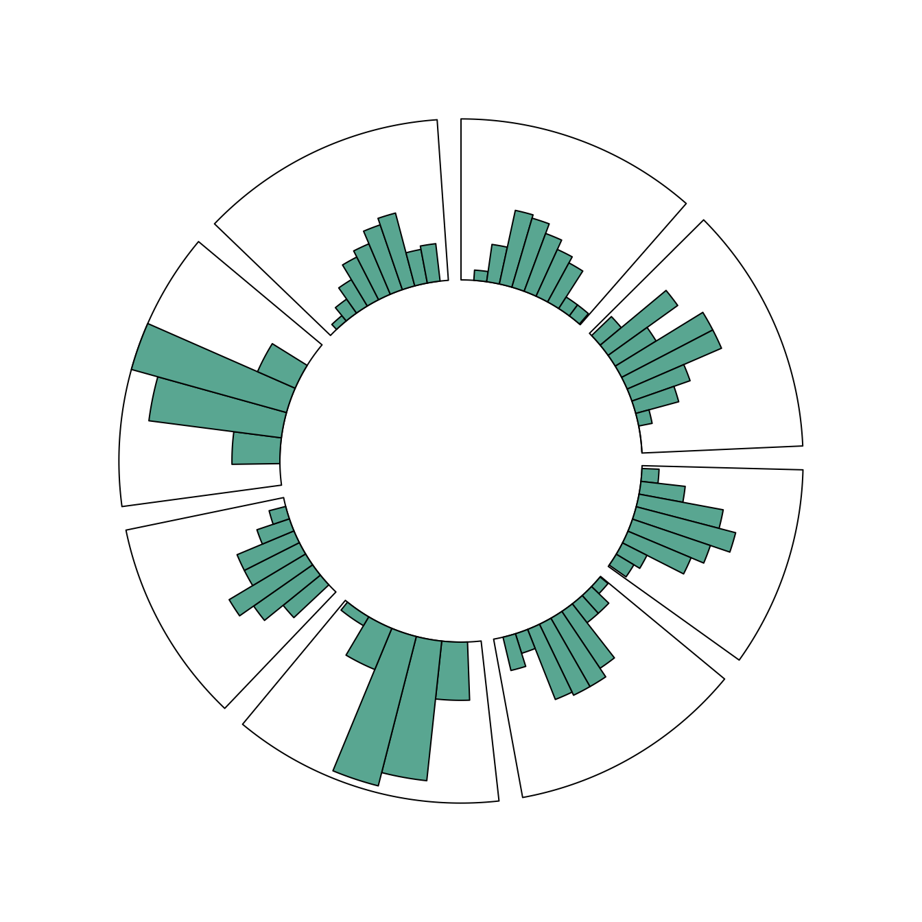
# Upload library
library(circlize)
circos.par("track.height" = 0.4)

# Create data
data = data.frame(
    factor = sample(letters[1:8], 1000, replace = TRUE),
    x = rnorm(1000),
    y = runif(1000)
    )

# Step1: Initialise the chart giving factor and x-axis.
circos.initialize( factors=data$factor, x=data$x )

circos.trackHist(data$factor, data$x, bg.col = "white", col = "#69b3a2")