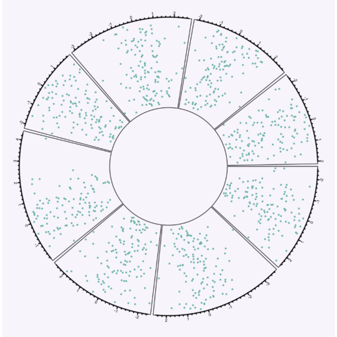
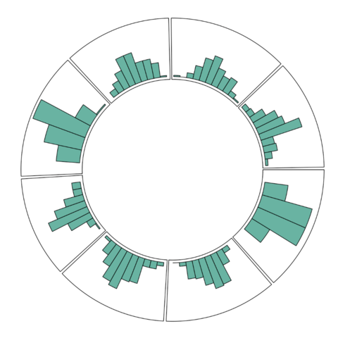
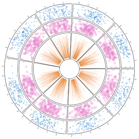
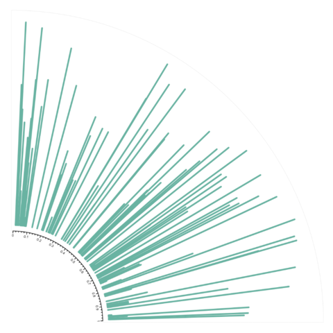
The circlize package allows to build all kinds of circular chart. This first section introduces the way it works, step by step. Chord diagram are described in the following section, but a basic understanding of the library is necessary at first.
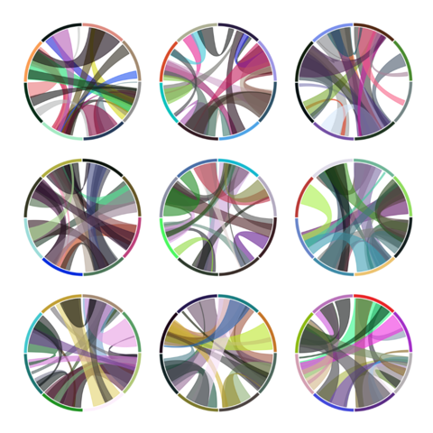
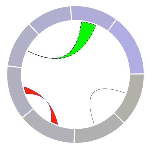
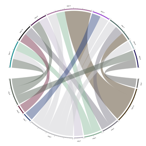
The circlize package also offers
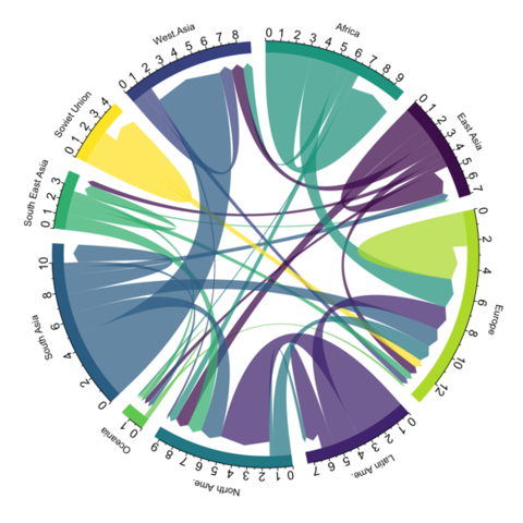
functions to build chord diagrams. Basically, it allows to add arcs
between nodes to show flows. The examples below will guide you through
their usage. The circos.links() function builds
connection one by one, when chordDiagram() plot a whole
dataset in one shot.
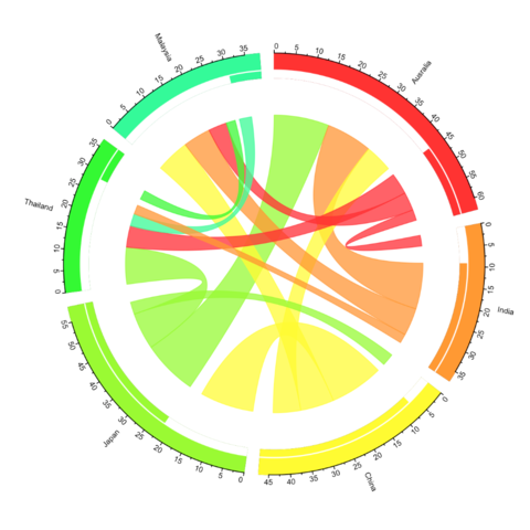
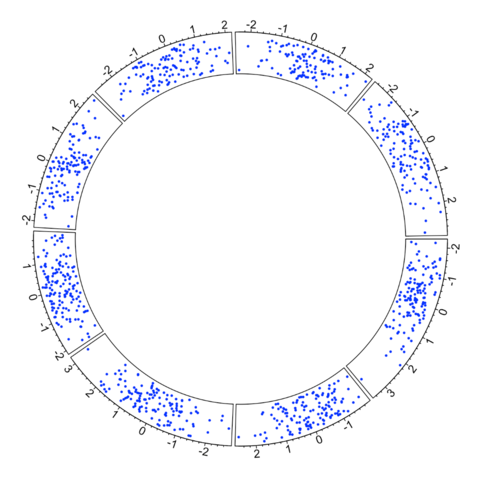
The chorddiag package is an htmlwidget: it automatically builds interactive charts. On the chart below, hovering a group or a connection will highlight the related flow and give additional information.
Note: The example below comes directly from the chorddiag documentation. Thanks to Mattflor for developping such a nice package.
How to export to .png Chart code