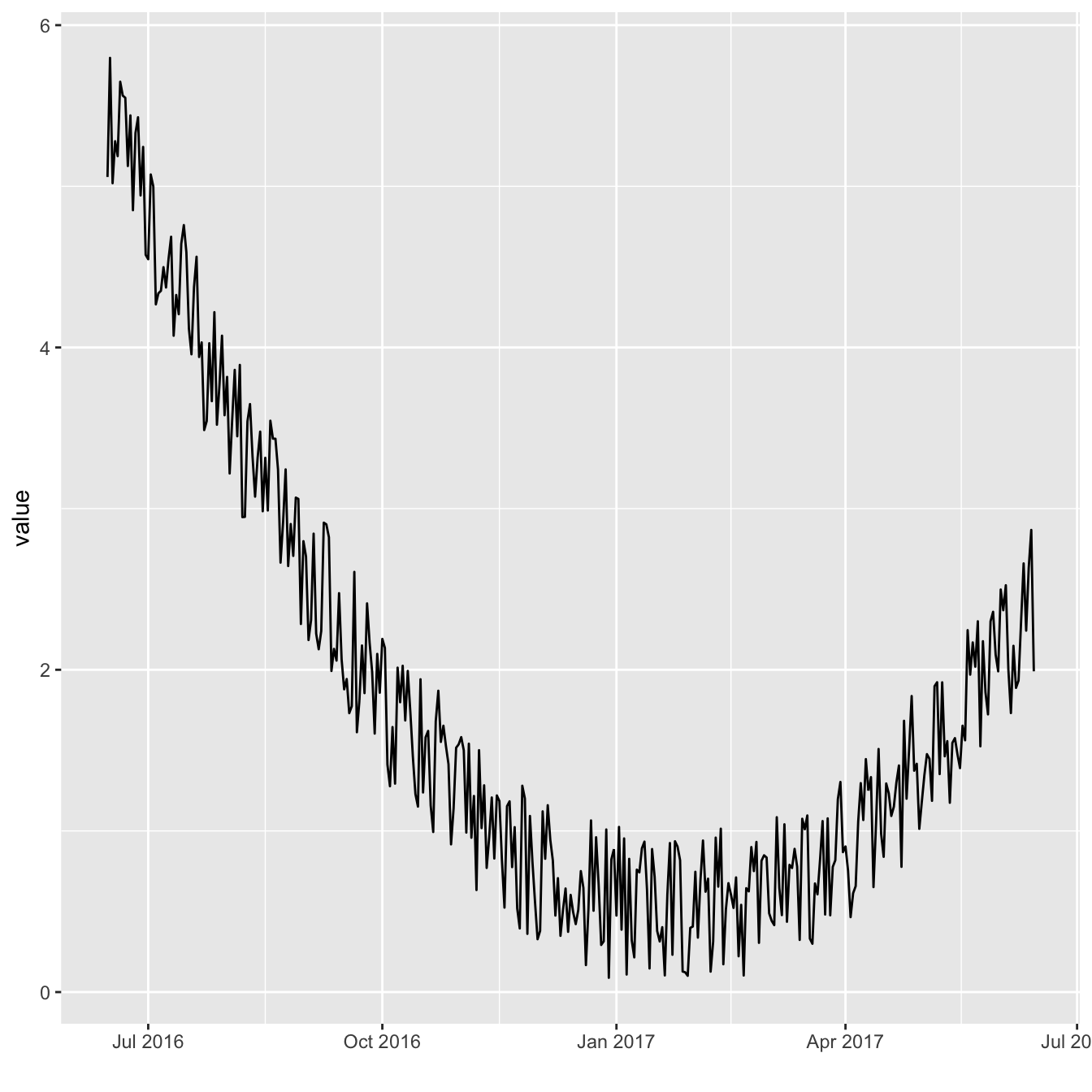
Basic line chart for time series with ggplot2
The ggplot2 package recognizes the date format and automatically uses a specific type of X axis. If the time variable isn’t at the date format, this won’t work. Always check with str(data) how variables are understood by R. If not read as a date, use lubridate to convert it. Read more about this here.
On the chart beside, dates are displayed using a neat format: month + year.
Note: the gallery offers a section dedicated to line charts.
# Libraries
library(ggplot2)
library(dplyr)

# Dummy data
data <- data.frame(
  day = as.Date("2017-06-14") - 0:364,
  value = runif(365) + seq(-140, 224)^2 / 10000
)

# Most basic bubble plot
p <- ggplot(data, aes(x=day, y=value)) +
  geom_line() +
  xlab("")
p
Format used on the X axis
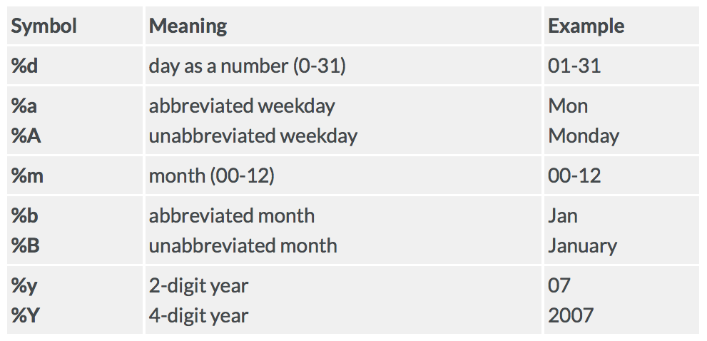
As soon as the time variable is recognized as a date, you can use the scale_x_date() function to choose the format displayed on the X axis.
Below are 4 examples on how to call the function. See beside the list of available options. (source)
p+scale_x_date(date_labels = "%b")
p+scale_x_date(date_labels = "%Y %b %d")
p+scale_x_date(date_labels = "%W")
p+scale_x_date(date_labels = "%m-%Y")


Breaks and minor breaks
It also possible to control the amount of break and minor breaks to display with date_breaks and date_minor_breaks.
p + scale_x_date(date_breaks = "1 week", date_labels = "%W")
p + scale_x_date(date_minor_breaks = "2 day")

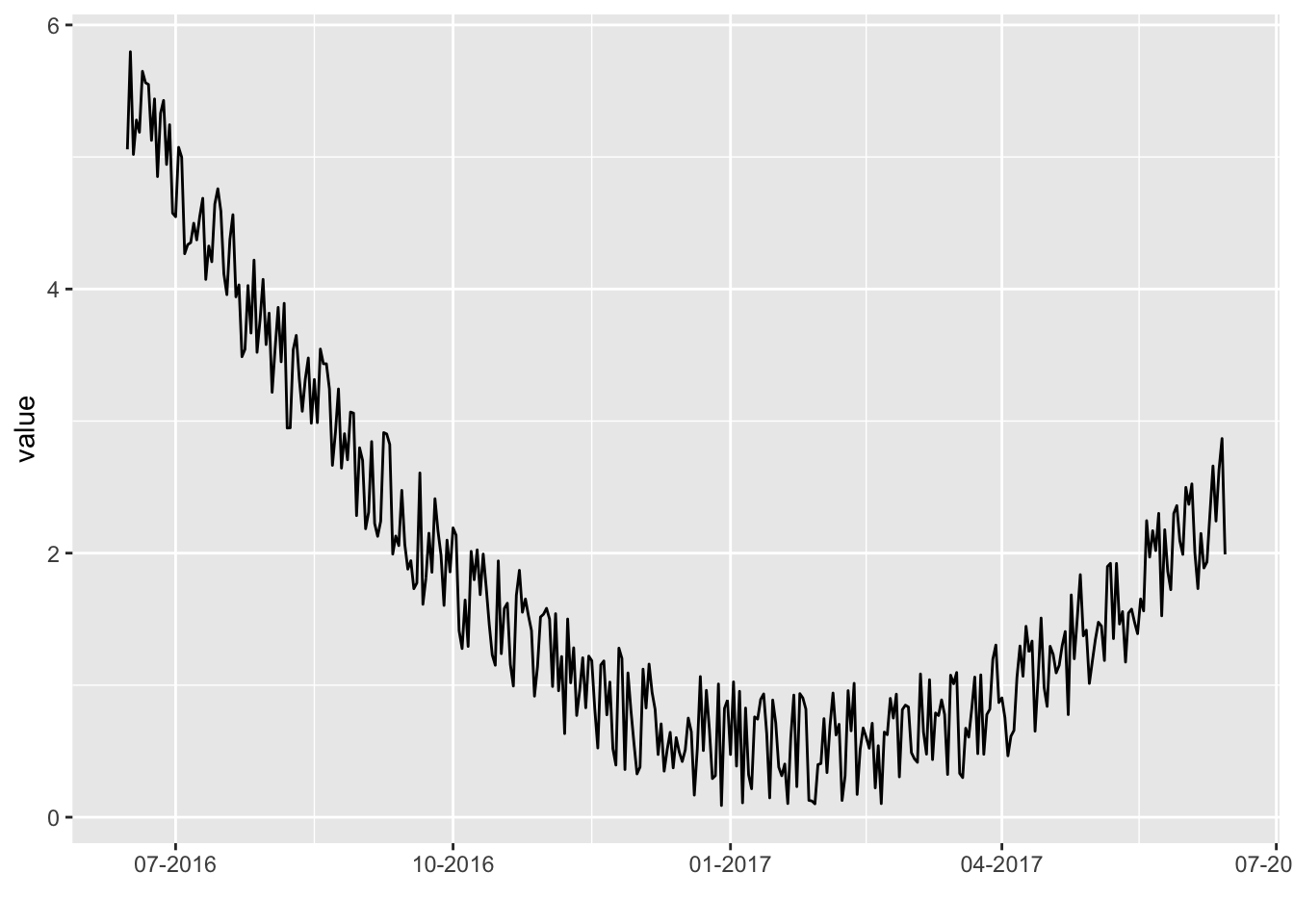
Add angle to X axis labels
The ggplot2 package recognizes the date format and automatically uses a specific type of X axis. If the time variable isn’t at the date format, this won’t work. Always check with str(data) how variables are understood by R. If not read as a date, use lubridate to convert it. Read more about this here.
On the chart beside, dates are displayed using a neat format: month + year.
Note: the gallery offers a section dedicated to line charts.
# Libraries
library(ggplot2)
library(dplyr)
library(hrbrthemes)
# Dummy data
data <- data.frame(
day = as.Date("2017-06-14") - 0:364,
value = runif(365) - seq(-140, 224)^2 / 10000
)
# Most basic bubble plot
p <- ggplot(data, aes(x=day, y=value)) +
geom_line( color="#69b3a2") +
xlab("") +
theme_ipsum() +
theme(axis.text.x=element_text(angle=60, hjust=1))
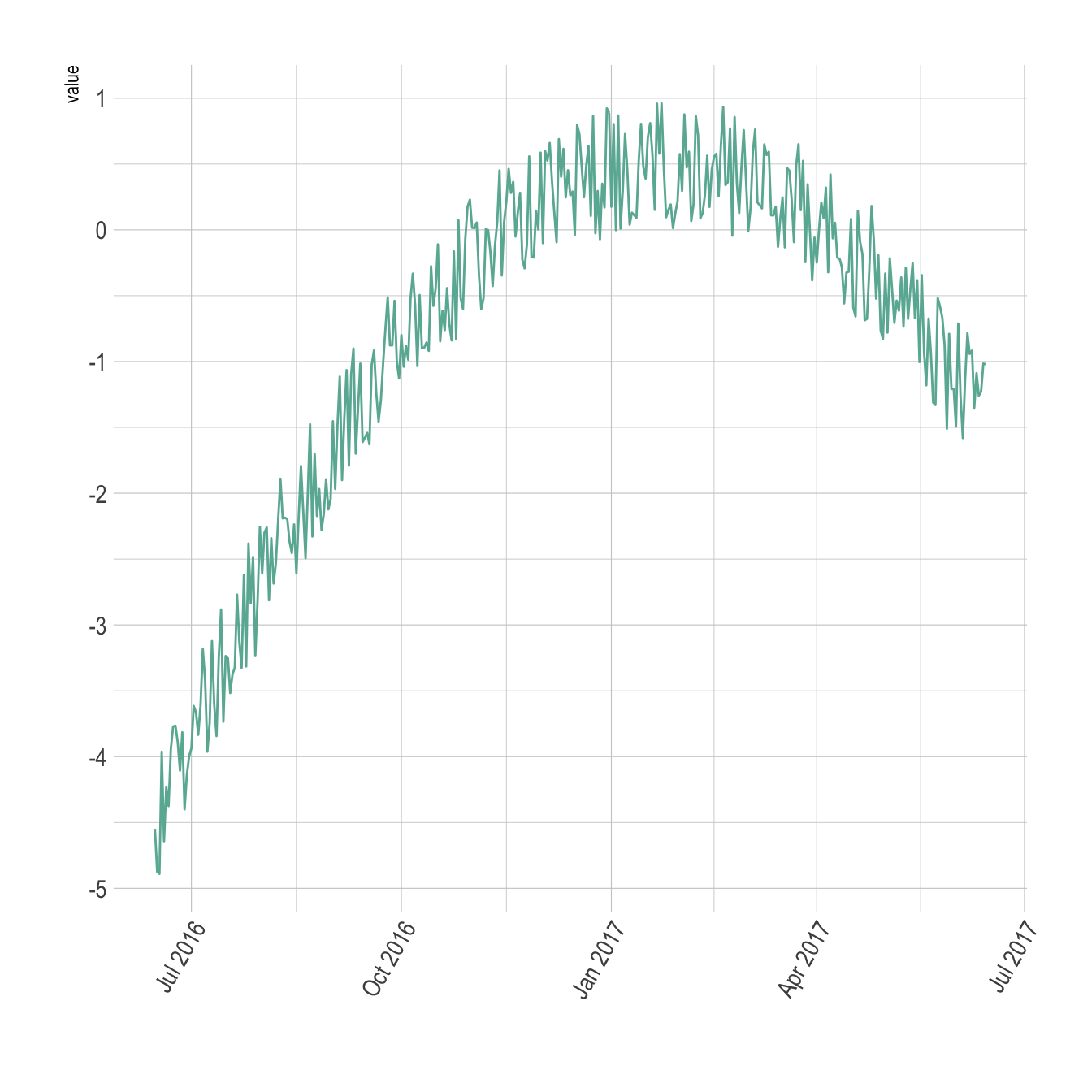
pSelect time frame
Use the limit option of the scale_x_date() function to select a time frame in the data:
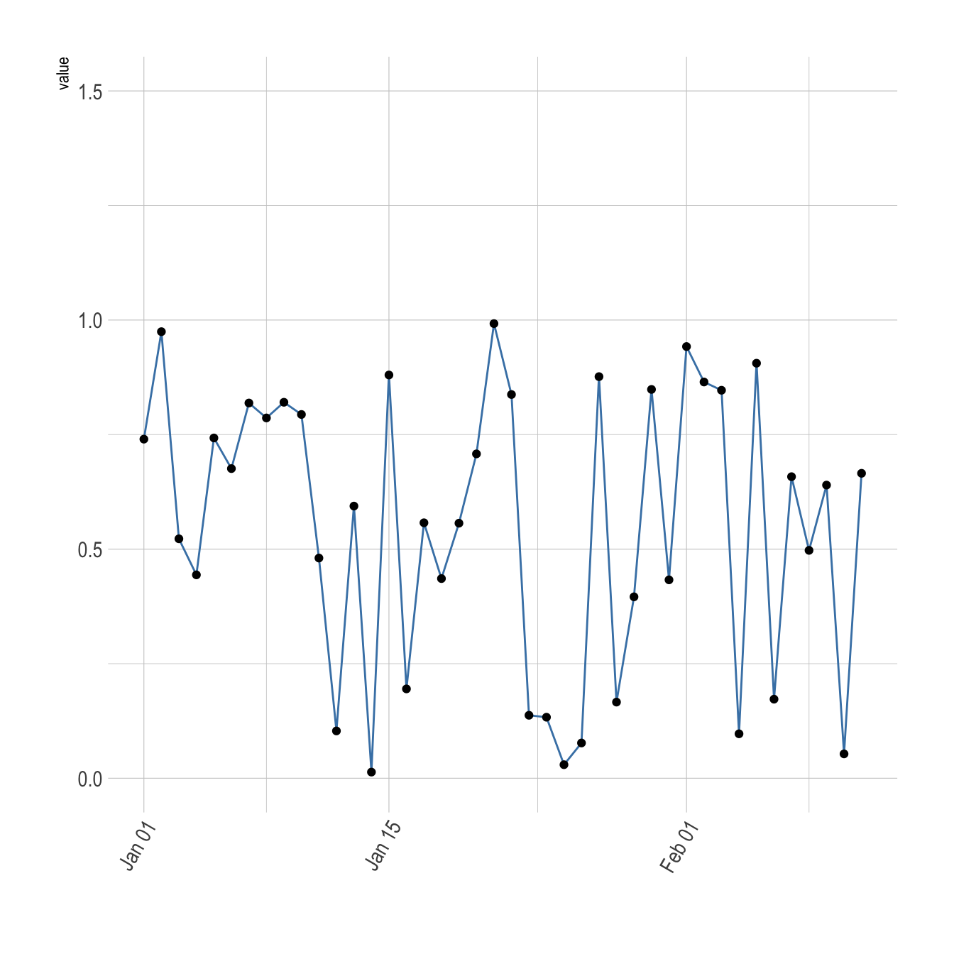
# Libraries
library(ggplot2)
library(dplyr)
library(hrbrthemes)

# Dummy data
data <- data.frame(
  day = as.Date("2017-06-14") - 0:364,
  value = runif(365) + seq(-140, 224)^2 / 10000
)

# Most basic bubble plot
p <- ggplot(data, aes(x=day, y=value)) +
  geom_line( color="steelblue") +
  geom_point() +
  xlab("") +
  theme_ipsum() +
  theme(axis.text.x=element_text(angle=60, hjust=1)) +
  scale_x_date(limit=c(as.Date("2017-01-01"),as.Date("2017-02-11"))) +
  ylim(0,1.5)

p