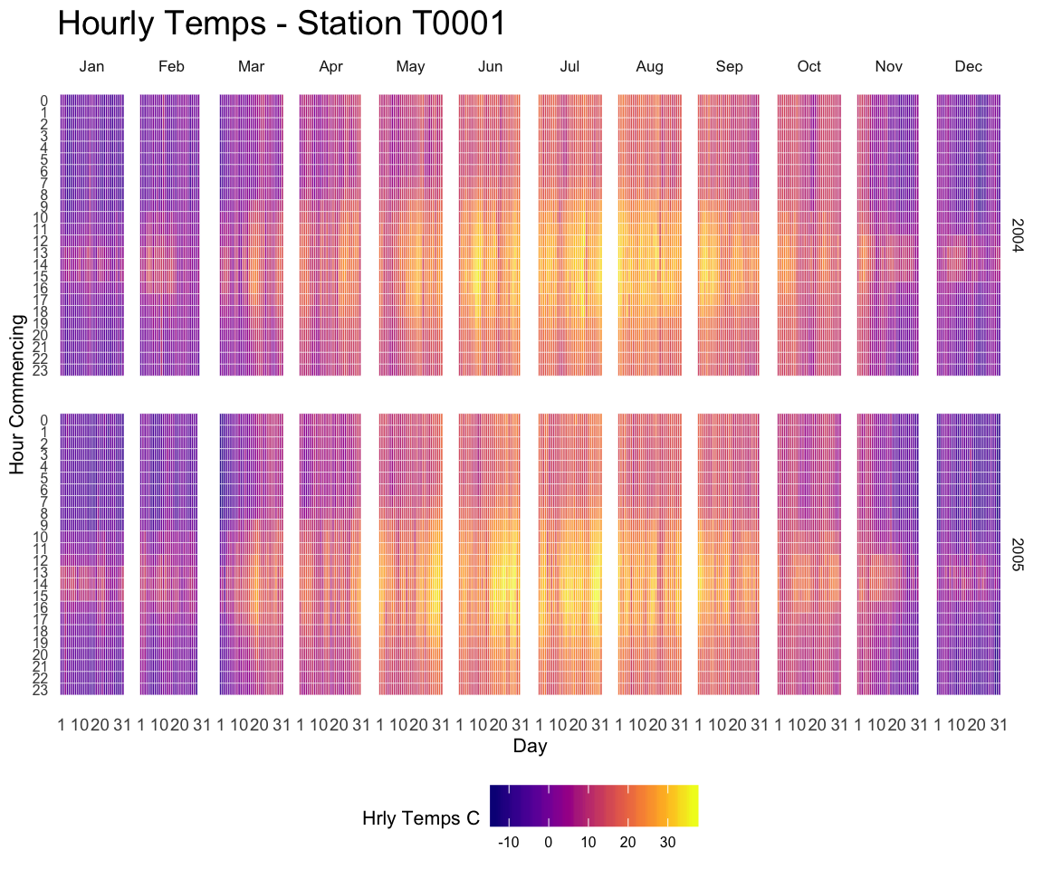
A submission by John MacKintosh who visualized meteorological data using a heatmap built with ggplot2. Initial code is stored on github and displayed below:
library(ggplot2)
library(dplyr) # easier data wrangling
library(viridis) # colour blind friendly palette, works in B&W also
library(Interpol.T) #  will generate a large dataset on initial load
library(lubridate) # for easy date manipulation
library(ggExtra) # because remembering ggplot theme options is beyond me
library(tidyr)


data <- data(Trentino_hourly_T,package = "Interpol.T")

names(h_d_t)[1:5]<- c("stationid","date","hour","temp","flag")
df <- tbl_df(h_d_t) %>%
  filter(stationid =="T0001")

df <- df %>% mutate(year = year(date),
                  month = month(date, label=TRUE),
                  day = day(date))

df$date<-ymd(df$date) # not necessary for plot but
#useful if you want to do further work with the data

#cleanup
rm(list=c("h_d_t","mo_bias","Tn","Tx",
          "Th_int_list","calibration_l",
          "calibration_shape","Tm_list"))


#create plotting df
df <-df %>% select(stationid,day,hour,month,year,temp)%>%
        fill(temp) #optional - see note below

# Re: use of fill
# This code is for demonstrating a visualisation technique
# There are 5 missing hourly values in the dataframe.

# see the original plot here (from my ggplot demo earlier this year) to see the white spaces where the missing values occcur:
# https://github.com/johnmackintosh/ggplotdemo/blob/master/temp8.png

# I used 'fill' from  tidyr to take the prior value for each missing value and replace the NA
# This is a quick fix for the blog post only - _do not_ do this with your real world data

# Should really use either use replace_NA or complete(with fill)in tidyr
# OR
# Look into more specialist way of replacing these missing values -e.g. imputation.


statno <-unique(df$stationid)


######## Plotting starts here#####################
p <-ggplot(df,aes(day,hour,fill=temp))+
  geom_tile(color= "white",size=0.1) +
  scale_fill_viridis(name="Hrly Temps C",option ="C")
p <-p + facet_grid(year~month)
p <-p + scale_y_continuous(trans = "reverse", breaks = unique(df$hour))
p <-p + scale_x_continuous(breaks =c(1,10,20,31))
p <-p + theme_minimal(base_size = 8)
p <-p + labs(title= paste("Hourly Temps - Station",statno), x="Day", y="Hour Commencing")
p <-p + theme(legend.position = "bottom")+
  theme(plot.title=element_text(size = 14))+
  theme(axis.text.y=element_text(size=6)) +
  theme(strip.background = element_rect(colour="white"))+
  theme(plot.title=element_text(hjust=0))+
  theme(axis.ticks=element_blank())+
  theme(axis.text=element_text(size=7))+
  theme(legend.title=element_text(size=8))+
  theme(legend.text=element_text(size=6))+
  removeGrid()#ggExtra

# you will want to expand your plot screen before this bit!
p #awesomeness