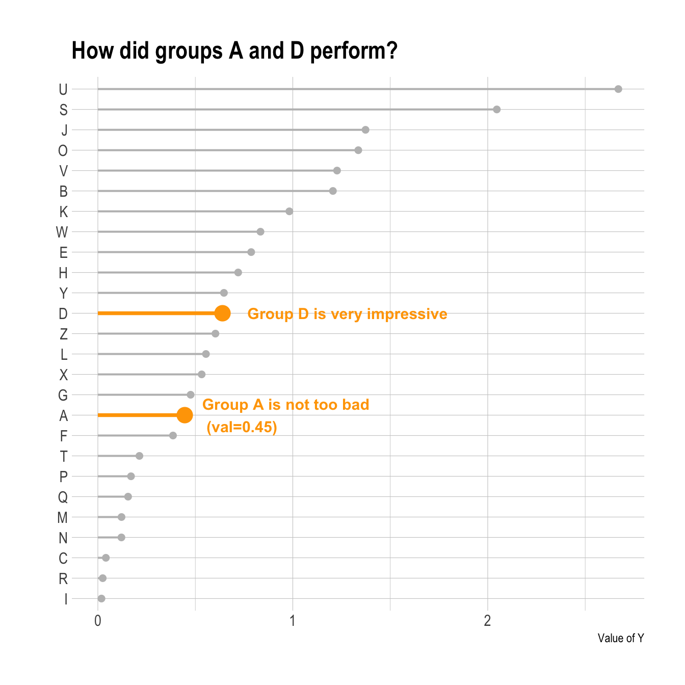
Annotation is key in data visualization: it allows the reader to focus on the main message you want to convey.
If one or a few groups specifically interest you, it is a good practice to highlight them on the plot. Your reader will understand quicker what the story behind the chart is.
To do so, you can use an ifelse statement to change
size, color, alpha or any
other aesthetics. Moreover, it is even more insightful to add text
annotation directly on the chart.
Learn more about ggplot2 annotation here and more generally in the ggplot2 section.
# Library
library(ggplot2)
library(dplyr)
library(hrbrthemes)

# Create data
set.seed(1000)
data <- data.frame(
  x=LETTERS[1:26],
  y=abs(rnorm(26))
)

# Reorder the data
data <- data %>%
  arrange(y) %>%
  mutate(x=factor(x,x))

# Plot
p <- ggplot(data, aes(x=x, y=y)) +
  geom_segment(
    aes(x=x, xend=x, y=0, yend=y),
    color=ifelse(data$x %in% c("A","D"), "orange", "grey"),
    size=ifelse(data$x %in% c("A","D"), 1.3, 0.7)
  ) +
  geom_point(
    color=ifelse(data$x %in% c("A","D"), "orange", "grey"),
    size=ifelse(data$x %in% c("A","D"), 5, 2)
  ) +
  theme_ipsum() +
  coord_flip() +
  theme(
    legend.position="none"
  ) +
  xlab("") +
  ylab("Value of Y") +
  ggtitle("How did groups A and D perform?")

# Add annotation
p + annotate("text", x=grep("D", data$x), y=data$y[which(data$x=="D")]*1.2,
           label="Group D is very impressive",
           color="orange", size=4 , angle=0, fontface="bold", hjust=0) +

    annotate("text", x = grep("A", data$x), y = data$y[which(data$x=="A")]*1.2,
           label = paste("Group A is not too bad\n (val=",data$y[which(data$x=="A")] %>% round(2),")",sep="" ) ,
           color="orange", size=4 , angle=0, fontface="bold", hjust=0)
What’s next
The lollipop chart is one of my favourite. There is so much to do with
it and it is under-utilized in favor of barplot. Visit the
dedicated section for more examples
produced with R, or
data-to-viz
to learn about the available variations and caveats to avoid.
