The waffle package
The waffle package is the best way to build a waffle chart in R. You can read more about this package on its github page. Something important to note is that you can’t install it directly from the CRAN. Instead, use this command line:
install.packages("waffle", repos = "https://cinc.rud.is")There are 2 main ways to build a waffle chart using this library:
-
using the
geom_wafflegeom inside aggplot2call - using the
waffle()function
We will focus on the second option in this blogpost.
Data input: vector
The waffle function accepts 2 kinds of input: a vector or a data frame.
Let’s start with a first example based on a vector input. The
vector is a list of values. Each value will be represented as a
set of rectangles. The rows argument controls how
many rows will be displayed on the chart.
By default, categories will be labeled A, B, C.. and so on. We will see later how to customize this.
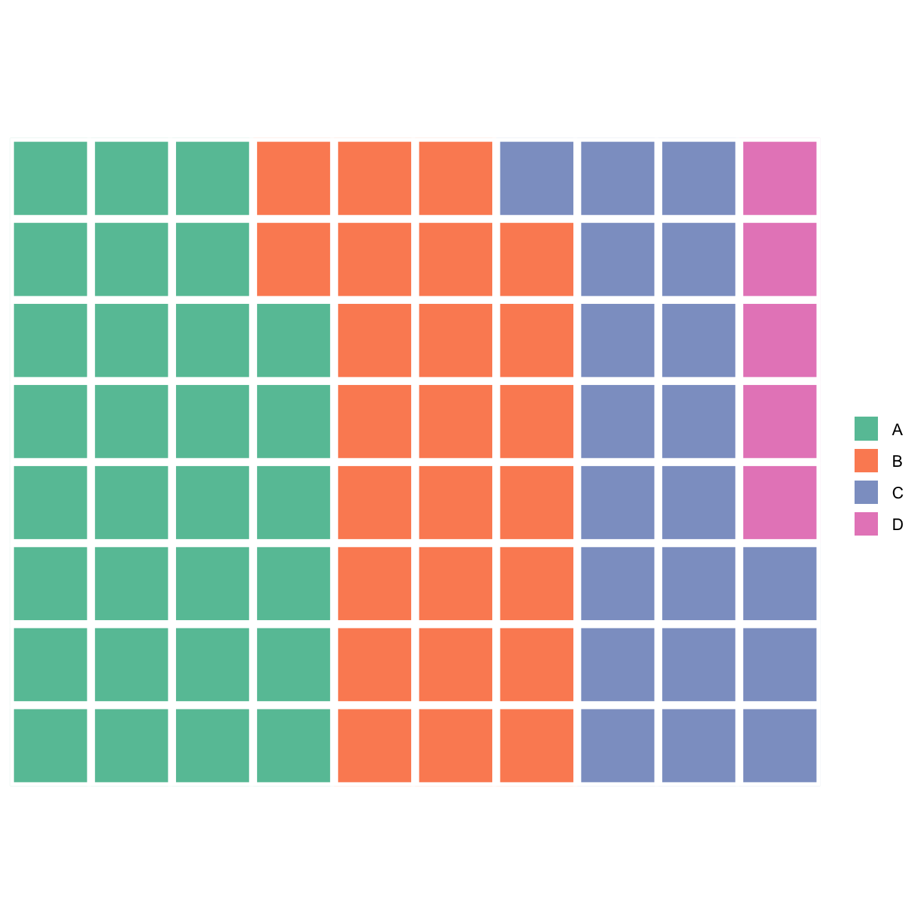
# Load the library
library(waffle)

# Vector
x <- c(30, 25, 20, 5)

# Waffle chart
waffle(x, rows = 8)
Data input: data frame
We can also build a waffle plot from a data frame.
Here a simple example with pizza topings.
The data frame requires 2 columns: the first one provides the labels, the second the quantities of each group.
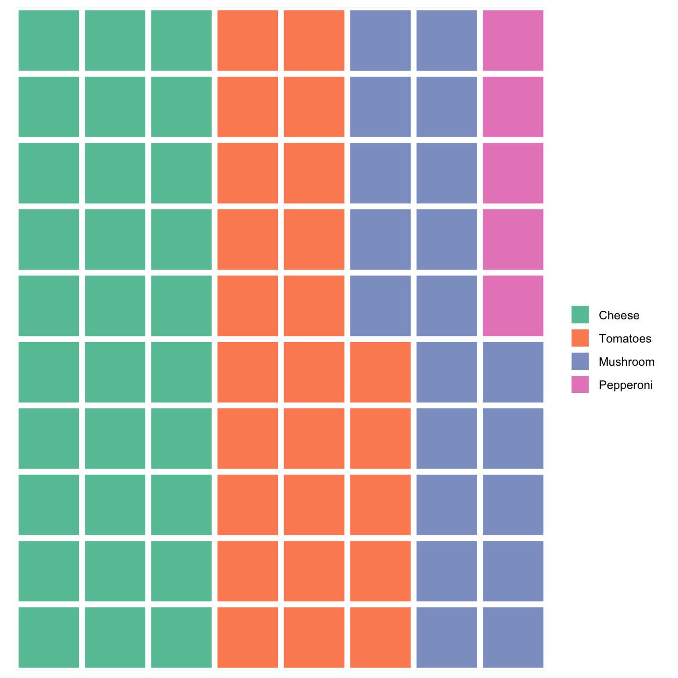
# install.packages("waffle", repos = "https://cinc.rud.is")
library(waffle)

# Creating a simple data frame
mypizza <- data.frame(
  ingredients = c("Cheese","Tomatoes","Mushroom","Pepperoni"),
  vals = c(30, 25, 20, 5)
)

waffle(mypizza)
Waffle chart with customization
The waffle function allows a lot of customization to make the graphic more pleasant. In this example:
- a title is added (
titleattribute) - the width of the grid is controled with
size -
some custom colors are picked to match the ingredient
(
colors) -
the legend is put at the bottom of the chart
(
legend_pos)
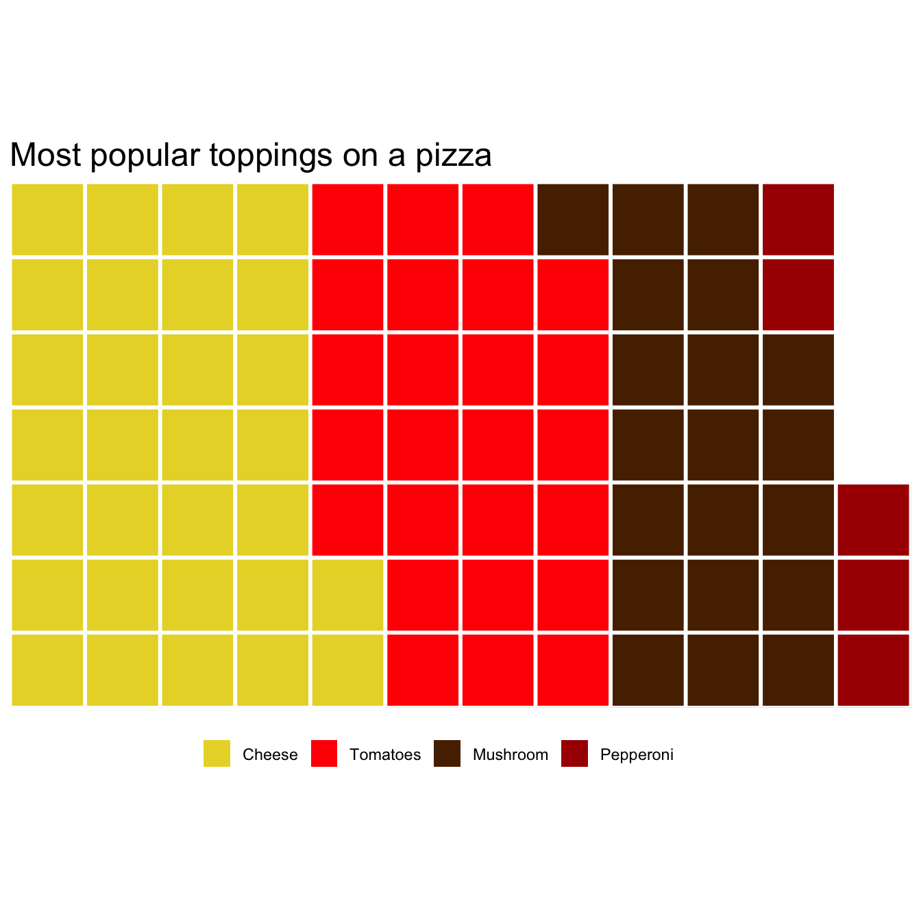
library(waffle)

# Creating a simple data frame
mypizza <- data.frame(
  ingredients = c("Cheese","Tomatoes","Mushroom","Pepperoni"),
  vals = c(30, 25, 20, 5)
)

waffle(mypizza,
   rows = 7, # Numbers of rows
   size = 1, # width of the separator between blocks
   colors = c("#E8D630", "#FF0000", "#582900","#A91101"), # Colors of each group
   legend_pos = "bottom", # Position of the legend
   title = "Most popular toppings on a pizza" # Title
)
Conclusion
That’s a very quick introduction to waffle charts with R using the
waffle package. There is much more you can do using this
package, so feel free to visit the
waffle section of the gallery tp
browse more examples.