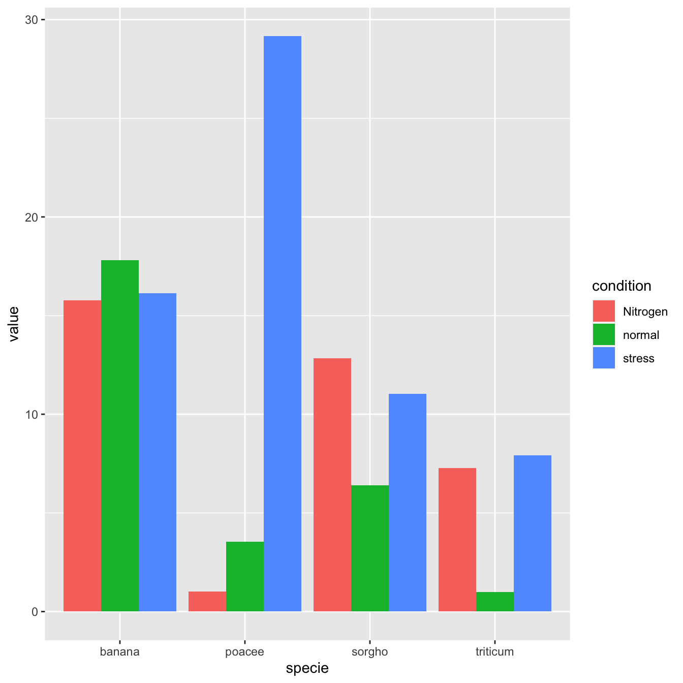
Grouped barchart
A grouped barplot display a numeric value for a set of entities
split in groups and subgroups. Before trying to build one, check
how to make a
basic barplot
with R and ggplot2.
A few explanation about the code below:
-
input dataset must provide 3 columns: the numeric value
(
value), and 2 categorical variables for the group (specie) and the subgroup (condition) levels. -
in the
aes()call, x is the group (specie), and the subgroup (condition) is given to thefillargument. -
in the
geom_bar()call,position="dodge"must be specified to have the bars one beside each other.
# library
library(ggplot2)
# create a dataset
specie <- c(rep("sorgho" , 3) , rep("poacee" , 3) , rep("banana" , 3) , rep("triticum" , 3) )
condition <- rep(c("normal" , "stress" , "Nitrogen") , 4)
value <- abs(rnorm(12 , 0 , 15))
data <- data.frame(specie,condition,value)
# Grouped
ggplot(data, aes(fill=condition, y=value, x=specie)) +
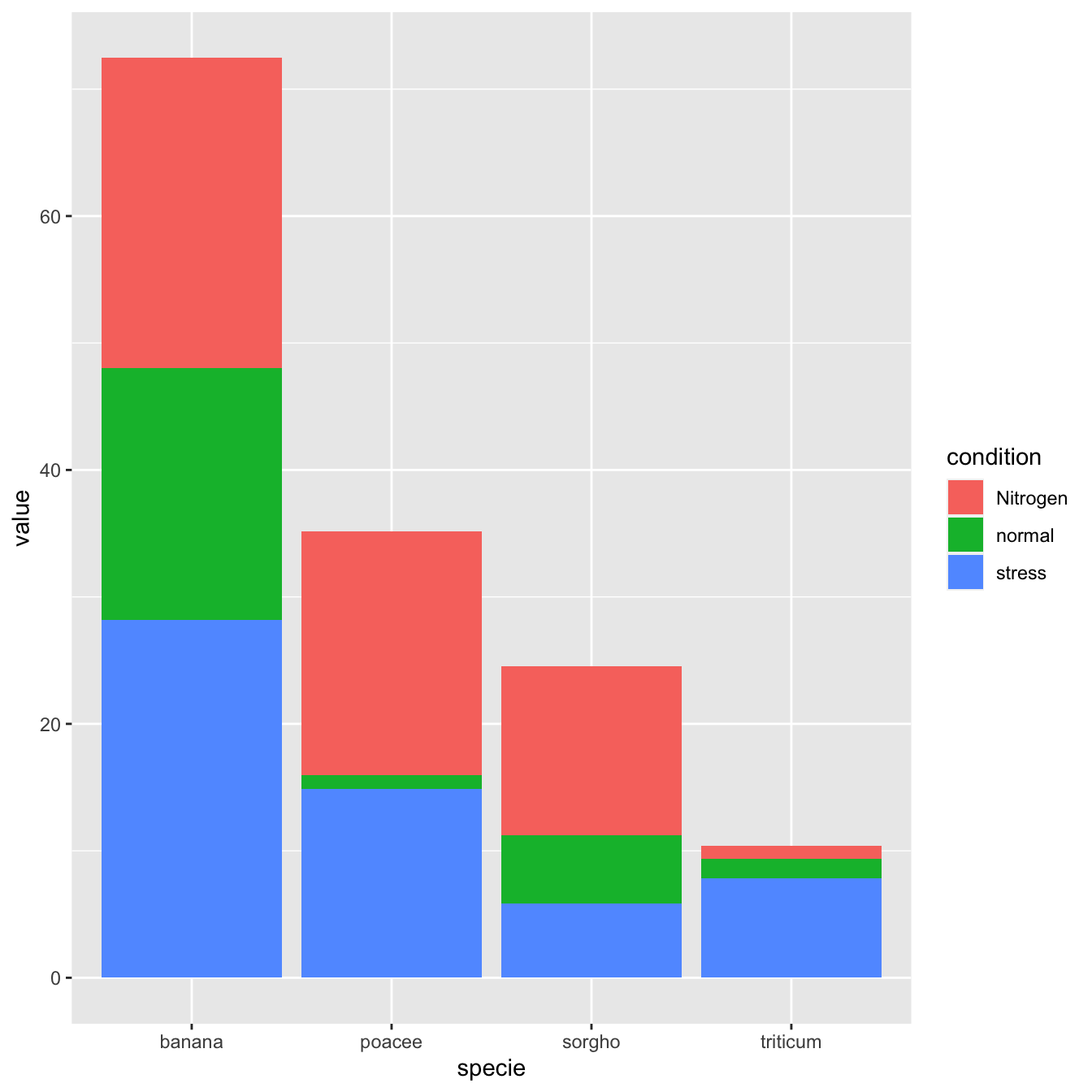
geom_bar(position="dodge", stat="identity")Stacked barchart
A stacked barplot is very similar to the grouped barplot above. The subgroups are just displayed on top of each other, not beside.
The only thing to change to get this figure is to switch the
position argument to stack.
# library
library(ggplot2)
# create a dataset
specie <- c(rep("sorgho" , 3) , rep("poacee" , 3) , rep("banana" , 3) , rep("triticum" , 3) )
condition <- rep(c("normal" , "stress" , "Nitrogen") , 4)
value <- abs(rnorm(12 , 0 , 15))
data <- data.frame(specie,condition,value)
# Stacked
ggplot(data, aes(fill=condition, y=value, x=specie)) +
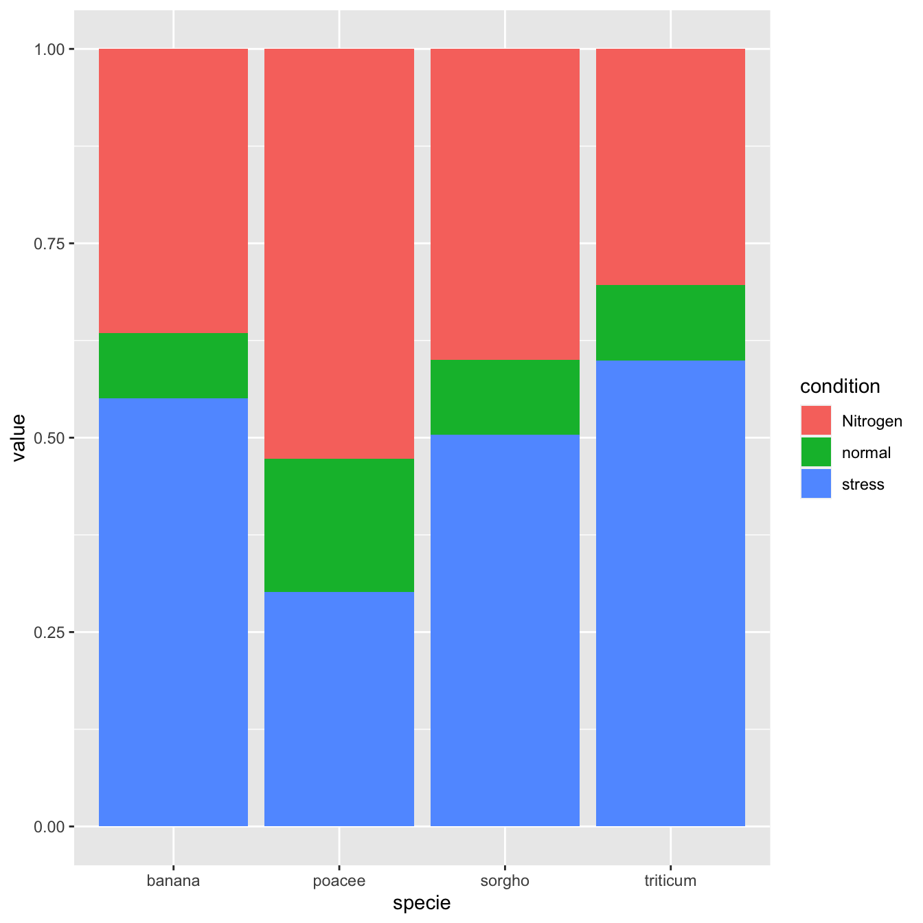
geom_bar(position="stack", stat="identity")Percent stacked barchart
Once more, there is not much to do to switch to a percent stacked
barplot. Just switch to position="fill". Now, the
percentage of each subgroup is represented, allowing to study the
evolution of their proportion in the whole.
# library
library(ggplot2)
# create a dataset
specie <- c(rep("sorgho" , 3) , rep("poacee" , 3) , rep("banana" , 3) , rep("triticum" , 3) )
condition <- rep(c("normal" , "stress" , "Nitrogen") , 4)
value <- abs(rnorm(12 , 0 , 15))
data <- data.frame(specie,condition,value)
# Stacked + percent
ggplot(data, aes(fill=condition, y=value, x=specie)) +
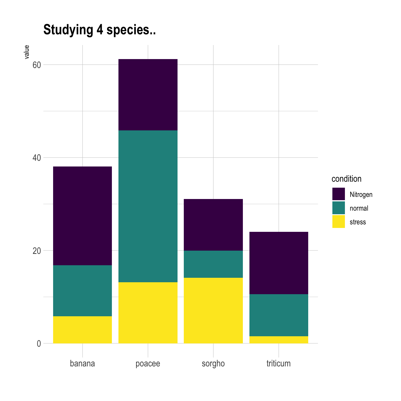
geom_bar(position="fill", stat="identity")Grouped barchart customization
As usual, some customization are often necessary to make the chart look better and personnal. Let’s:
# library
library(ggplot2)
library(viridis)
library(hrbrthemes)

# create a dataset
specie <- c(rep("sorgho" , 3) , rep("poacee" , 3) , rep("banana" , 3) , rep("triticum" , 3) )
condition <- rep(c("normal" , "stress" , "Nitrogen") , 4)
value <- abs(rnorm(12 , 0 , 15))
data <- data.frame(specie,condition,value)

# Small multiple
ggplot(data, aes(fill=condition, y=value, x=specie)) +
    geom_bar(position="stack", stat="identity") +
    scale_fill_viridis(discrete = T) +
    ggtitle("Studying 4 species..") +
    theme_ipsum() +
    xlab("")
Small multiple
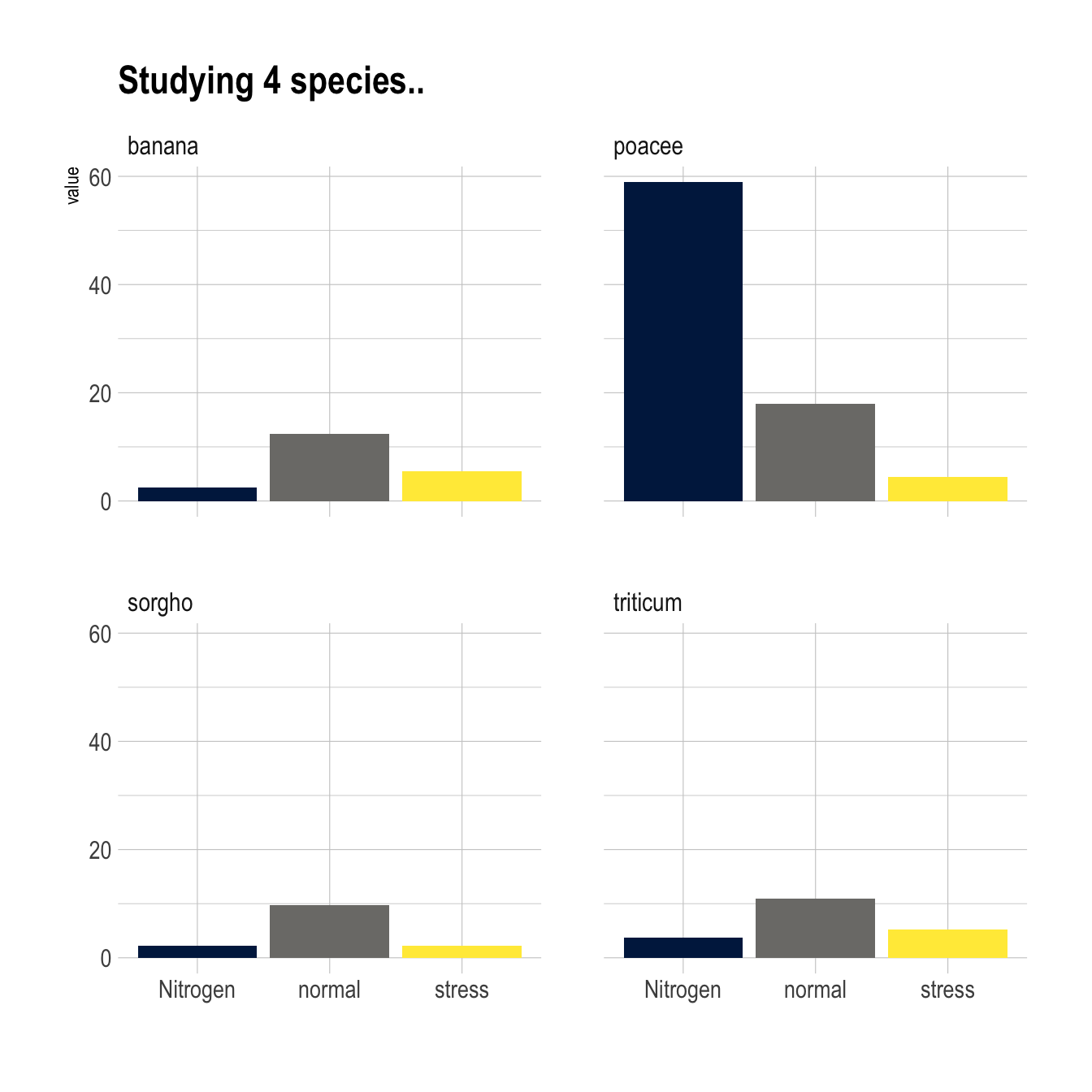
Small multiple can be used as an alternative of stacking or
grouping. It is straightforward to make thanks to the
facet_wrap() function.
# library
library(ggplot2)
library(viridis)
library(hrbrthemes)

# create a dataset
specie <- c(rep("sorgho" , 3) , rep("poacee" , 3) , rep("banana" , 3) , rep("triticum" , 3) )
condition <- rep(c("normal" , "stress" , "Nitrogen") , 4)
value <- abs(rnorm(12 , 0 , 15))
data <- data.frame(specie,condition,value)

# Graph
ggplot(data, aes(fill=condition, y=value, x=condition)) +
    geom_bar(position="dodge", stat="identity") +
    scale_fill_viridis(discrete = T, option = "E") +
    ggtitle("Studying 4 species..") +
    facet_wrap(~specie) +
    theme_ipsum() +
    theme(legend.position="none") +
    xlab("")


