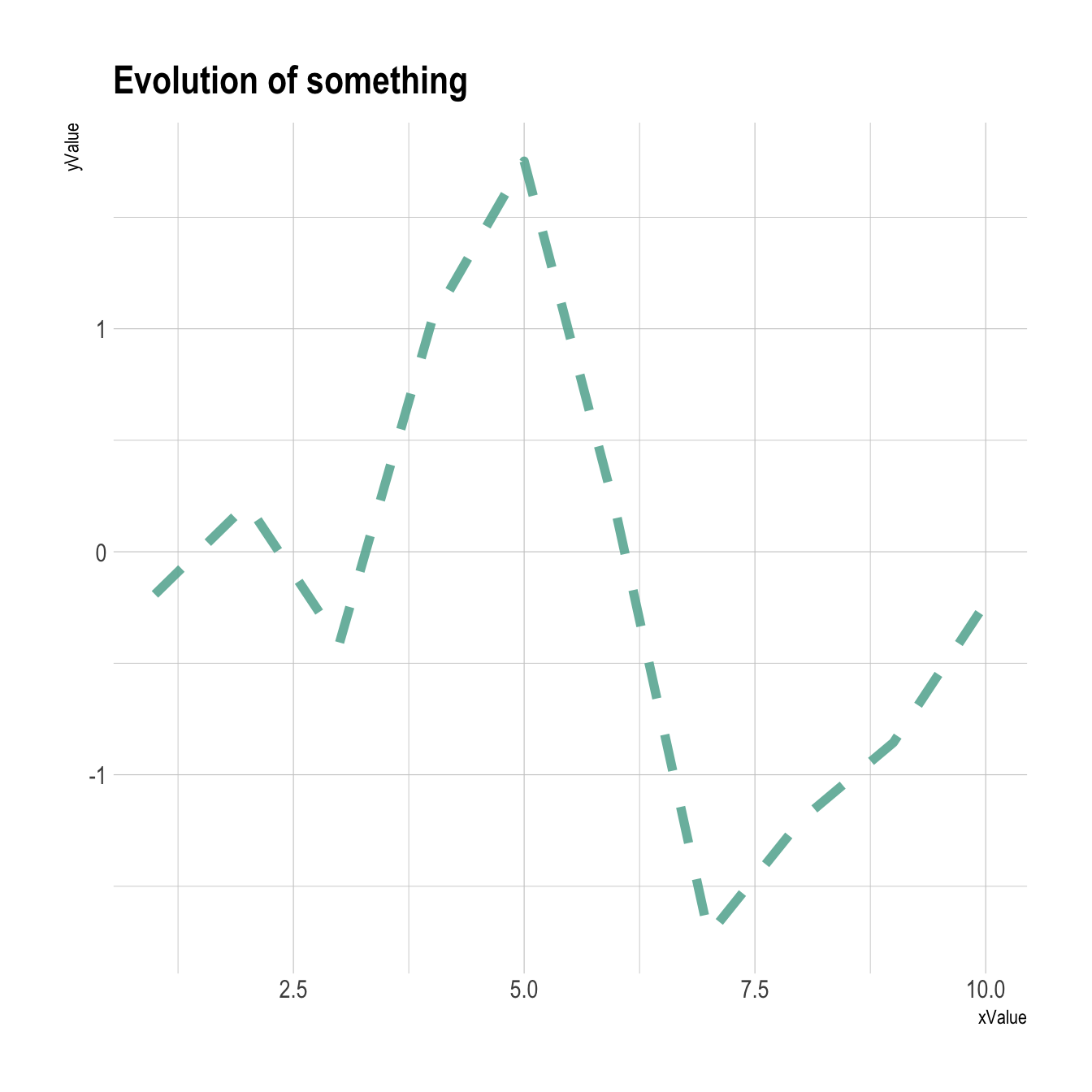
Basic line chart with ggplot2 and geom_line()
A line chart or line graph displays the evolution of one or several numeric variables. Data points are usually connected by straight line segments. You read an extensive definition here.
The input data frame requires at least 2 columns:
- An ordered numeric variable for the X axis
- Another numeric variable for the Y axis
Once the data is read by ggplot2 and those 2 variables are specified
in the x and y arguments of the
aes(), just call the geom_line() function.
# Libraries
library(ggplot2)

# create data
xValue <- 1:10
yValue <- cumsum(rnorm(10))
data <- data.frame(xValue,yValue)

# Plot
ggplot(data, aes(x=xValue, y=yValue)) +
  geom_line()
Customize the line chart
Several options are available to customize the line chart appearance:
- Add a title with
ggtitle(). -
Change line style with arguments like
shape,size,colorand more. -
Custom the general theme with the
theme_ipsum()function of thehrbrthemespackage.
More generally, visit the [ggplot2 section] for more ggplot2 related stuff.