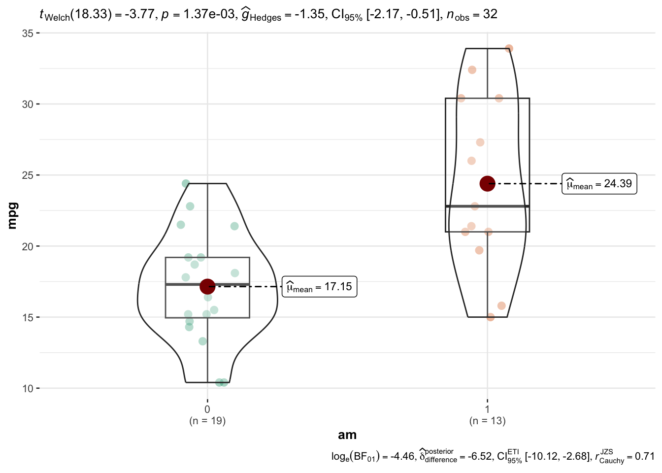
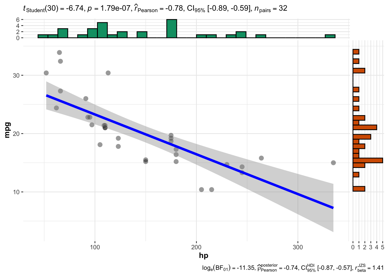
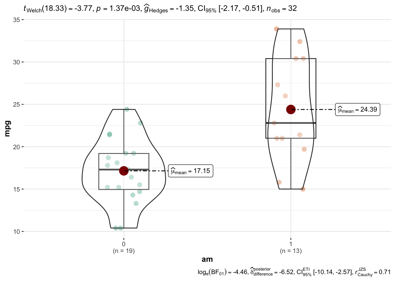
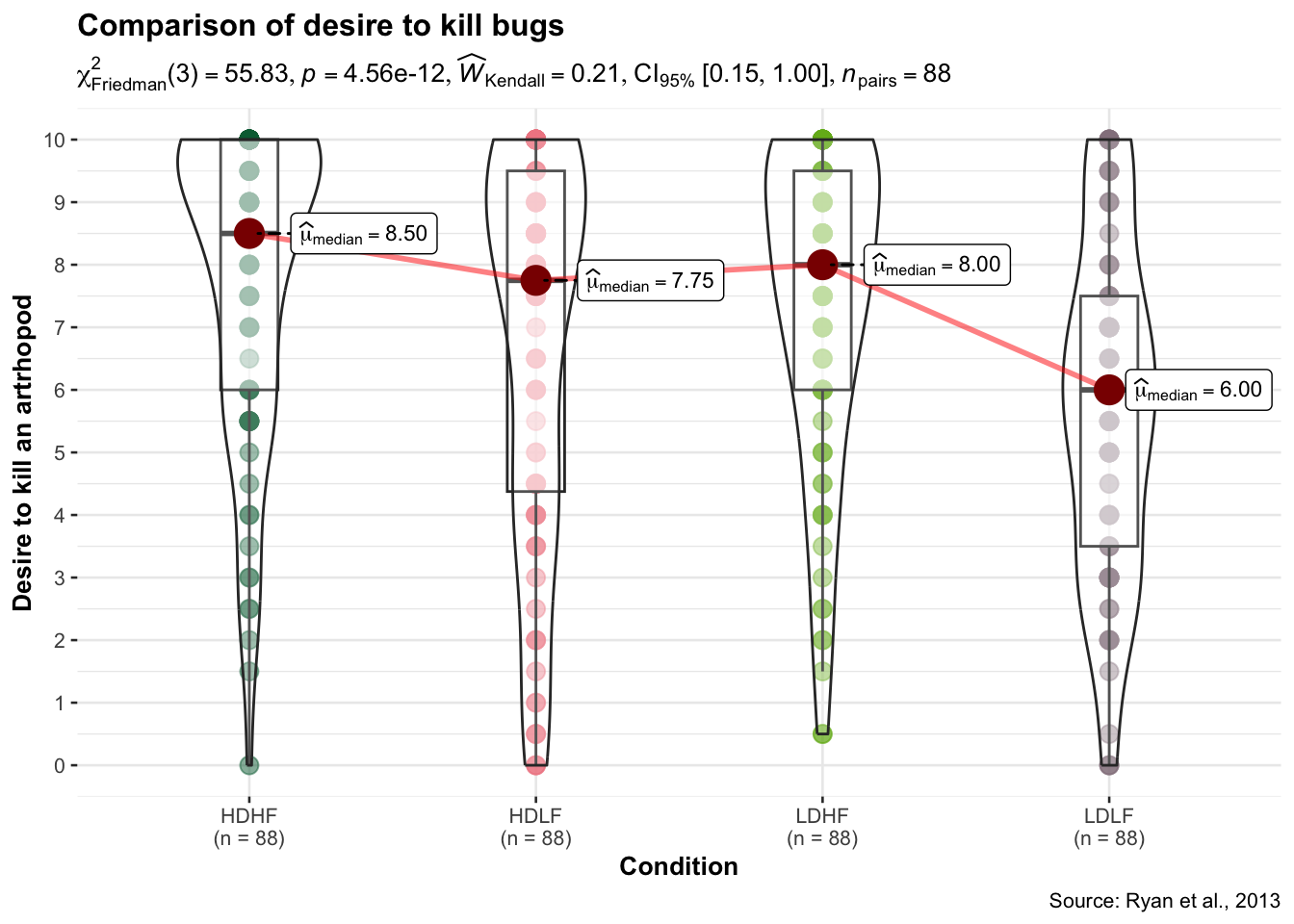
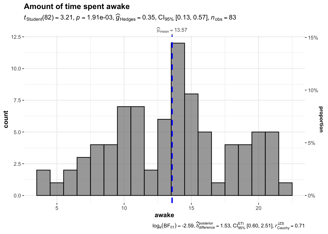
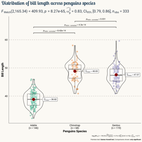
The ggstatsplot
package in R is
an extension of the ggplot2
package, designed to facilitate the creation of visualizations
accompanied by statistical details.
This post
showcases the key features of ggstatsplot
and provides a set of graph examples using the
package.
{ggstatsplot}
The ggstatsplot
package in R is an extension of the ggplot2
package, designed to facilitate the creation of visualizations
accompanied by relevant statistical details.
It streamlines the process of integrating statistical tests with informative plots, making it easier for researchers and data analysts to communicate their findings effectively.
βοΈ author β Indrajeet Patil
π documentation β github
βοΈ more than 1000 stars on github
Getting started with ggstatsplot
is straightforward.
First, ensure you have ggplot2
installed. Then, you can
install ggstatsplot
directly from CRAN using the
install.packages
function:
The ggstatsplot
package comes with about 9
functions, each of them targeting a specific
statistical test.
For instance, the ggscatterstats()
function visualizes
the relationship between 2 variables x
and y
using a scatterplot. It
runs a linear regression and draw a regression line
that provides a visual representation of the linear relationship between
the two variables. The shaded region around it represents the
confidence interval.
The marginal histograms on the top and right side of
the plot show the distribution of the x
and y
variables, respectively. Additionally, the plot provides statistical
details like correlation coefficient,
p-value, and sample size.
Here is an example using the famous mtcars
dataset,
checking the relationship between the hp
and
mpg
columns:
Now, letβs try to summarize the power of ggstatsplot
through its main functions:
Here is an overview of the main function offered by ggstatsplot with a short description of what they do:
ggbetweenstats()
creates violin plots for
comparisons between groups or conditions, accompanied by results from
statistical tests.
Example:
ggwithinstats()
is used to display data distributions,
descriptive statistics, and statistical tests for different groups
within the same variable.
The function is particularly useful for visualizing and testing differences within a single categorical variable.
Hereβs a simple example using the mtcars dataset that comes built-in with R:
ggwithinstats(
data = bugs_long,
x = condition,
y = desire,
type = "nonparametric", ## type of statistical test
xlab = "Condition", ## label for the x-axis
ylab = "Desire to kill an artrhopod", ## label for the y-axis
package = "yarrr", ## package from which color palette is to be taken
palette = "info2", ## choosing a different color palette
title = "Comparison of desire to kill bugs",
caption = "Source: Ryan et al., 2013"
) + ## modifying the plot further
ggplot2::scale_y_continuous(
limits = c(0, 10),
breaks = seq(from = 0, to = 10, by = 1)
)
gghistostats()
generates histograms to visualize the
distribution of a numeric variable and checks if its mean is
significantly different from a specified value with a one-sample
test:
gghistostats(
data = ggplot2::msleep,
x = awake,
title = "Amount of time spent awake",
test.value = 12,
binwidth = 1
)
Several other functions are available: -
ggdotplotstats()
β Similar to gghistostats()
,
but intended for labeled numeric variables.
ggscatterstats()
β Creates a scatterplot with
marginal distributions overlaid on the axes and results from statistical
tests in the subtitle.
ggcorrmat()
β Produces a correlalogram (a matrix of
correlation coefficients) with statistical details.
ggpiestats()
β Creates a pie chart for categorical
or nominal variables with results from contingency table analysis
included in the subtitle.
ggbarstats()
β An alternative to
ggpiestats()
, this function creates bar charts for
categorical data with associated statistical tests.
ggcoefstats()
β Generates dot-and-whisker plots for
regression models and meta-analysis.
Those functions are described more in depth in other pages of the R graph gallery.