About
This page showcases the work of
Tuo Wang that introduces
packages to make
ggplot2
plots more beautiful. You can find the original code on Tuo’s blog
here.
Thanks to him for accepting sharing his work here! Thanks also to Tomás Capretto who split the original code into this step-by-step guide!
Load packages
Let’s start by loading the packages needed to build the figure.
ggstatsplot
is the showcased package today. ggstatsplot is an
extension of ggplot2 package for creating graphics with details from
statistical tests included in the information-rich plots themselves.
library(ggstatsplot)
library(palmerpenguins)
library(tidyverse)
Load and prepare the dataset
Today’s data were collected and made available by
Dr. Kristen Gorman
and the
Palmer Station, Antarctica LTER, a member of the
Long Term Ecological Research Network. This dataset was popularized by
Allison Horst in her R
package
palmerpenguins
with the goal to offer an alternative to the iris dataset for data
exploration and visualization.
data("penguins", package = "palmerpenguins")The only data preparation step is to simply drop missing values.
penguins <- drop_na(penguins)Basic chart
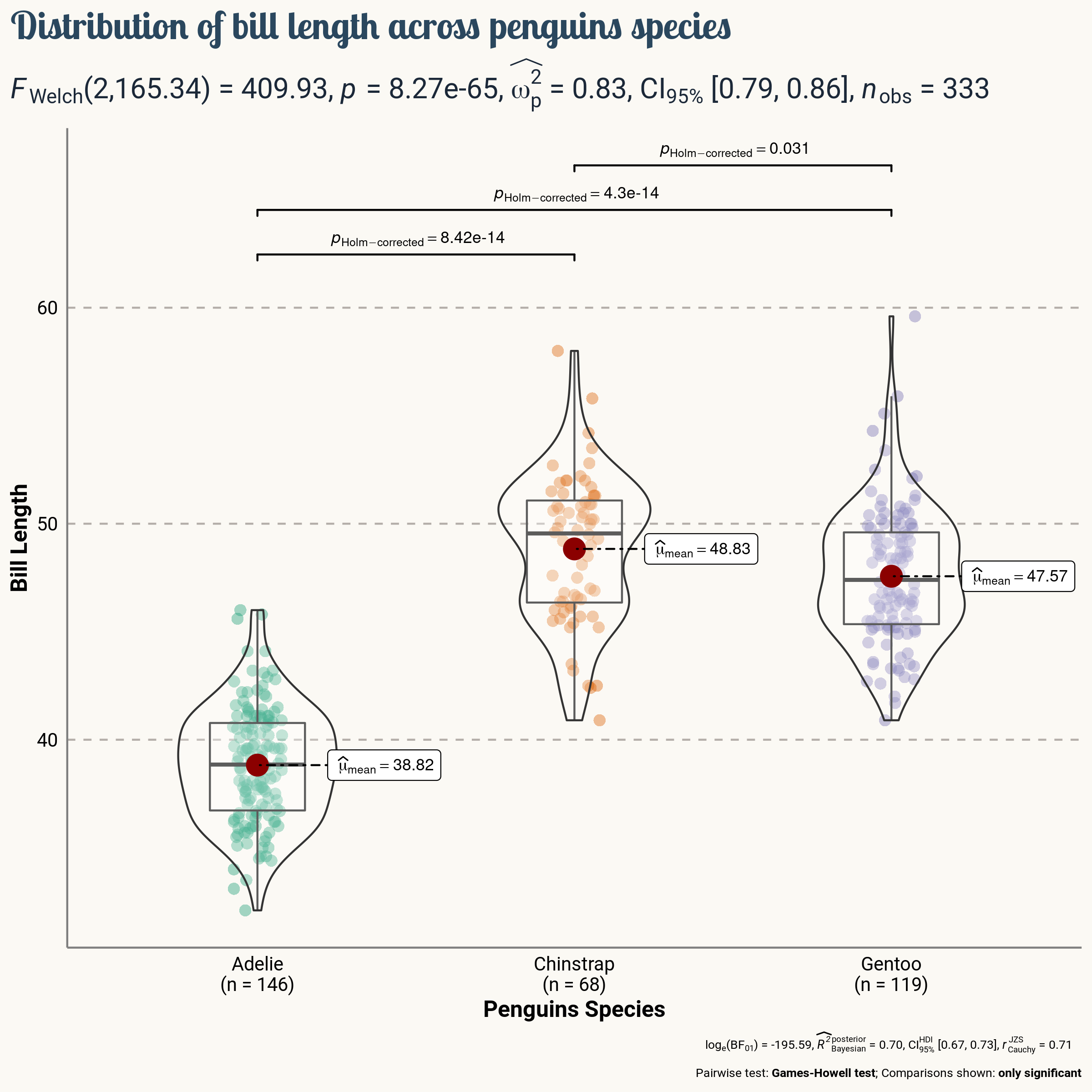
Today’s chart is going to show the distribution of Bill length for
the three species of penguins in the dataset (Adelie, Chinstrap, and
Gentoo). The function ggbetweenstats in the
ggstatsplot is a great fit for this goal. Let’s see how
it works.
plt <- ggbetweenstats(
  data = penguins,
  x = species,
  y = bill_length_mm
)
It’s hard to find where the basic word fits in such a beautiful default plot, isn’t it?
Add title and labels
ggstatsplot has very nice defaults that save a lot of
time and work. But it can’t take over every single aspect of our
charts. This is a good moment to add an appropriate title and labels
with nice-looking styles.
plt <- plt +
  # Add labels and title
  labs(
    x = "Penguins Species",
    y = "Bill Length",
    title = "Distribution of bill length across penguins species"
  ) +
  # Customizations
  theme(
    # This is the new default font in the plot
    text = element_text(family = "Roboto", size = 8, color = "black"),
    plot.title = element_text(
      family = "Lobster Two",
      size = 20,
      face = "bold",
      color = "#2a475e"
    ),
    # Statistical annotations below the main title
    plot.subtitle = element_text(
      family = "Roboto",
      size = 15,
      face = "bold",
      color="#1b2838"
    ),
    plot.title.position = "plot", # slightly different from default
    axis.text = element_text(size = 10, color = "black"),
    axis.title = element_text(size = 12)
  )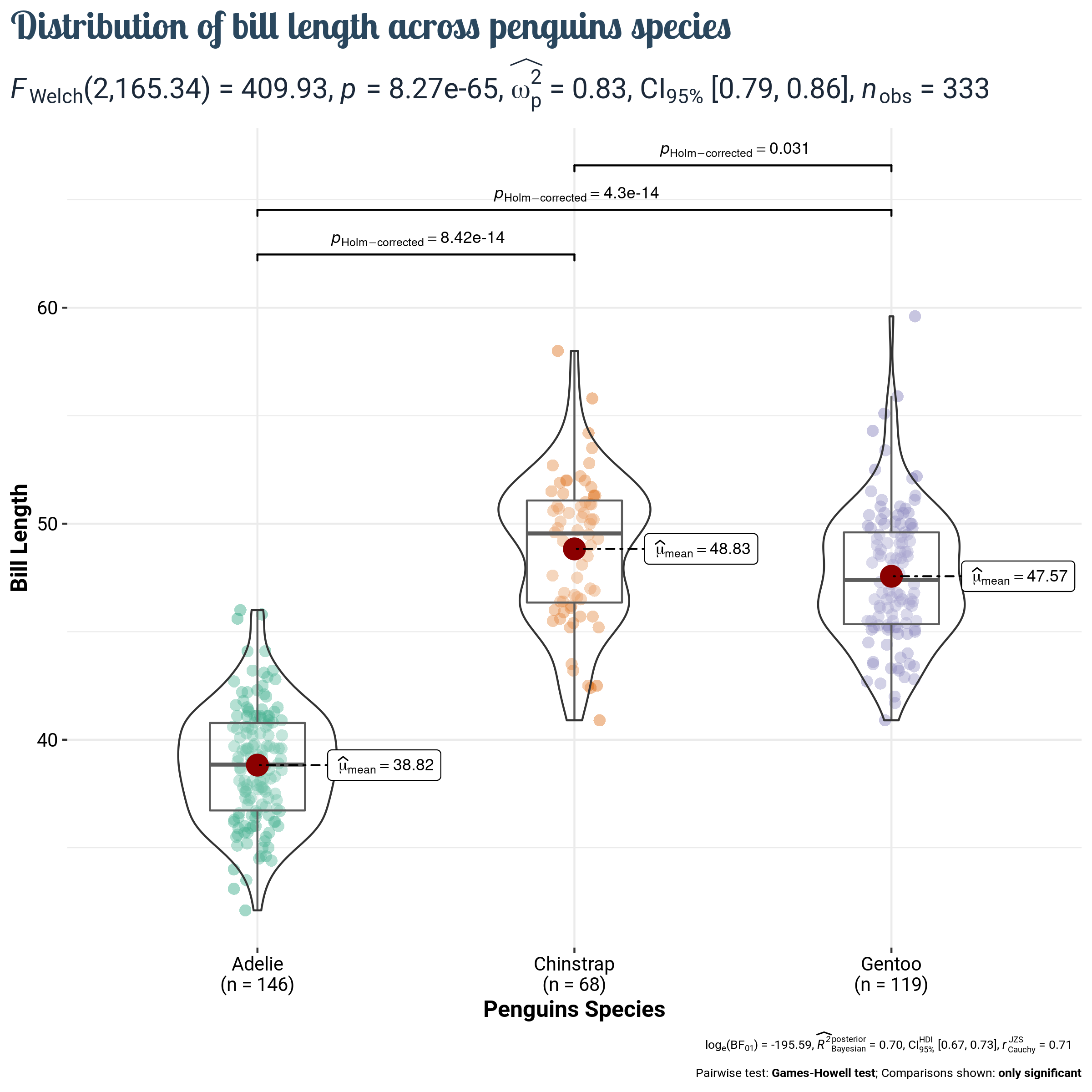
Much better!
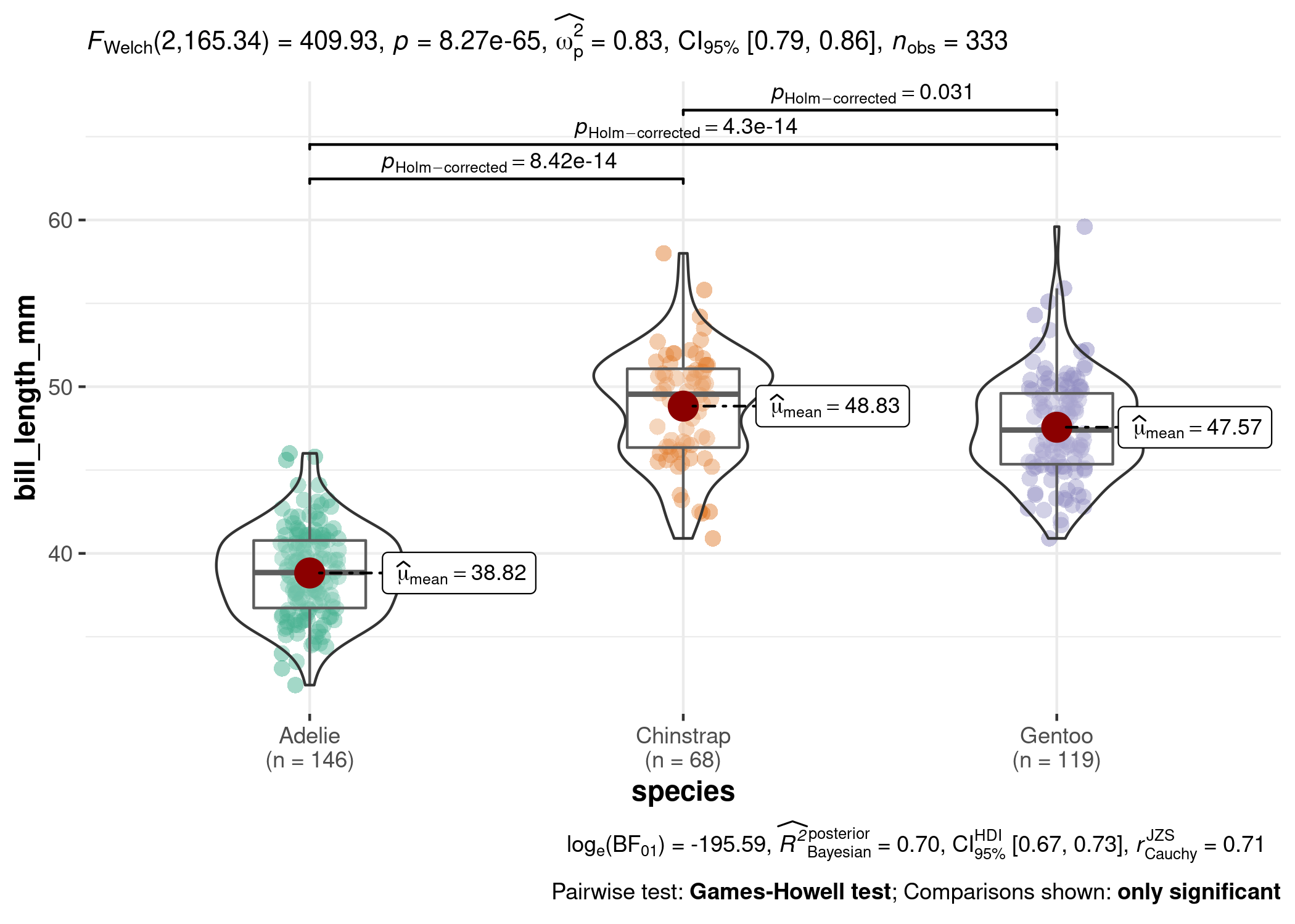
Final chart
The chart above is pretty close to being publication-ready. It only needs some final touches to the layout and it’s ready to go.
# 1. Remove axis ticks
# 2. Change default color of the axis lines with a lighter one
# 3. Remove most reference lines, only keep the major horizontal ones.
#    This reduces clutter, while keeping the reference for the variable
#    being compared.
# 4. Set the panel and the background fill to the same light color.

plt <- plt  +
  theme(
    axis.ticks = element_blank(),
    axis.line = element_line(colour = "grey50"),
    panel.grid = element_line(color = "#b4aea9"),
    panel.grid.minor = element_blank(),
    panel.grid.major.x = element_blank(),
    panel.grid.major.y = element_line(linetype = "dashed"),
    panel.background = element_rect(fill = "#fbf9f4", color = "#fbf9f4"),
    plot.background = element_rect(fill = "#fbf9f4", color = "#fbf9f4")
  )
And finally, save the result. Check it out! Isn’t it wonderful?
ggsave(
  filename = here::here("img", "fromTheWeb", "web-violinplot-with-ggstatsplot.png"),
  plot = plt,
  width = 8,
  height = 8,
  device = "png"
)