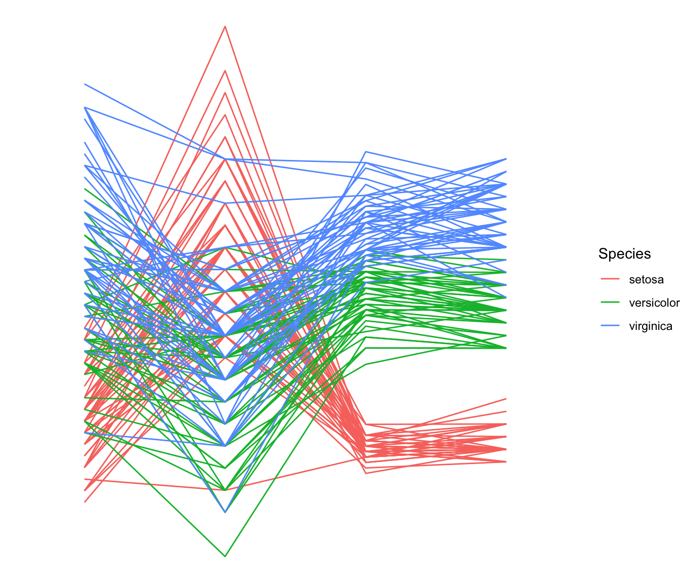
Most basic
This is the most basic parallel coordinates chart you can build with
R, the ggally packages and its
ggparcoord() function.
The input dataset must be a data frame with several numeric
variables, each being used as a vertical axis on the chart. Columns
number of these variables are specified in the
columns argument of the function.
Note: here, a categoric variable is used to color lines, as
specified in the groupColumn variable.
# Libraries
library(GGally)
# Data set is provided by R natively
data <- iris
# Plot
ggparcoord(data,
columns = 1:4, groupColumn = 5
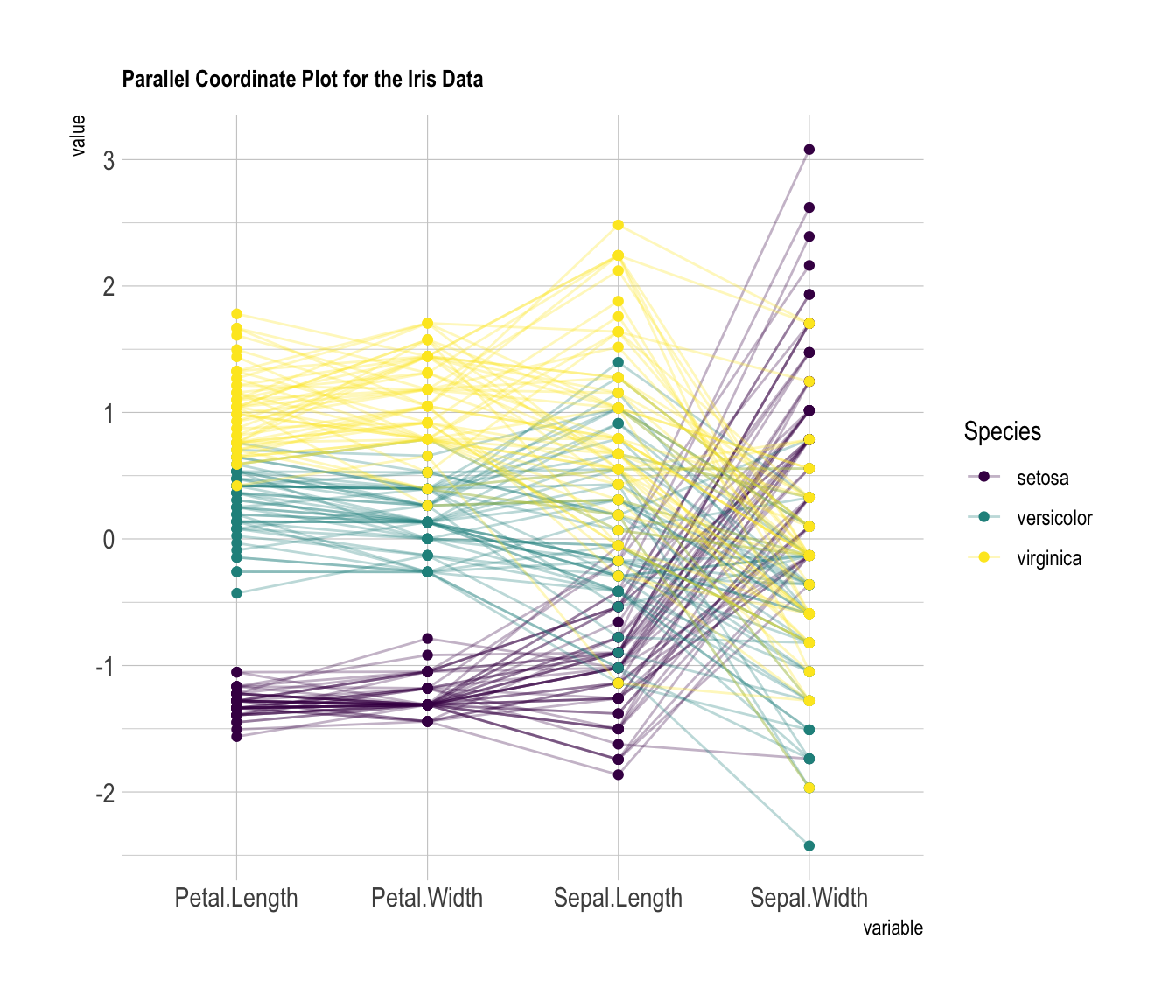
) Custom color, theme, general appearance
This is pretty much the same chart as te previous one, except for the following customizations:
-
color palette is improved thanks to the
viridispackage -
title is added with
title, and customized intheme - dots are added with
showPoints -
a bit of transparency is applied to lines with
alphaLines -
theme_ipsum()is used for the general appearance
# Libraries
library(hrbrthemes)
library(GGally)
library(viridis)

# Data set is provided by R natively
data <- iris

# Plot
ggparcoord(data,
    columns = 1:4, groupColumn = 5, order = "anyClass",
    showPoints = TRUE,
    title = "Parallel Coordinate Plot for the Iris Data",
    alphaLines = 0.3
    ) +
  scale_color_viridis(discrete=TRUE) +
  theme_ipsum()+
  theme(
    plot.title = element_text(size=10)
  )
Scaling
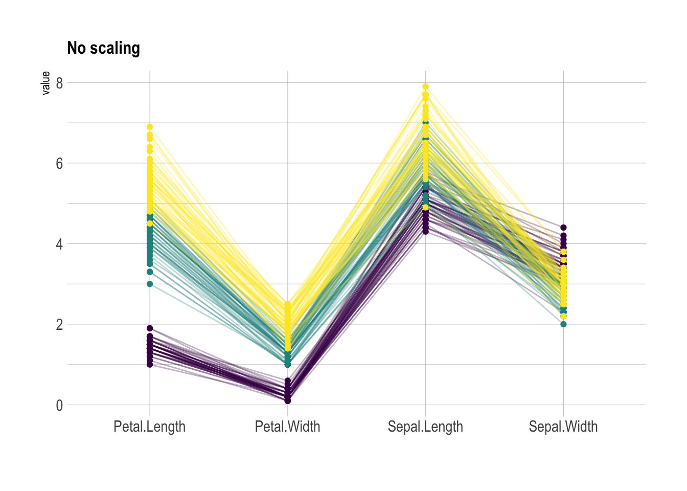
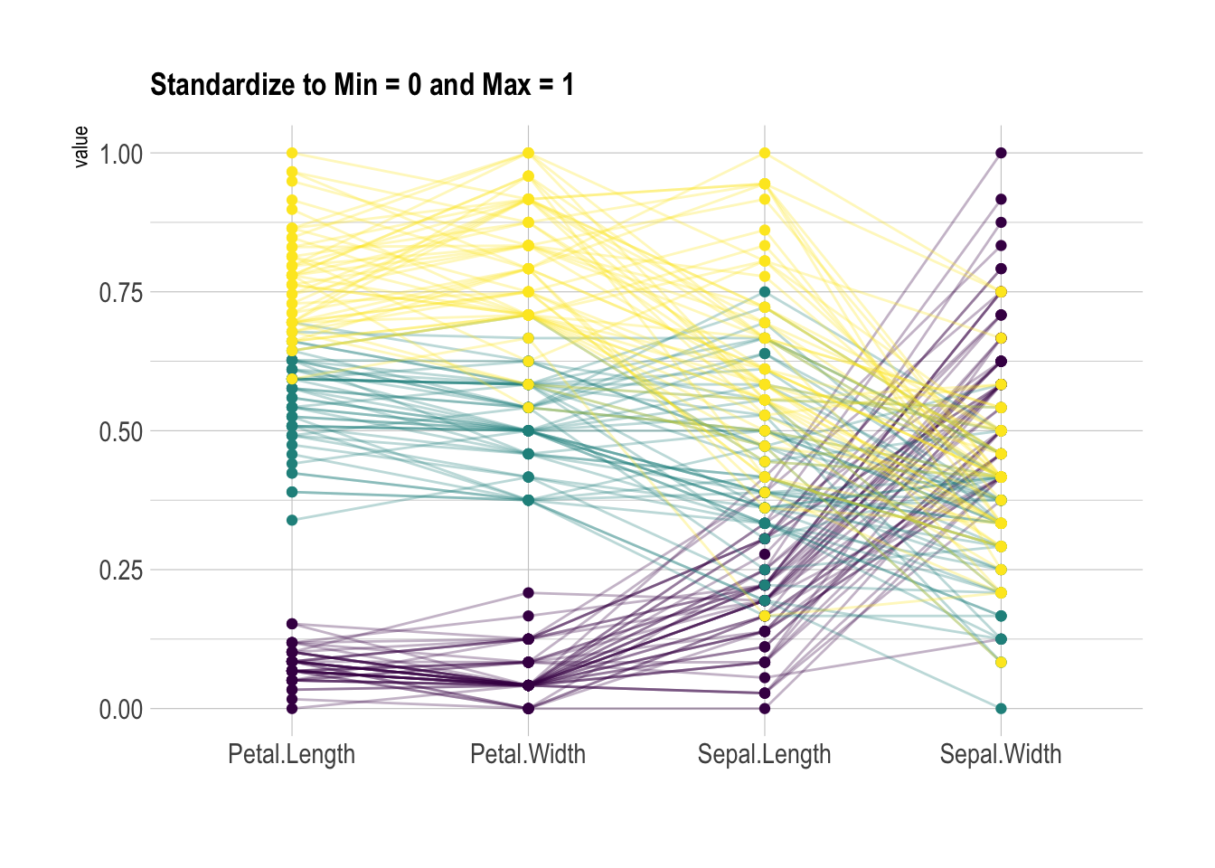
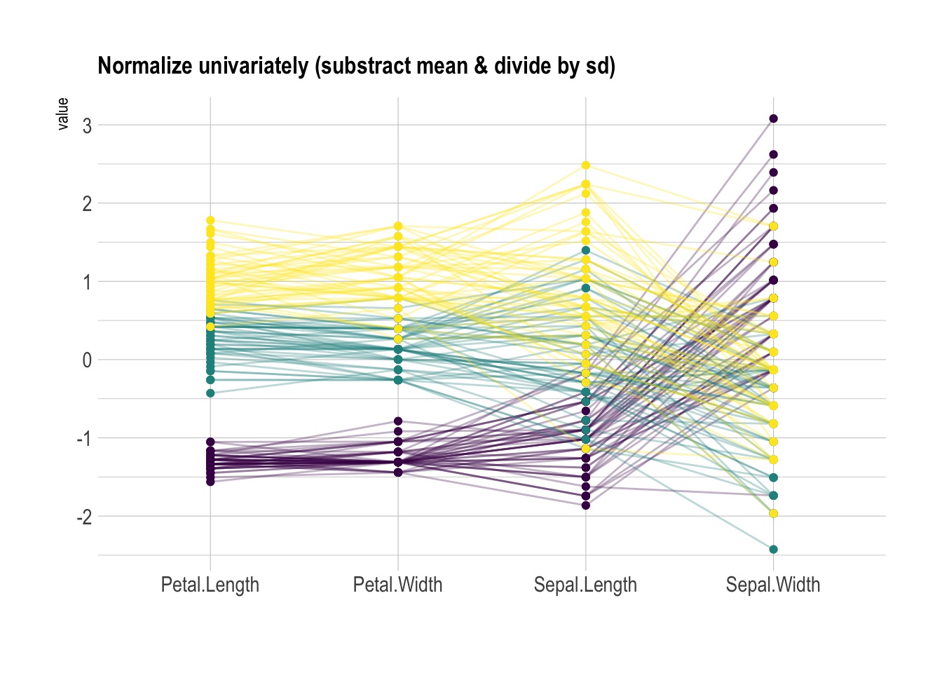
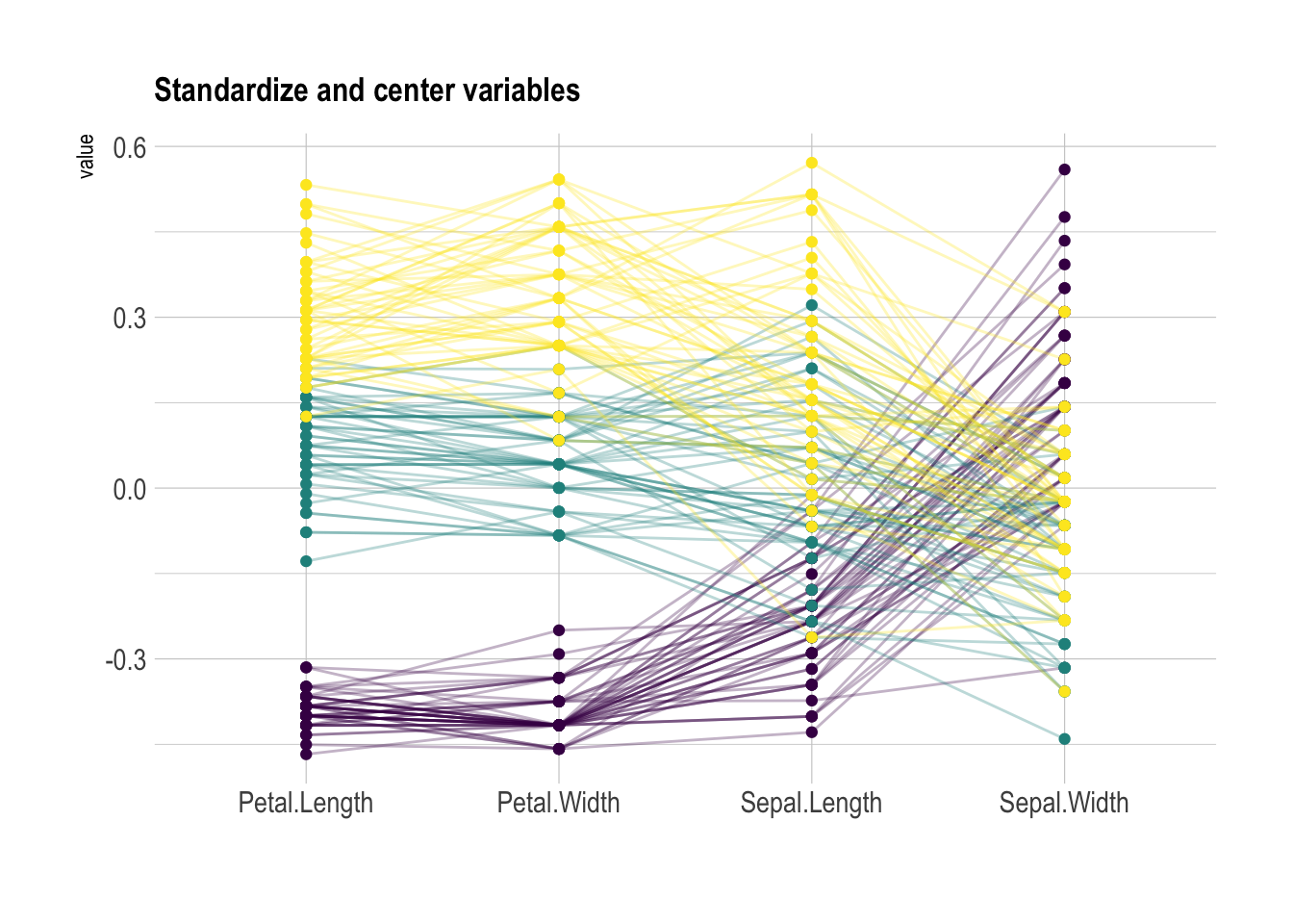
Scaling transforms the raw data to a new scale that is common with other variables. It is a crucial step to compare variables that do not have the same unit, but can also help otherwise as shown in the example below.
The ggally package offers a scale argument.
Four possible options are applied on the same dataset below:
globalminmax→ No scalinguniminmax→ Standardize to Min = 0 and Max = 1-
std→ Normalize univariately (substract mean & divide by sd) center→ Standardize and center variables
ggparcoord(data,
    columns = 1:4, groupColumn = 5, order = "anyClass",
    scale="globalminmax",
    showPoints = TRUE,
    title = "No scaling",
    alphaLines = 0.3
    ) +
  scale_color_viridis(discrete=TRUE) +
  theme_ipsum()+
  theme(
    legend.position="none",
    plot.title = element_text(size=13)
  ) +
xlab("")ggparcoord(data,
columns = 1:4, groupColumn = 5, order = "anyClass",
scale="uniminmax",
showPoints = TRUE,
title = "Standardize to Min = 0 and Max = 1",
alphaLines = 0.3
) +
scale_color_viridis(discrete=TRUE) +
theme_ipsum()+
theme(
legend.position="none",
plot.title = element_text(size=13)
) +
xlab("")ggparcoord(data,
columns = 1:4, groupColumn = 5, order = "anyClass",
scale="std",
showPoints = TRUE,
title = "Normalize univariately (substract mean & divide by sd)",
alphaLines = 0.3
) +
scale_color_viridis(discrete=TRUE) +
theme_ipsum()+
theme(
legend.position="none",
plot.title = element_text(size=13)
) +
xlab("")ggparcoord(data,
columns = 1:4, groupColumn = 5, order = "anyClass",
scale="center",
showPoints = TRUE,
title = "Standardize and center variables",
alphaLines = 0.3
) +
scale_color_viridis(discrete=TRUE) +
theme_ipsum()+
theme(
legend.position="none",
plot.title = element_text(size=13)
) +
xlab("")Highlight a group
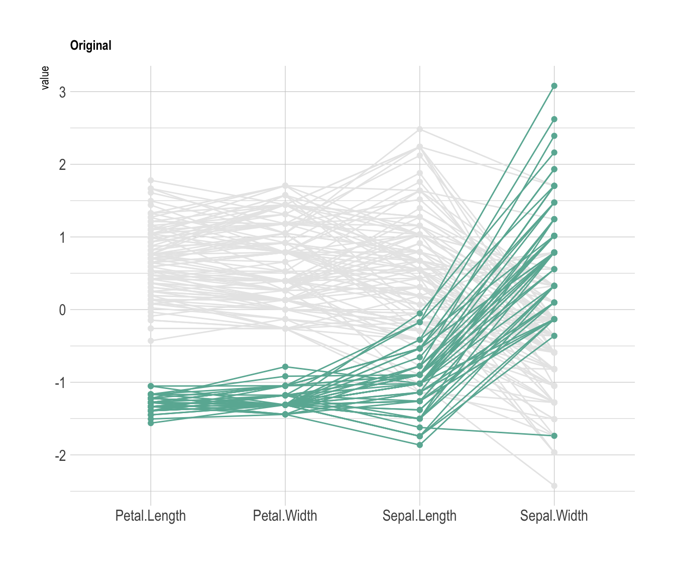
Data visualization aims to highlight a story in the data. If you are interested in a specific group, you can highlight it as follow:
# Libraries
library(GGally)
library(dplyr)

# Data set is provided by R natively
data <- iris

# Plot
data %>%
  arrange(desc(Species)) %>%
  ggparcoord(
    columns = 1:4, groupColumn = 5, order = "anyClass",
    showPoints = TRUE,
    title = "Original",
    alphaLines = 1
    ) +
  scale_color_manual(values=c( "#69b3a2", "#E8E8E8", "#E8E8E8") ) +
  theme_ipsum()+
  theme(
    legend.position="Default",
    plot.title = element_text(size=10)
  ) +
  xlab("")


