About
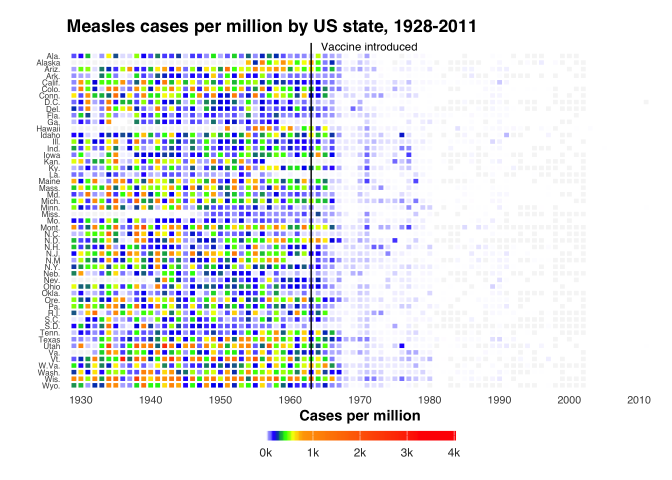
This chart visualizes measles cases across US states between 1928-2011 using a temporal heatmap. It highlights the impact of the 1963 measles vaccine introduction, demonstrating through historical public health data how vaccination successfully reduced disease incidence across the United States.
The visualization is based on historical public health records and clearly demonstrates the effectiveness of vaccination programs, providing insights into one of the most successful public health interventions in US history.
This chart was adapted from Ben Moore’s post. Thanks to him for sharing this insightful chart!
Load required libraries
This visualization only requires two R packages:
dplyr for data preparation, and ggplot2 for
creating the heatmap.
Read and prepare the data
This code reads a CSV file containing measles cases per million
inhabitants per year and US state. First, it imports the data using
readr::read_csv(). See how the data is structured from
the print() output. Then, it creates a new dataset “mdf”
where states are converted to factors and
arranged in reverse alphabetical order - this
ordering will determine how states are displayed from top to bottom in
our final heatmap.
# Read the data
measles = readr::read_csv("https://raw.githubusercontent.com/holtzy/R-graph-gallery/refs/heads/master/measles_data_1928-2011.csv")

# Show the first few rows of the data
print(head(measles))
## # A tibble: 6 × 3
## Year State value
## <dbl> <chr> <dbl>
## 1 1928 Alaska NA
## 2 1928 Ala. 335.
## 3 1928 Ark. 482.
## 4 1928 Ariz. 201.
## 5 1928 Calif. 69.2
## 6 1928 Colo. 207.Create color palette
This code creates a custom color gradient for the
heatmap that will represent different levels of measles cases. It
combines two color palettes: a spectrum from light blue through deeper
blues, green, and yellows/oranges for lower case counts up to 500,
followed by an orange-to-red gradient for higher case counts from
500-4000. The colorRampPalette() function smoothly
interpolates between these colors to create 100 total color steps.
Create advanced temporal heatmap
This code generates a comprehensive
temporal heatmap visualization in R using
ggplot2 to display measles cases across US states from
1928 to 2011. It also highlights the
year of vaccine introduction.
Core Plot Structure:
-
Creates a heatmap using
ggplot2with states on y-axis, years on x-axis, and case numbers determining color -
Uses
geom_tile()to create the rectangular cells with white borders
Color and Scale Settings:
- Applies the custom color gradient defined earlier
- Sets color scale limits from 0 to 4,000 cases per million
- Formats legend labels with ‘k’ suffix (0k to 4k)
Timeline Features:
- X-axis spans 1928-2012 with decade intervals
- Adds black vertical line at 1963 (vaccine introduction)
- Includes annotation “Vaccine introduced” near the line
Visual Styling:
- Uses
theme_minimal()with customized elements - Removes grid lines and unnecessary aesthetic elements
- Sets horizontal legend at bottom of plot
- Uses Helvetica font family throughout
- Customizes text sizes (smaller for states, larger for years)
Title and Labels:
- Adds main title “Measles cases per million by US state, 1928-2011”
- Removes x and y-axis labels
- Positions legend title “Cases per million” at top of color bar
ggplot(mdf, aes(x = Year, y = State, fill = value)) +
geom_tile(colour = "white", linewidth = 0.5,
            width = .9, height = .9) +
theme_minimal() +
scale_fill_gradientn(colours = cols,
                    limits = c(0, 4000),
                    breaks = seq(0, 4000, by = 1000),
                    labels = c("0k", "1k", "2k", "3k", "4k"),
                    na.value = rgb(246/255, 246/255, 246/255),
                    guide = guide_colourbar(ticks = TRUE,
                                          nbin = 50,
                                          barheight = .5,
                                          label = TRUE,
                                          barwidth = 10,
                                          title = "Cases per million",
                                          title.position = "top",
                                          title.hjust = 0.5)) +
scale_x_continuous(expand = c(0,0),
                  breaks = seq(1930, 2010, by = 10),
                  limits = c(1928, 2012)) +
geom_vline(xintercept = 1963, color = "black", size = 0.5) +
  theme(legend.position = c(.5, -.13),
      legend.direction = "horizontal",
      legend.text = element_text(colour = "grey20"),
      plot.margin = grid::unit(c(.5,.5,1.5,.5), "cm"),
      axis.text.y = element_text(size = 6, family = "Helvetica",
                                hjust = 1),
      axis.text.x = element_text(size = 8),
      axis.ticks.y = element_blank(),
      panel.grid = element_blank(),
      title = element_text(hjust = -.07, face = "bold", vjust = 1,
                          family = "Helvetica"),
      text = element_text(family = "Helvetica")) +
ggtitle("Measles cases per million by US state, 1928-2011") +
annotate("text", label = "Vaccine introduced", x = 1963, y = 53,
         vjust = 0.9, hjust = -0.1, size = I(3), family = "Helvetica") +
  xlab("") + ylab("")