Chord diagram from adjacency matrix
The chordDiagram() function of the
circlize package makes it a breeze to build chord
diagrams from adjacency matrix in R.
The adjacency matrix displays all origins in rows, and all destinations in columns. Each cell is filled with a numeric value specifying the flow strength.
Note: visit the chord section of the gallery or the circlize vignette for more chord examples.
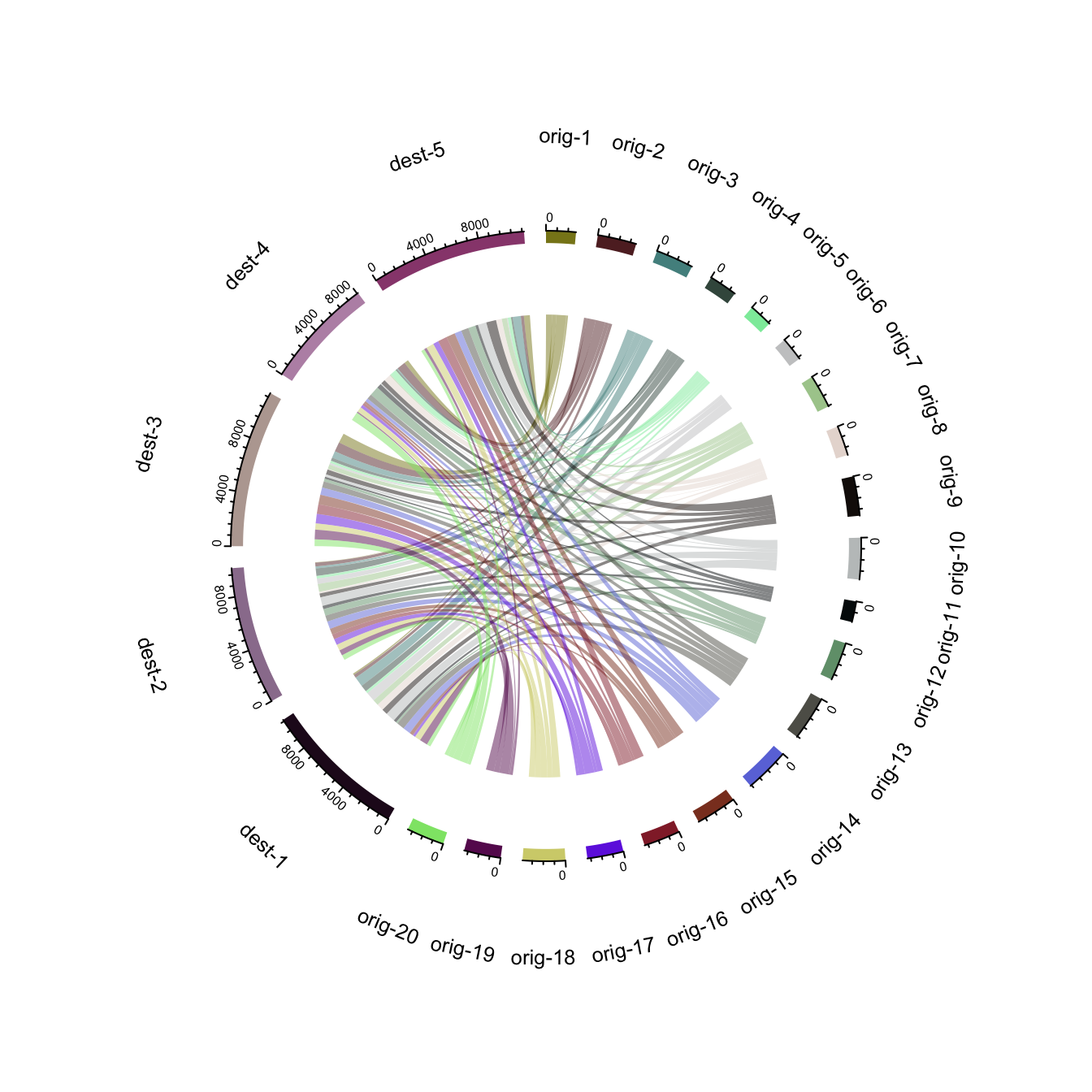
# Create an adjacency matrix:
# a list of connections between 20 origin nodes, and 5 destination nodes:
numbers <- sample(c(1:1000), 100, replace = T)
data <- matrix( numbers, ncol=5)
rownames(data) <- paste0("orig-", seq(1,20))
colnames(data) <- paste0("dest-", seq(1,5))

# Load the circlize library
library(circlize)

# Make the circular plot
chordDiagram(data, transparency = 0.5)
Chord diagram from edge list
Another common format to store flow information iis the edge list. Basically, all connections are stored one by one in a 2 columns file, listing the origin and destination of each.
Since the chordDiagram() function expects an adjacency
matrix as input, it is required to use the
table() function for reformating, as described below:
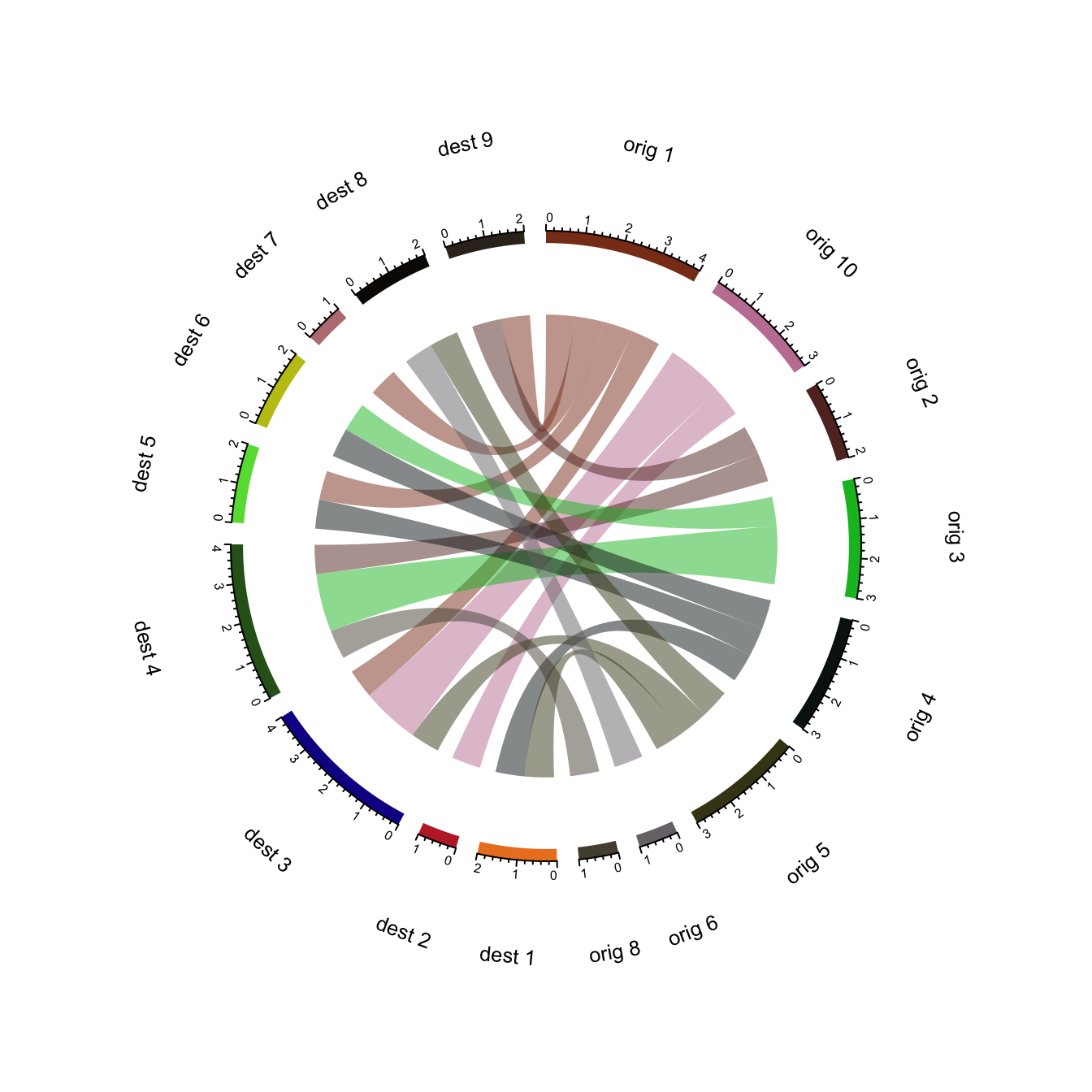
# Create an edge list: a list of connections between 10 origin nodes, and 10 destination nodes:
origin <- paste0("orig ", sample(c(1:10), 20, replace = T))
destination <- paste0("dest ", sample(c(1:10), 20, replace = T))
data <- data.frame(origin, destination)

# Transform input data in a adjacency matrix
adjacencyData <- with(data, table(origin, destination))

# Charge the circlize library
library(circlize)

# Make the circular plot
chordDiagram(adjacencyData, transparency = 0.5)