The networkD3 package allows to visualize networks using
several kinds of viz. One of its function makes stunning Sankey
diagrams as shown below. Follow the steps below to get the basics and
learn how to customize your Sankey Diagram.
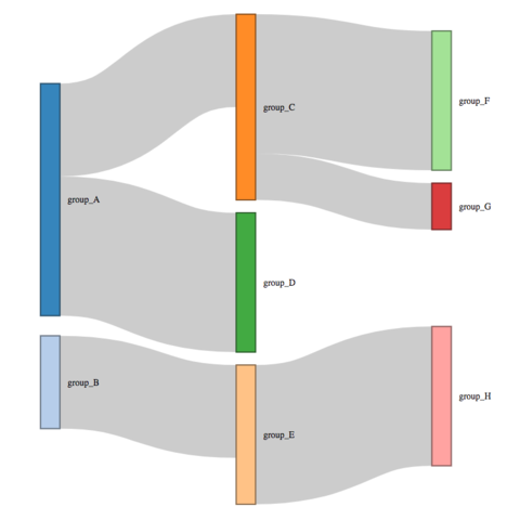

The networkD3 package is an htmlwidget: it automatically
builds interactive charts. Check the chart below: you can drag nodes
and hover links for more informagtion. If for some reason you need to
export it to png or pdf, it is possible
thanks to the
webshot
package.
Note: The example below comes directly from the networkD3 documentation.
How to export to .png Chart code
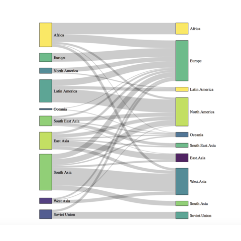
An alluvial chart is a variation of the sankey plot. It visualizes
frequency distributions over time or frequency tables involving
several categorical variables. In R, 2 packages exist to
build an alluvial diagram: alluvial and
ggalluvial
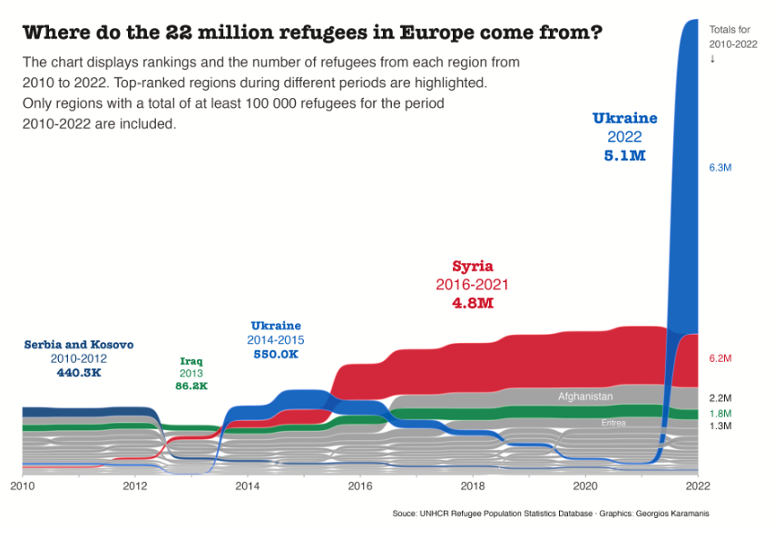
A bump chart can be seen as a variation of the sankey diagram. It visualizes changes in rank over time. Instead of showing absolute values, it focuses on the relative positioning of different categories across multiple time points. Each category is represented by a line that "bumps" up or down as its rank changes.