This page aims to explain how to add a legend to a plot made in base
R. It is done using the legend() function. The main
arguments are:
legend: names to display-
bty: type of box around the legend. See graph #73 -
horiz: legend in column or in row col: symbol color-
pch: symbol type. See graph #6 -
pt.cex: symbol size cex: text size-
text.col: text color -
topright: legend position:bottomright,bottom,bottomleft,left,topleft,top,topright,right,center. -
inset: % (from 0 to 1) to draw the legend away from x and y axis -
You can also give the
XandYcoordinate of the legend:legend(3, 5, ...)
Note that an equivalent page exist concerning legends with ggplot2.
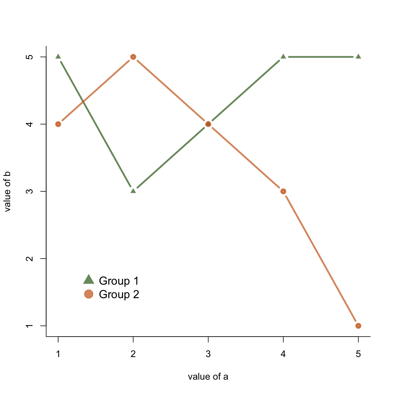
# Create data:
a=c(1:5)
b=c(5,3,4,5,5)
c=c(4,5,4,3,1)

# Make a basic graph
plot( b~a , type="b" , bty="l" , xlab="value of a" , ylab="value of b" , col=rgb(0.2,0.4,0.1,0.7) , lwd=3 , pch=17 , ylim=c(1,5) )
lines(c ~a , col=rgb(0.8,0.4,0.1,0.7) , lwd=3 , pch=19 , type="b" )

# Add a legend
legend("bottomleft",
  legend = c("Group 1", "Group 2"),
  col = c(rgb(0.2,0.4,0.1,0.7),
  rgb(0.8,0.4,0.1,0.7)),
  pch = c(17,19),
  bty = "n",
  pt.cex = 2,
  cex = 1.2,
  text.col = "black",
  horiz = F ,
  inset = c(0.1, 0.1))