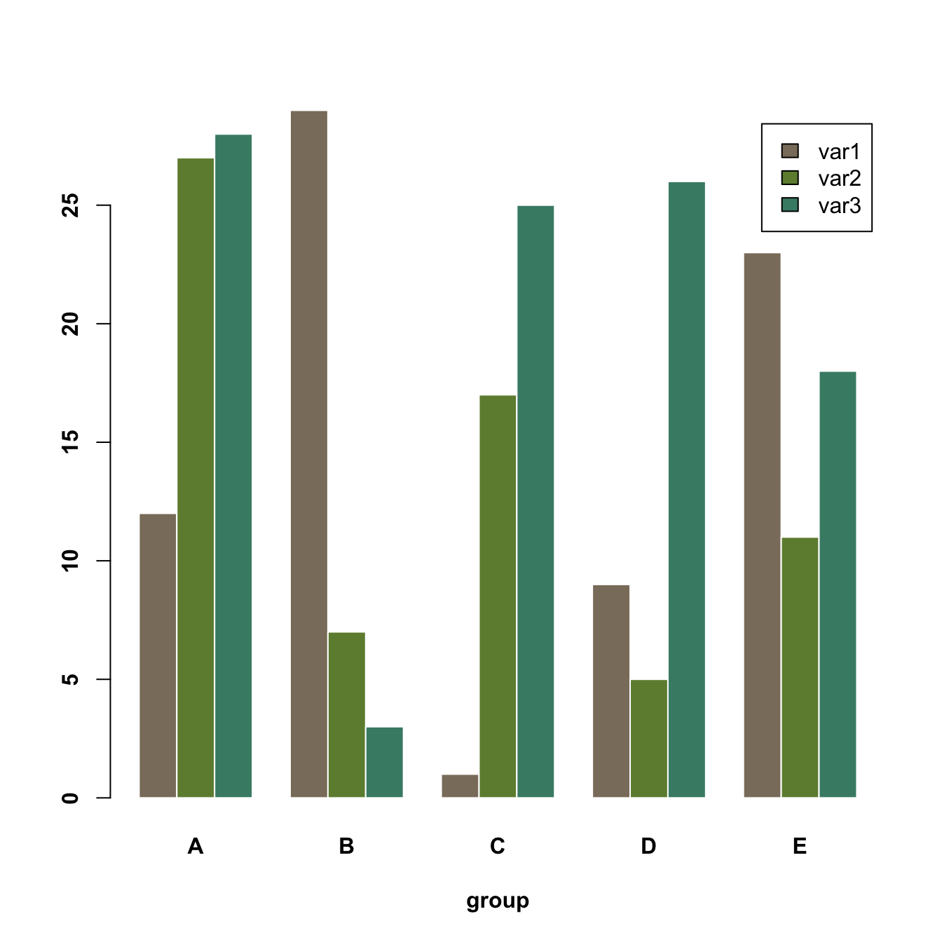
Grouped barchart
A grouped barplot display a numeric value for a set of entities
split in groups and subgroups. Before trying to build one, check how
to make a basic barplot with
R and ggplot2.
A few explanation about the code below:
- input dataset must be a numeric matrix. Each group is a column. Each subgroup is a row.
-
the
barplot()function will recognize this format, and automatically perform the grouping for you. -
the
besideallows to toggle between the grouped and the stacked barchart
# Create data
set.seed(112)
data <- matrix(sample(1:30,15) , nrow=3)
colnames(data) <- c("A","B","C","D","E")
rownames(data) <- c("var1","var2","var3")
# Grouped barplot
barplot(data,
col=colors()[c(23,89,12)] ,
border="white",
font.axis=2,
beside=T,
legend=rownames(data),
xlab="group",
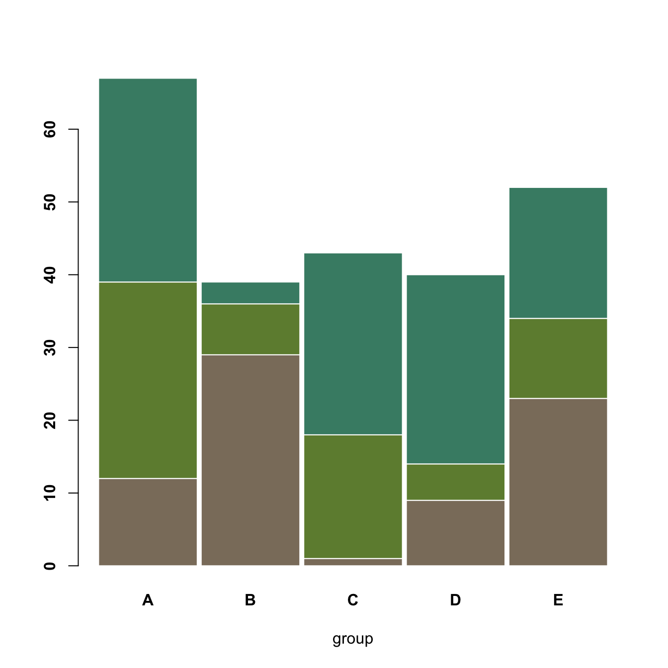
font.lab=2)Grouped barchart
A stacked barplot is very similar to the grouped barplot above. The
subgroups are just displayed on top of each other, not beside. The
stacked barchart is the default option of the
barplot() function in base R, so you don’t need to use
the beside argument.
# Create data
set.seed(112)
data <- matrix(sample(1:30,15) , nrow=3)
colnames(data) <- c("A","B","C","D","E")
rownames(data) <- c("var1","var2","var3")
# Get the stacked barplot
barplot(data,
col=colors()[c(23,89,12)] ,
border="white",
space=0.04,
font.axis=2,
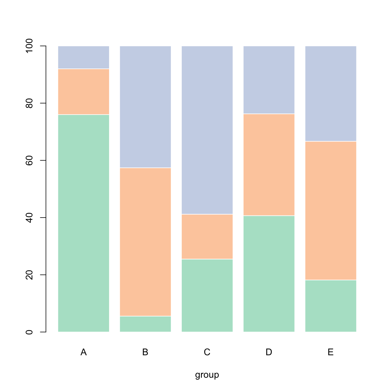
xlab="group")Percent stacked barplot
A percent stacked barchart displays the evolution of the proportion of each subgroup. The sum is always equal to 100%.
In base R, you have to manually compute the percentages, using the
apply() function. This is more straightforward using
ggplot2.
Note that here, a custom color palette is used, thanks to the
RColorBrewer package.
# Create data
set.seed(1124)
data <- matrix(sample(1:30,15) , nrow=3)
colnames(data) <- c("A","B","C","D","E")
rownames(data) <- c("var1","var2","var3")

# create color palette:
library(RColorBrewer)
coul <- brewer.pal(3, "Pastel2")

# Transform this data in %
data_percentage <- apply(data, 2, function(x){x*100/sum(x,na.rm=T)})

# Make a stacked barplot--> it will be in %!
barplot(data_percentage, col=coul , border="white", xlab="group")


