Animated bubble chart
Before trying to build an animated plot
with gganimate, make sure you understood how to build a
basic bubble chart with R and
ggplot2.
The idea is to add an additional aesthetics called
transition_..() that provides a frame variable. For
each value of the variable, a step on the chart will be drawn. Here,
transition_time() is used since the frame variable is
numeric.
Note that the gganimate automatically performs a
transition between state. Several options are available, set using
the ease_aes() function.
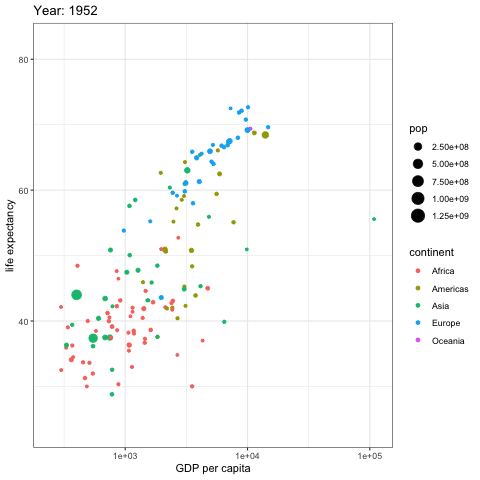
# Get data:
library(gapminder)

# Charge libraries:
library(ggplot2)
library(gganimate)

# Make a ggplot, but add frame=year: one image per year
ggplot(gapminder, aes(gdpPercap, lifeExp, size = pop, color = continent)) +
  geom_point() +
  scale_x_log10() +
  theme_bw() +
  # gganimate specific bits:
  labs(title = 'Year: {frame_time}', x = 'GDP per capita', y = 'life expectancy') +
  transition_time(year) +
  ease_aes('linear')

# Save at gif:
anim_save("271-ggplot2-animated-gif-chart-with-gganimate1.gif")
Use small multiple
Since gganimate is a ggplot2 extension, any ggplot2
option can be used to customize the chart. Here, an example using
facet_wrap() to use small multiple on the previous
chart, spliting the chart window per continent.
Important note: this example comes from the gganimate homepage.
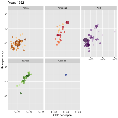
# Get data:
library(gapminder)

# Charge libraries:
library(ggplot2)
library(gganimate)

# Make a ggplot, but add frame=year: one image per year
ggplot(gapminder, aes(gdpPercap, lifeExp, size = pop, colour = country)) +
  geom_point(alpha = 0.7, show.legend = FALSE) +
  scale_colour_manual(values = country_colors) +
  scale_size(range = c(2, 12)) +
  scale_x_log10() +
  facet_wrap(~continent) +
  # Here comes the gganimate specific bits
  labs(title = 'Year: {frame_time}', x = 'GDP per capita', y = 'life expectancy') +
  transition_time(year) +
  ease_aes('linear')

# Save at gif:
anim_save("271-ggplot2-animated-gif-chart-with-gganimate2.gif")