Dataset
The dataset used in this post has 5 columns:
-
the first column is called
xand actually provides the month of the year, from January to December - the columns 2 to 5 provide a numeric value for 4 employees of a company respectively. Let’s say it’s the amount of money they brought or spend each month.
The dataset is stored on github and can be loaded as follow:
# Load the dataset that is stored on the web
data <- read.table("https://raw.githubusercontent.com/holtzy/R-graph-gallery/master/DATA/stacked_barplot_negative_values.csv", header=T, sep=",")
This is an overview of how it looks like:
library(knitr)
kable(head(data, 4))| x | groupA | groupB | groupC | groupD |
|---|---|---|---|---|
| Jan | 12 | 19 | -9 | 2 |
| Feb | 16 | 21 | -13 | 8 |
| Mar | 23 | 21 | -24 | 9 |
| Apr | 38 | 34 | 25 | 23 |
To work with ggplot2 and more generally with the
tidyverse, it’s necessary to transform it to a “long” or
“tidy” format. This is totally doable thanks to the
tidyr package:
# Load the package
library(tidyr)
library(dplyr)

# transform the format
data_long <- gather(data, group, value, groupA:groupD) %>%
  arrange(factor(x, levels = c("Jan", "Feb", "Mar", "Apr", "May", "Jun", "Jul", "Aug", "Sept", "Oct"))) %>%
  mutate(x=factor(x, levels=unique(x)))

# And that's the result!
kable(head(data_long, 4))| x | group | value |
|---|---|---|
| Jan | groupA | 12 |
| Jan | groupB | 19 |
| Jan | groupC | -9 |
| Jan | groupD | 2 |
Note: sorting the data is annoying and is described more in depth here
Stacked barchart
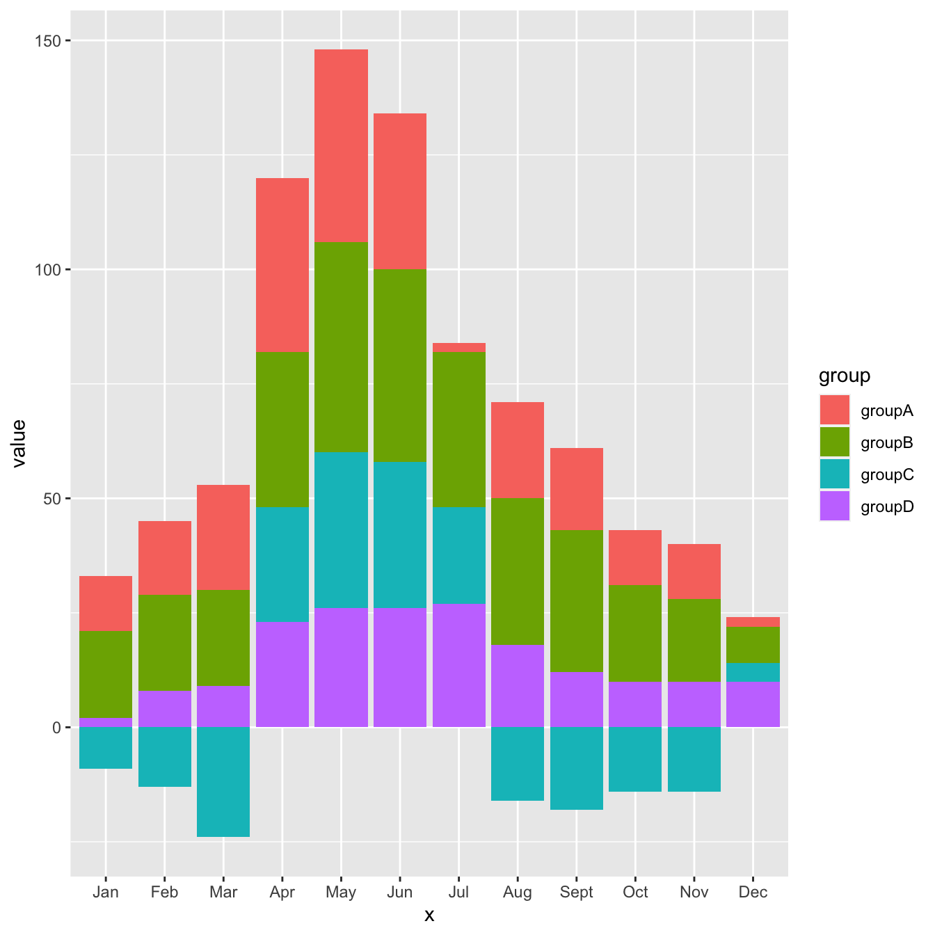
It’s now pretty straightforward to build the stacked barplot. Pretty much the same guideline that this specific post are applied. It’s important to notice that the negative values are automatically located below the 0 baseline, without any additional work required.

 # library
library(ggplot2)

# plot
ggplot(data_long, aes(fill=group, y=value, x=x)) +
  geom_bar(position="stack", stat="identity")
Stacked barchart polish
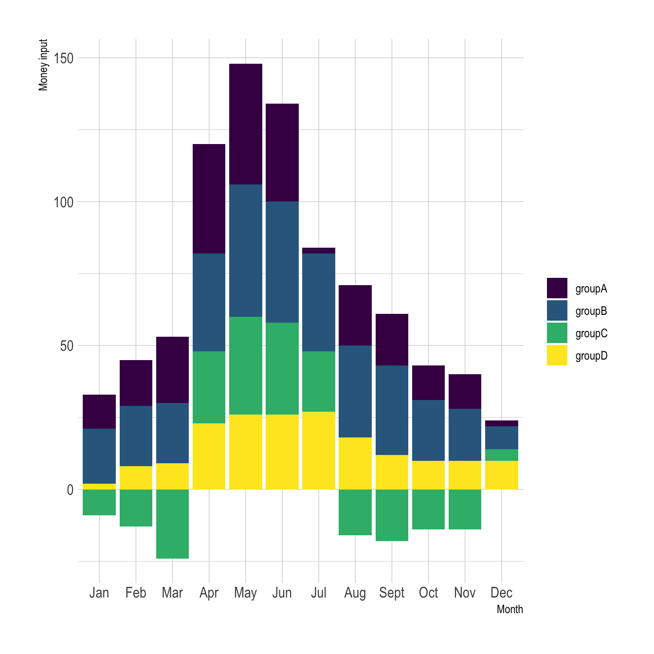
As always, a few polish steps to make the chart looks better with
proper axis titles, better theme and a classic
viridis color palette.

 # library
library(ggplot2)
library(hrbrthemes)
library(viridis)

# plot
ggplot(data_long, aes(fill=group, y=value, x=x)) +
  geom_bar(position="stack", stat="identity") +
  scale_fill_viridis(discrete=TRUE, name="") +
  theme_ipsum() +
  ylab("Money input") +
  xlab("Month")
Conclusion
By default, ggplot2 uses a “diverging” approach when it
comes to stacking negative values. Basically, it places all the
negative values below the 0 axis, and all the positive ones above.
If stacking is a topic that interests you, this article goes more in depth.


