Libraries and dataset
The ggbump package provides a
geom_bump() function that allows to
build ggbump charts.
Install the package with install.packages("ggbump").
The input dataset is simple: we just have 3 groups, with one value per group and per year. Here is how to build it:
# Library
#install.packages("ggbump")
library(ggbump)
library(tidyverse)
# Create data
year <- rep(2019:2021, 3)
products_sold <- c(
500, 600, 700,
550, 650, 600,
600, 400, 500
)
store <- c(
"Store A", "Store A", "Store A",
"Store B", "Store B", "Store B",
"Store C", "Store C", "Store C"
)
# Create the new dataframe
df <- data.frame(
year = year,
products_sold = products_sold,
store = store
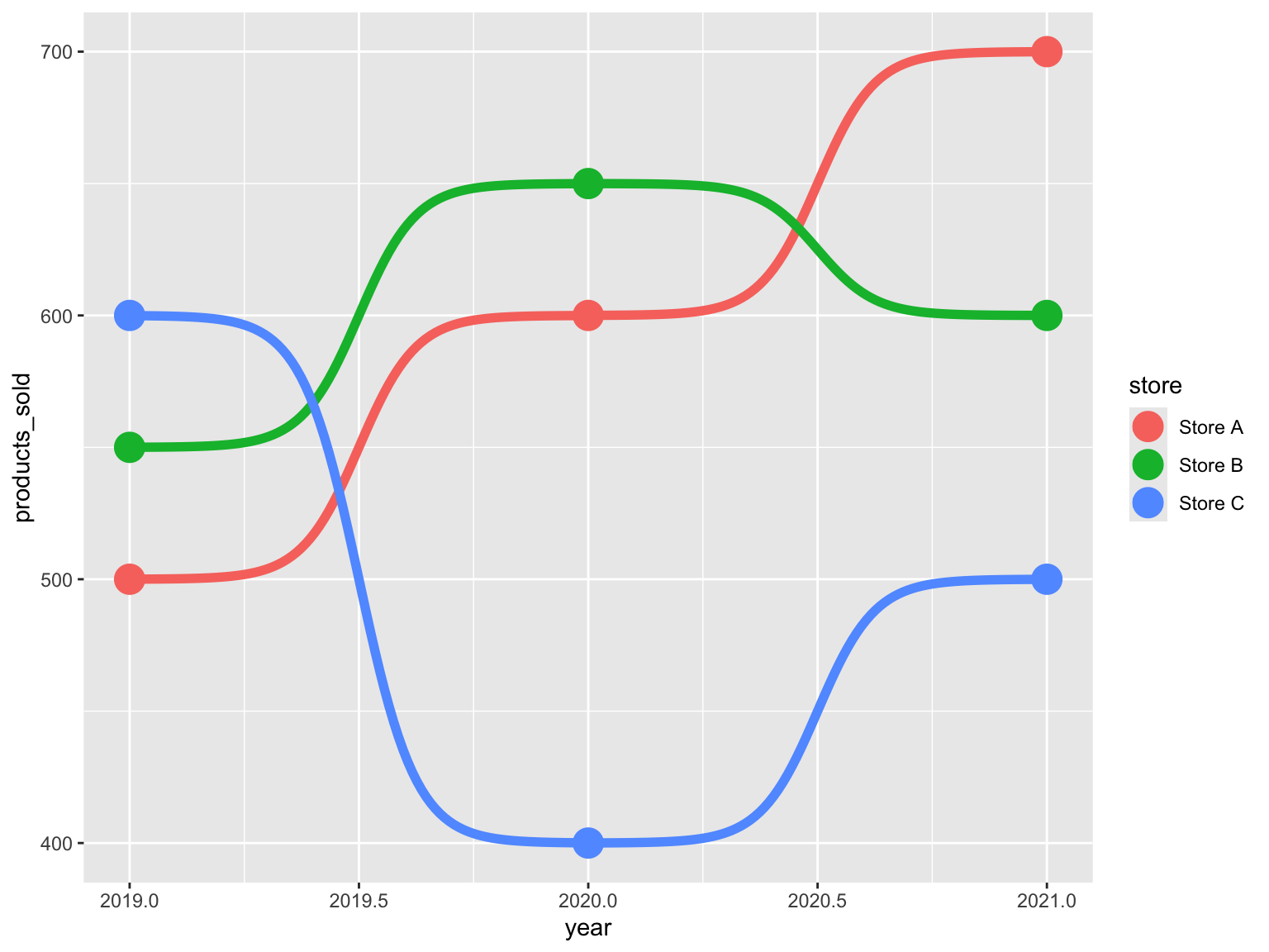
)Simple bump plot
Thanks to the geom_bump() function, we can easily build a
ggbump chart.
ggplot(df, aes(x = year, y = products_sold, color = store)) +
  geom_bump(size = 2) +
  geom_point(size = 6)
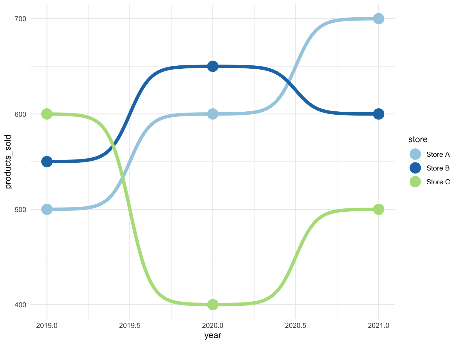
Change colors
It is possible to add individual points to the bump
chart. This is done by adding a geom_point() layer.
ggplot(df, aes(x = year, y = products_sold, color = store)) +
  geom_bump(size = 2) +
  geom_point(size = 6) +
  scale_color_brewer(palette = "Paired") +
  theme_minimal()
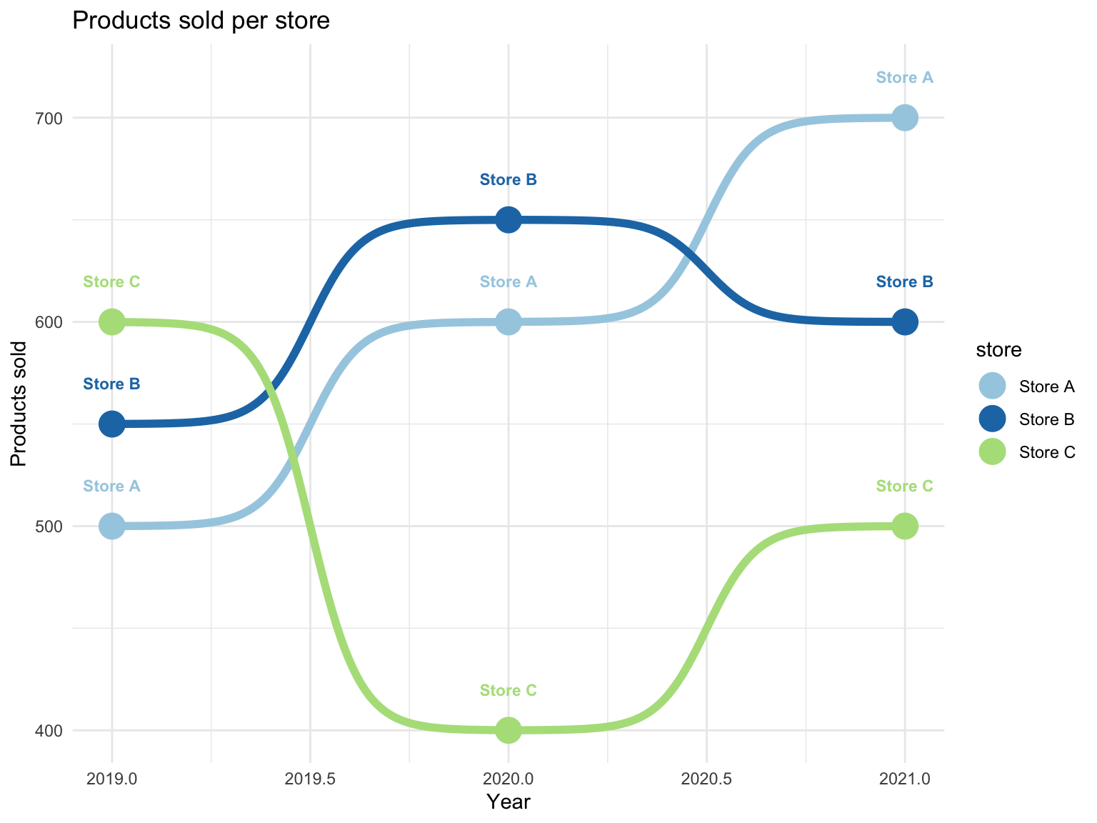
Add labels and title
The geom_text() and labs() functions can be
used to add labels and a title to the chart.
ggplot(df, aes(x = year, y = products_sold, color = store)) +
  geom_bump(size = 2) +
  geom_point(size = 6) +
  geom_text(aes(label = store), nudge_y = 20, fontface = "bold", size=3) +
  scale_color_brewer(palette = "Paired") +
  theme_minimal() +
  labs(
    title = "Products sold per store",
    x = "Year",
    y = "Products sold"
  )
Going further
You might be interested in
- learning how to use the ggbump package
- the basics of bump plots
- how to highlight specific lines in a bump plot


