Basic version
If you’re not familiar with the geom_line() function,
you should probably have a look to the
most basic line chart first.
Here, the input data frame is composed by 3 columns:
- An ordered numeric variable for the X axis
- Another numeric variable for the Y axis
- A categorical variable that specify the group of the observation
The idea is to draw one line per group. This is doable by specifying
a different color to each group with the color argument
of ggplot2.
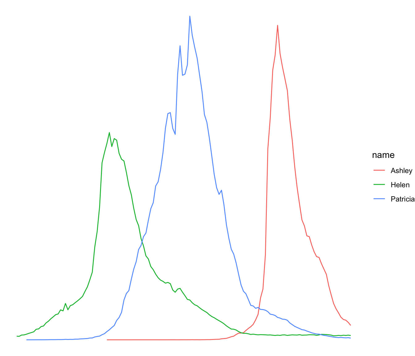
# Libraries
library(ggplot2)
library(babynames) # provide the dataset: a dataframe called babynames
library(dplyr)

# Keep only 3 names
don <- babynames %>%
  filter(name %in% c("Ashley", "Patricia", "Helen")) %>%
  filter(sex=="F")

# Plot
don %>%
  ggplot( aes(x=year, y=n, group=name, color=name)) +
    geom_line()
Customize the grouped line chart
Several options are available to customize the line chart appearance:
- Add a title with
ggtitle(). -
Change line style with arguments like
shape,size,colorand more. -
Use the
viridispackage to get a nice color palette. -
Custom the general theme with the
theme_ipsum()function of thehrbrthemespackage.
More generally, visit the [ggplot2 section] for more ggplot2 related stuff.
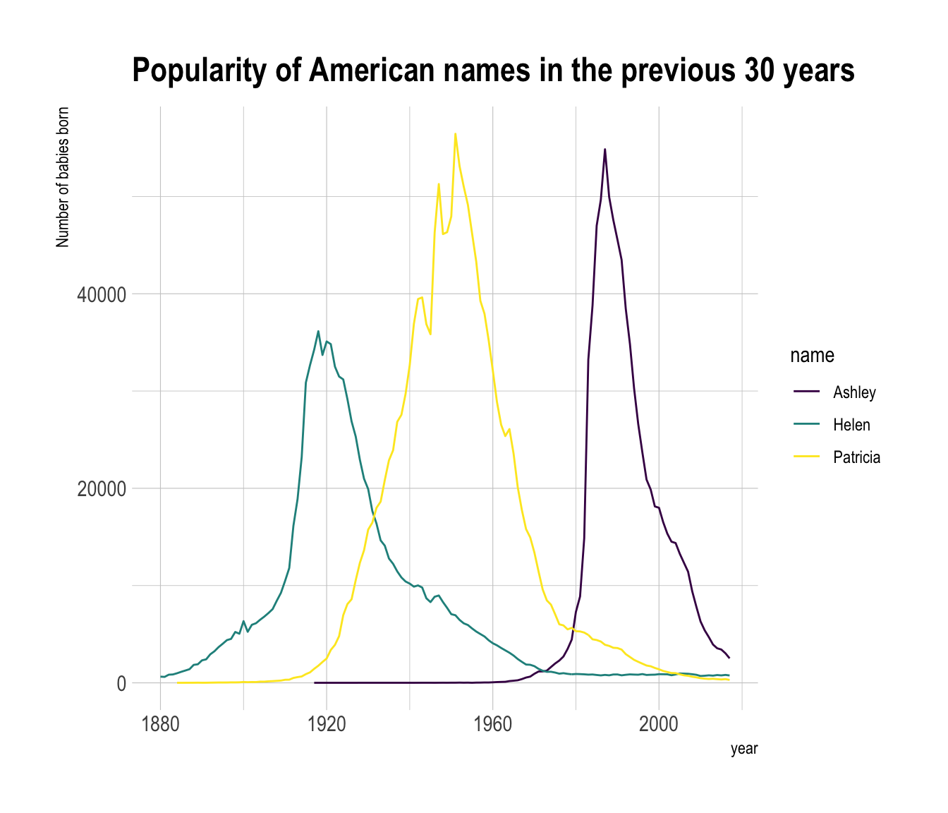
# Libraries
library(ggplot2)
library(babynames) # provide the dataset: a dataframe called babynames
library(dplyr)
library(hrbrthemes)
library(viridis)

# Keep only 3 names
don <- babynames %>%
  filter(name %in% c("Ashley", "Patricia", "Helen")) %>%
  filter(sex=="F")

# Plot
don %>%
  ggplot( aes(x=year, y=n, group=name, color=name)) +
    geom_line() +
    scale_color_viridis(discrete = TRUE) +
    ggtitle("Popularity of American names in the previous 30 years") +
    theme_ipsum() +
    ylab("Number of babies born")
Notes
- Read more about line charts theory here
- Be careful: a line chart with too many groups results in a spaghetti chart, which is a bad practice.
- Visit data-to-viz for line chart alternatives.