Without Labels
Previous post of the hierarchical edge bundling section explained:
- how to build a very basic version.
- how to customize connection and node features
Let’s remind how to prepare the data for the
ggraph library.
# Libraries
library(ggraph)
library(igraph)
library(tidyverse)
library(RColorBrewer)

# create a data frame giving the hierarchical structure of your individuals
set.seed(1234)
d1 <- data.frame(from="origin", to=paste("group", seq(1,10), sep=""))
d2 <- data.frame(from=rep(d1$to, each=10), to=paste("subgroup", seq(1,100), sep="_"))
edges <- rbind(d1, d2)

# create a dataframe with connection between leaves (individuals)
all_leaves <- paste("subgroup", seq(1,100), sep="_")
connect <- rbind(
  data.frame( from=sample(all_leaves, 100, replace=T) , to=sample(all_leaves, 100, replace=T)),
  data.frame( from=sample(head(all_leaves), 30, replace=T) , to=sample( tail(all_leaves), 30, replace=T)),
  data.frame( from=sample(all_leaves[25:30], 30, replace=T) , to=sample( all_leaves[55:60], 30, replace=T)),
  data.frame( from=sample(all_leaves[75:80], 30, replace=T) , to=sample( all_leaves[55:60], 30, replace=T)) )
connect$value <- runif(nrow(connect))

# create a vertices data.frame. One line per object of our hierarchy
vertices  <-  data.frame(
  name = unique(c(as.character(edges$from), as.character(edges$to))) ,
  value = runif(111)
)
# Let's add a column with the group of each name. It will be useful later to color points
vertices$group  <-  edges$from[ match( vertices$name, edges$to ) ]
Create the labels
Next step: computing the label features that will be displayed all around the circle, next to the nodes:
- angle → vertical on top and botton, horizontal on the side, and so on.
- flip it → labels on the left hand side must be 180° flipped to be readable
- alignment → if labels are flipped, they must be right aligned
Those information are computed and added to the
vertices data frame.
#Let's add information concerning the label we are going to add: angle, horizontal adjustement and potential flip
#calculate the ANGLE of the labels
vertices$id <- NA
myleaves <- which(is.na( match(vertices$name, edges$from) ))
nleaves <- length(myleaves)
vertices$id[ myleaves ] <- seq(1:nleaves)
vertices$angle <- 90 - 360 * vertices$id / nleaves

# calculate the alignment of labels: right or left
# If I am on the left part of the plot, my labels have currently an angle < -90
vertices$hjust <- ifelse( vertices$angle < -90, 1, 0)

# flip angle BY to make them readable
vertices$angle <- ifelse(vertices$angle < -90, vertices$angle+180, vertices$angle)
Plot the labels
Now that label features have been computed, we just need to display
it on the chart using the geom_node_text() function.
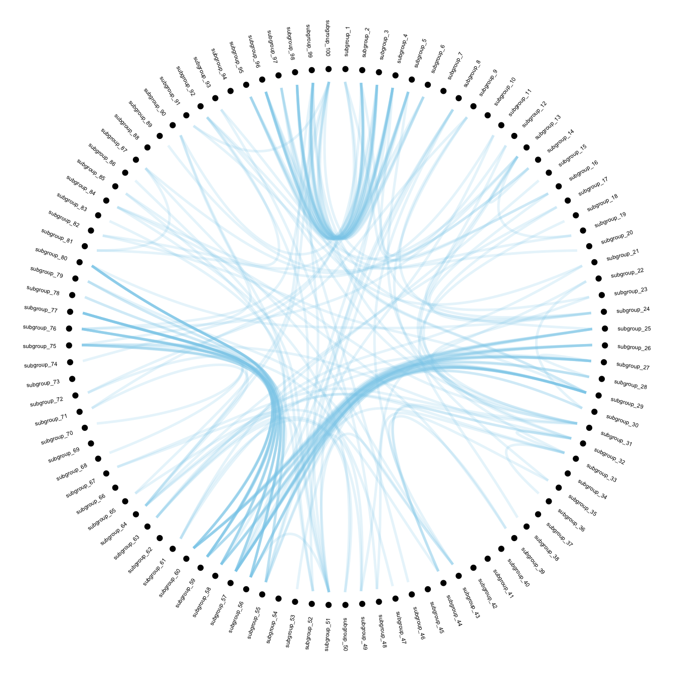
# Create a graph object
mygraph <- igraph::graph_from_data_frame( edges, vertices=vertices )

# The connection object must refer to the ids of the leaves:
from  <-  match( connect$from, vertices$name)
to  <-  match( connect$to, vertices$name)

# Basic usual argument
ggraph(mygraph, layout = 'dendrogram', circular = TRUE) +
  geom_node_point(aes(filter = leaf, x = x*1.05, y=y*1.05)) +
  geom_conn_bundle(data = get_con(from = from, to = to), alpha=0.2, colour="skyblue", width=0.9) +
  geom_node_text(aes(x = x*1.1, y=y*1.1, filter = leaf, label=name, angle = angle, hjust=hjust), size=1.5, alpha=1) +
  theme_void() +
  theme(
    legend.position="none",
    plot.margin=unit(c(0,0,0,0),"cm"),
  ) +
  expand_limits(x = c(-1.2, 1.2), y = c(-1.2, 1.2))
With Customization
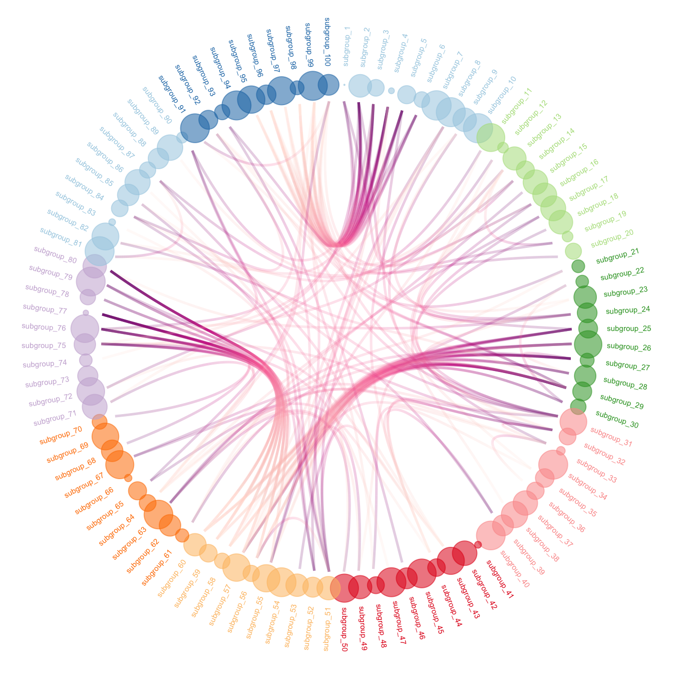
To get the final figure, it is necessary to add customization described in graph #310:
- control node size, color and transparency.
- control connection color
ggraph(mygraph, layout = 'dendrogram', circular = TRUE) +
  geom_conn_bundle(data = get_con(from = from, to = to), alpha=0.2, width=0.9, aes(colour=..index..)) +
  scale_edge_colour_distiller(palette = "RdPu") +

  geom_node_text(aes(x = x*1.15, y=y*1.15, filter = leaf, label=name, angle = angle, hjust=hjust, colour=group), size=2, alpha=1) +

  geom_node_point(aes(filter = leaf, x = x*1.07, y=y*1.07, colour=group, size=value, alpha=0.2)) +
  scale_colour_manual(values= rep( brewer.pal(9,"Paired") , 30)) +
  scale_size_continuous( range = c(0.1,10) ) +

  theme_void() +
  theme(
    legend.position="none",
    plot.margin=unit(c(0,0,0,0),"cm"),
  ) +
  expand_limits(x = c(-1.3, 1.3), y = c(-1.3, 1.3))