Most basic doughnut chart with ggplot2
The ggplot2 package allows to build
donut charts. Note however that
this is possible thanks a hack, since no specific function has been
created for this kind of chart. (This is voluntary, to avoid donut
charts that are dataviz
bad practice)
Here is the process: - input data provides a numeric variable for a
set of entities - absolute numeric values must be translated to
proportion - group positions must be stacked: we’re gonna display
them one after the other - geom_rect() is used to plot
each group as a rectangle - coord_polar() is used to
switch from stacked rectangles to a ring -
xlim() allows to switch from pie to donut: it adds the
empty circle in the middle
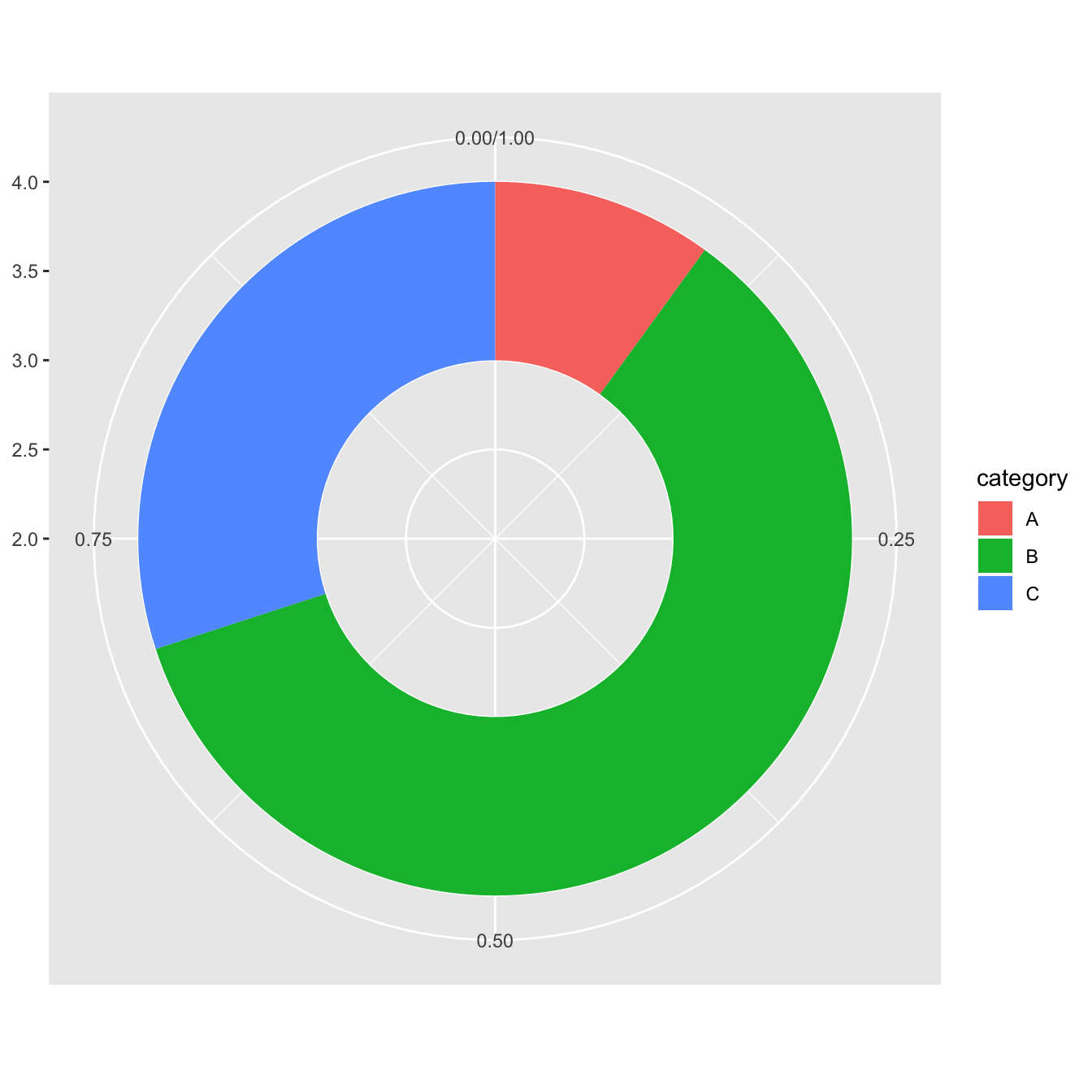
# load library
library(ggplot2)

# Create test data.
data <- data.frame(
  category=c("A", "B", "C"),
  count=c(10, 60, 30)
)

# Compute percentages
data$fraction = data$count / sum(data$count)

# Compute the cumulative percentages (top of each rectangle)
data$ymax = cumsum(data$fraction)

# Compute the bottom of each rectangle
data$ymin = c(0, head(data$ymax, n=-1))

# Make the plot
ggplot(data, aes(ymax=ymax, ymin=ymin, xmax=4, xmin=3, fill=category)) +
     geom_rect() +
     coord_polar(theta="y") + # Try to remove that to understand how the chart is built initially
     xlim(c(2, 4)) # Try to remove that to see how to make a pie chart
Customization
Here are a couple of things you can do improve your donut chart style:
-
use
theme_void()to get rid of the unnecessary background, axis, labels and so on. - use a better color palette
- don’t use a legend, add labels to groups directly
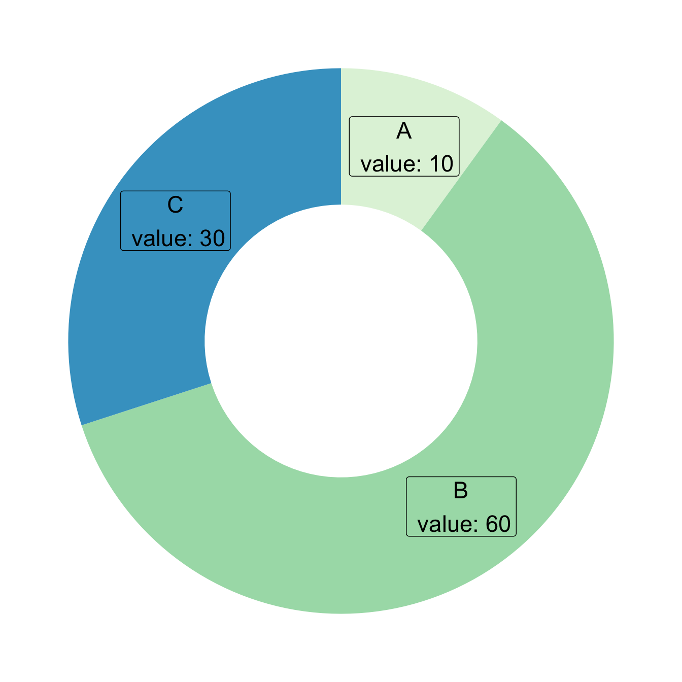
# load library
library(ggplot2)

# Create test data.
data <- data.frame(
  category=c("A", "B", "C"),
  count=c(10, 60, 30)
)

# Compute percentages
data$fraction <- data$count / sum(data$count)

# Compute the cumulative percentages (top of each rectangle)
data$ymax <- cumsum(data$fraction)

# Compute the bottom of each rectangle
data$ymin <- c(0, head(data$ymax, n=-1))

# Compute label position
data$labelPosition <- (data$ymax + data$ymin) / 2

# Compute a good label
data$label <- paste0(data$category, "\n value: ", data$count)

# Make the plot
ggplot(data, aes(ymax=ymax, ymin=ymin, xmax=4, xmin=3, fill=category)) +
  geom_rect() +
  geom_label( x=3.5, aes(y=labelPosition, label=label), size=6) +
  scale_fill_brewer(palette=4) +
  coord_polar(theta="y") +
  xlim(c(2, 4)) +
  theme_void() +
  theme(legend.position = "none")
Donut thickness
It is important to understand that donut chart are just stacked
rectangles that are made circular thanks to
coord_polar.
Thus, the empty circle that makes it a donut chart is just the space between the initial Y axis and the left part of the rectangle.
-
If
xlimleft boundary is big, no empty circle. You get a pie chart - If
xlimis low, the ring becomes thinner.
If you don’t get it, just plot the chart without
coord_polar()
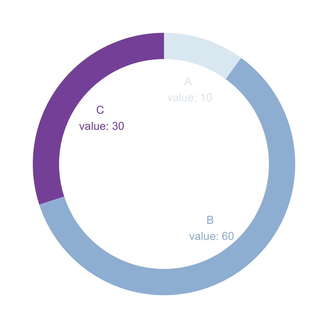
# load library
library(ggplot2)

# Create test data.
data <- data.frame(
  category=c("A", "B", "C"),
  count=c(10, 60, 30)
)

# Compute percentages
data$fraction <- data$count / sum(data$count)

# Compute the cumulative percentages (top of each rectangle)
data$ymax <- cumsum(data$fraction)

# Compute the bottom of each rectangle
data$ymin <- c(0, head(data$ymax, n=-1))

# Compute label position
data$labelPosition <- (data$ymax + data$ymin) / 2

# Compute a good label
data$label <- paste0(data$category, "\n value: ", data$count)

# Make the plot
ggplot(data, aes(ymax=ymax, ymin=ymin, xmax=4, xmin=3, fill=category)) +
  geom_rect() +
  geom_text( x=2, aes(y=labelPosition, label=label, color=category), size=6) + # x here controls label position (inner / outer)
  scale_fill_brewer(palette=3) +
  scale_color_brewer(palette=3) +
  coord_polar(theta="y") +
  xlim(c(-1, 4)) +
  theme_void() +
  theme(legend.position = "none")