Most basic
The VennDiagram package allows to build Venn Diagrams
thanks to its venn.diagram() function. It takes as
input a list of vector. Each vector providing words.
The function starts bycounting how many words are common between each pair of list. It then draws the result, showing each set as a circle.
The output is available as a .png file in your current
working directory.
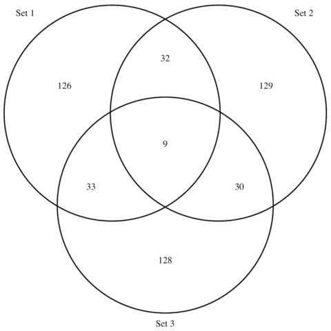
# Load library
library(VennDiagram)

# Generate 3 sets of 200 words
set1 <- paste(rep("word_" , 200) , sample(c(1:1000) , 200 , replace=F) , sep="")
set2 <- paste(rep("word_" , 200) , sample(c(1:1000) , 200 , replace=F) , sep="")
set3 <- paste(rep("word_" , 200) , sample(c(1:1000) , 200 , replace=F) , sep="")

# Chart
venn.diagram(
  x = list(set1, set2, set3),
  category.names = c("Set 1" , "Set 2 " , "Set 3"),
  filename = '#14_venn_diagramm.png',
  output=TRUE
)
Customize it
The venn.diagram() function offers several option to
customize the output. Those options allow to customize the circles,
the set names, and the intersection values.
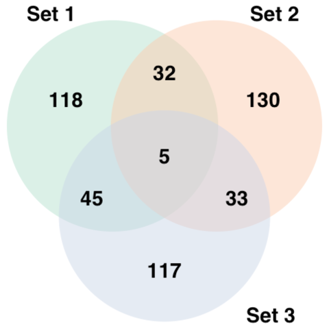
# Load library
library(VennDiagram)
# Generate 3 sets of 200 words
set1 <- paste(rep("word_" , 200) , sample(c(1:1000) , 200 , replace=F) , sep="")
set2 <- paste(rep("word_" , 200) , sample(c(1:1000) , 200 , replace=F) , sep="")
set3 <- paste(rep("word_" , 200) , sample(c(1:1000) , 200 , replace=F) , sep="")
# Prepare a palette of 3 colors with R colorbrewer:
library(RColorBrewer)
myCol <- brewer.pal(3, "Pastel2")
# Chart
venn.diagram(
x = list(set1, set2, set3),
category.names = c("Set 1" , "Set 2 " , "Set 3"),
filename = '#14_venn_diagramm.png',
output=TRUE,
# Output features
imagetype="png" ,
height = 480 ,
width = 480 ,
resolution = 300,
compression = "lzw",
# Circles
lwd = 2,
lty = 'blank',
fill = myCol,
# Numbers
cex = .6,
fontface = "bold",
fontfamily = "sans",
# Set names
cat.cex = 0.6,
cat.fontface = "bold",
cat.default.pos = "outer",
cat.pos = c(-27, 27, 135),
cat.dist = c(0.055, 0.055, 0.085),
cat.fontfamily = "sans",
rotation = 1
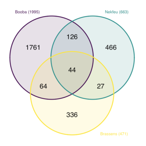
)Application on rap Lyrics
Here is an example showing the number of shared words in the lyrics of 3 famous french singers: (Nekfeu, Booba) and Georges Brassens.
This example is extensively described in this dedicated post.
Note the use of both the col and
fill options to make the circle border color different
darker.
# Libraries
library(tidyverse)
library(hrbrthemes)
library(tm)
library(proustr)

# Load dataset from github
data <- read.table("https://raw.githubusercontent.com/holtzy/data_to_viz/master/Example_dataset/14_SeveralIndepLists.csv", header=TRUE)
to_remove <- c("_|[0-9]|\\.|function|^id|script|var|div|null|typeof|opts|if|^r$|undefined|false|loaded|true|settimeout|eval|else|artist")
data <- data %>% filter(!grepl(to_remove, word)) %>% filter(!word %in% stopwords('fr')) %>% filter(!word %in% proust_stopwords()$word)

# library
library(VennDiagram)

#Make the plot
venn.diagram(
  x = list(
    data %>% filter(artist=="booba") %>% select(word) %>% unlist() ,
    data %>% filter(artist=="nekfeu") %>% select(word) %>% unlist() ,
    data %>% filter(artist=="georges-brassens") %>% select(word) %>% unlist()
    ),
  category.names = c("Booba (1995)" , "Nekfeu (663)" , "Brassens (471)"),
  filename = 'IMG/venn.png',
  output = TRUE ,
          imagetype="png" ,
          height = 480 ,
          width = 480 ,
          resolution = 300,
          compression = "lzw",
          lwd = 1,
          col=c("#440154ff", '#21908dff', '#fde725ff'),
          fill = c(alpha("#440154ff",0.3), alpha('#21908dff',0.3), alpha('#fde725ff',0.3)),
          cex = 0.5,
          fontfamily = "sans",
          cat.cex = 0.3,
          cat.default.pos = "outer",
          cat.pos = c(-27, 27, 135),
          cat.dist = c(0.055, 0.055, 0.085),
          cat.fontfamily = "sans",
          cat.col = c("#440154ff", '#21908dff', '#fde725ff'),
          rotation = 1
        )