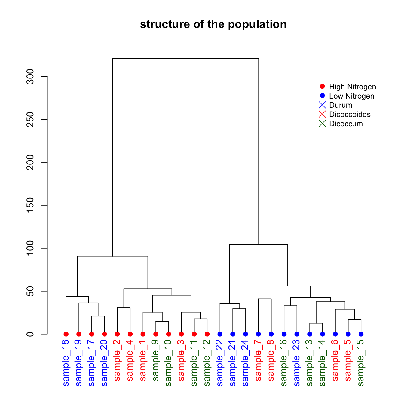
This is a upgrade of the basic dendrogram presented in the figure #29. Please refer to this previous post to understand how a dendrogram works.
In this exemple, we just show how to add specific colors to leaves and sample name. It allows to check if the expected groups are indeed found after clustering.
# Build dataset (just copy and paste, this is NOT interesting)
sample <- paste(rep("sample_",24) , seq(1,24) , sep="")
specie <- c(rep("dicoccoides" , 8) , rep("dicoccum" , 8) , rep("durum" , 8))
treatment <- rep(c(rep("High",4 ) , rep("Low",4)),3)
data <- data.frame(sample,specie,treatment)
for (i in seq(1:5)){
  gene=sample(c(1:40) , 24 )
  data=cbind(data , gene)
  colnames(data)[ncol(data)]=paste("gene_",i,sep="")
 }
data[data$treatment=="High" , c(4:8)]=data[data$treatment=="High" , c(4:8)]+100
data[data$specie=="durum" , c(4:8)]=data[data$specie=="durum" , c(4:8)]-30
rownames(data) <- data[,1]

# Have a look to the dataset
# head(data)

# Compute Euclidean distance between samples
dist=dist(data[ , c(4:8)] , diag=TRUE)

# Perfor clustering with hclust
hc <- hclust(dist)
dhc <- as.dendrogram(hc)

# Actually, each leaf of the tree has several attributes, like the color, the shape.. Have a look to it:
specific_leaf <- dhc[[1]][[1]][[1]]
# specific_leaf
# attributes(specific_leaf)

#So if I Want to color each leaf of the Tree, I have to change the attribute of each leaf. This can be done using the dendrapply function. So I create a function that # # add 3 attributes to the leaf : one for the color (“lab.col”) ,one for the font “lab.font” and one for the size (“lab.cex”).
i=0
colLab<<-function(n){
    if(is.leaf(n)){

        #I take the current attributes
        a=attributes(n)

        #I deduce the line in the original data, and so the treatment and the specie.
        ligne=match(attributes(n)$label,data[,1])
        treatment=data[ligne,3];
            if(treatment=="Low"){col_treatment="blue"};if(treatment=="High"){col_treatment="red"}
        specie=data[ligne,2];
            if(specie=="dicoccoides"){col_specie="red"};if(specie=="dicoccum"){col_specie="Darkgreen"};if(specie=="durum"){col_specie="blue"}

        #Modification of leaf attribute
        attr(n,"nodePar")<-c(a$nodePar,list(cex=1.5,lab.cex=1,pch=20,col=col_treatment,lab.col=col_specie,lab.font=1,lab.cex=1))
        }
    return(n)
}

# Finally I just have to apply this to my dendrogram
dL <- dendrapply(dhc, colLab)

# And the plot
plot(dL , main="structure of the population")
legend("topright",
     legend = c("High Nitrogen" , "Low Nitrogen" , "Durum" , "Dicoccoides" , "Dicoccum"),
     col = c("red", "blue" , "blue" , "red" , "Darkgreen"),
     pch = c(20,20,4,4,4), bty = "n",  pt.cex = 1.5, cex = 0.8 ,
     text.col = "black", horiz = FALSE, inset = c(0, 0.1))